A website can look fine to the people who built it and still turn customers away every day. Pages load slowly on a phone, buttons have no name for a screen reader, Google cannot tell what a page is about, and the form at the end of the journey asks one question too many. A website audit checklist is how you find those problems in a sensible order, before you spend more on ads, content or a redesign.
This guide explains what a website audit is, how to do a website audit step by step, and what to check in each of the six areas that matter: search, speed, accessibility, usability, content and tracking. It ends with a 42-point checklist and a simple template for writing up what you find. Throughout, it uses real results from UX Robot’s free check of a real website, Happy Menu, run on 6 November 2026.
In short
- A website audit is a structured review of how well a website is found, how fast it is, who can use it, and whether visitors can do what they came for.
- Check six areas: search, speed, accessibility, usability, content and tracking. Most free audits stop at the first one.
- Start with the pages that bring in customers and the journeys that make money, not the whole sitemap.
- Use real-visitor data where you can. A single lab test and real visitors often disagree, sometimes by seconds.
- Automated tools find only part of the problems. The rest needs a person, or an agent, using the website.
What is a website audit?
A website audit is a structured check of a website’s health that finds what stops people finding it, using it and acting on it. A complete audit covers search visibility, speed, accessibility, usability, content and tracking, and ends with a ranked list of problems, each with the evidence and a fix.
Many tools sold as website audits are really search audits. They crawl your pages and report broken links, missing titles and duplicate content. That matters, but it answers only one question: can Google find and understand this page? It says nothing about whether the visitor who arrives can read the text, tap the right button or finish the form. A website that ranks well and then loses people on the first screen has a problem a crawler will never show you.
A good website audit therefore looks at the website from two sides. From the outside, as Google and other search engines see it. And from the inside, as a customer sees it, on the device they actually use, trying to do the thing they came for. The checklist in this guide covers both.
The six areas a website audit should cover
Check search, speed, accessibility, usability, content and tracking. Search and speed decide whether people arrive and stay, accessibility and usability decide whether they can act, and content and tracking decide whether they trust you and whether you can tell what worked.
The problems in each area are common enough that almost every website has some. Independent research shows how common:
That last figure is the reason a website audit cannot be only a tool. When the UK’s Government Digital Service built a page with 142 known accessibility barriers and ran it through 13 automated tools, the best one found 40% of them and the worst found 13%. Tools are excellent at the checks a script can do. Everything else needs someone to use the page.
- Indexed, titled and described
- Matches what people search for
- Main content within 2.5 seconds
- Taps answered within 200 milliseconds
- Readable, zoomable, works with a keyboard
- Clear next step, forms that forgive
- Prices, proof and contact details
- Goals counted in analytics
How to do a website audit, step by step
Choose the pages that matter most, collect real-visitor data, run the automated checks, then use each page yourself on a phone, record every problem with its evidence and rank the list by impact and effort.
- Pick the pages and journeys that matterThe pages ads and search send people to, and the path to your main goal.
- Collect what real visitors didAnalytics, Search Console, real-visitor speed and session recordings.
- Run the automated checksSpeed, accessibility and search basics, page by page.
- Use each page as a customer wouldOn a phone first, then on a computer, with a keyboard too.
- Read the content with fresh eyesDoes each page say what it offers, for whom, at what price?
- Check that tracking counts the right thingsEvery goal recorded once, consent respected.
- Write up and rank every findingEvidence, fix and severity, sorted by impact and effort.
1. Pick the pages and journeys that matter
Auditing every page with equal care is how audits stall. Start with the pages that bring people in: your home page, the landing pages your ads point to and the pages with the most search traffic. Then add the journey that makes you money, such as product page to checkout, or service page to booked call. Customers move through several pages to reach a goal, so a page that looks fine alone can still fail them halfway. Write down where each journey starts and where it ends.
2. Collect what real visitors did
Before you judge a single screen, look at the evidence you already have. Google Analytics shows which pages people leave from and on which devices. Search Console shows which searches bring people in and which pages Google has not indexed. Chrome’s real-visitor speed data, the Chrome UX Report, shows how fast the website is for the people who actually use it. Session recordings from a free tool such as Microsoft Clarity show where people tap on things that do nothing. Treat all of it as leads: places to look hardest in the steps that follow.
3. Run the automated checks
Automated checks are fast and cheap, so run them on every page on your list. Google’s Lighthouse, built into Chrome and behind PageSpeed Insights, scores a page for performance, accessibility, best practices and search basics on a simulated phone, and lists the specific failures. Note each failed check and the element it names. The real example below shows what one of these checks returns.
4. Use each page as a customer would
This is the step most audits skip, and where the biggest problems hide. Take each journey from start to finish on a phone. Read the first screen and ask whether it is obvious what the page offers and what to do next. Tap every button and open every menu. Fill in forms with test details, make a mistake on purpose and see whether the page helps you recover. Then put the mouse away on a computer and press Tab through the page: can you reach everything and always see where you are? Stop before anything you cannot undo, such as paying or sending a message.
5. Read the content with fresh eyes
Content problems look like design problems from a distance. Check that every important page says who it is for in the customer’s words, gives the price or how pricing works, shows real proof such as reviews or examples, and answers the questions people ask before they buy. Look for pages that promise one thing in the search result and talk about another once people arrive.
6. Check that tracking counts the right things
If your analytics count a sign-up twice, or not at all, every decision you make from them is off. Complete each goal with test details and confirm it is recorded once, with the right source. Check that your consent banner does what it says, and that test visits from your own team are excluded.
7. Write up and rank every finding
Every finding needs the same few things: where it is, a screenshot, how to see it again, why it matters, a fix and a severity. The template below lays them out. Then rank the list by impact and effort, so the team fixes what hurts most first rather than what is easiest to argue about.
A real website audit: what the automated part finds
On Happy Menu’s home page, a free automated check found slow loading for real visitors on phones, six accessibility failures including zoom turned off, and one search basics failure, all in about a minute.
Here is what steps 2 and 3 look like on a real website. We ran UX Robot’s free check on happymenu.co, a restaurant discovery website whose owner lets us publish its results, on 6 November 2026. The check reads Google’s real-visitor speed data for the website, then runs Lighthouse on a phone.
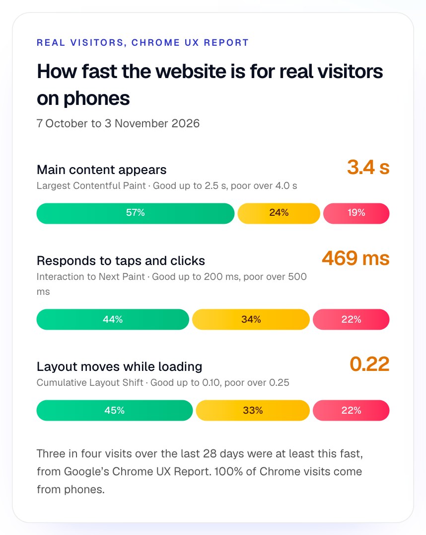
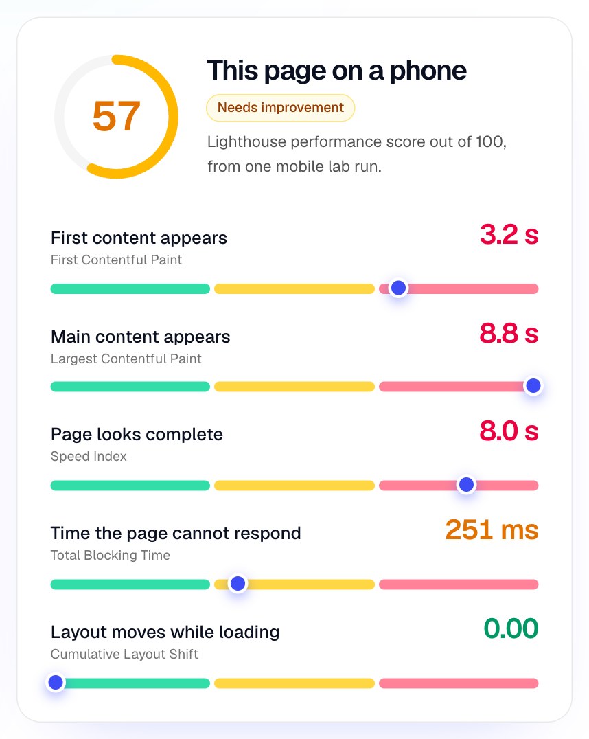
Speed: real visitors waited, and the page moved. Over 28 days, three in four phone visits saw the main content appear within 3.4 seconds, the page respond to a tap within 469 milliseconds and the layout shift by 0.22 or less. Google’s targets are 2.5 seconds, 200 milliseconds and 0.1, so all three need improvement. Every Chrome visit in the period came from a phone, which is why a website audit should start there.
Lab and real visitors disagree, and both are useful. The lab test put the main content at 8.8 seconds, much slower than real visitors saw, and measured no layout shift at all, although real visitors had plenty. A lab test is one load on a deliberately slow simulated phone, with no scrolling or tapping, so it cannot see the shifts that happen as people use the page. Use real-visitor data to decide whether there is a problem, and the lab test to find out why. Here, Lighthouse named the causes:
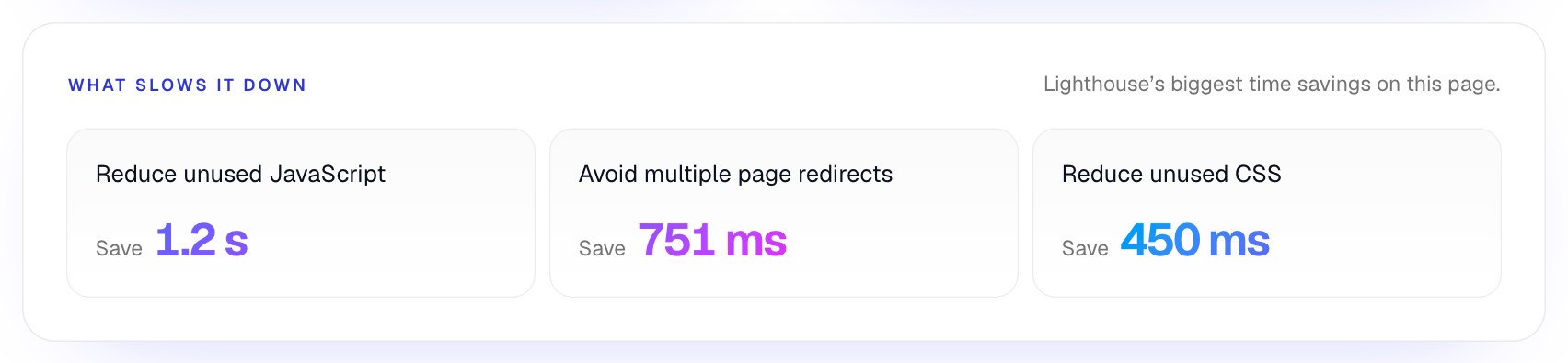
Unused JavaScript, unused CSS and more than one redirect before the page arrives are some of the most common speed findings in any website audit. The redirect is often the cheapest fix of all: link and advertise the final address, so visitors land on it directly.
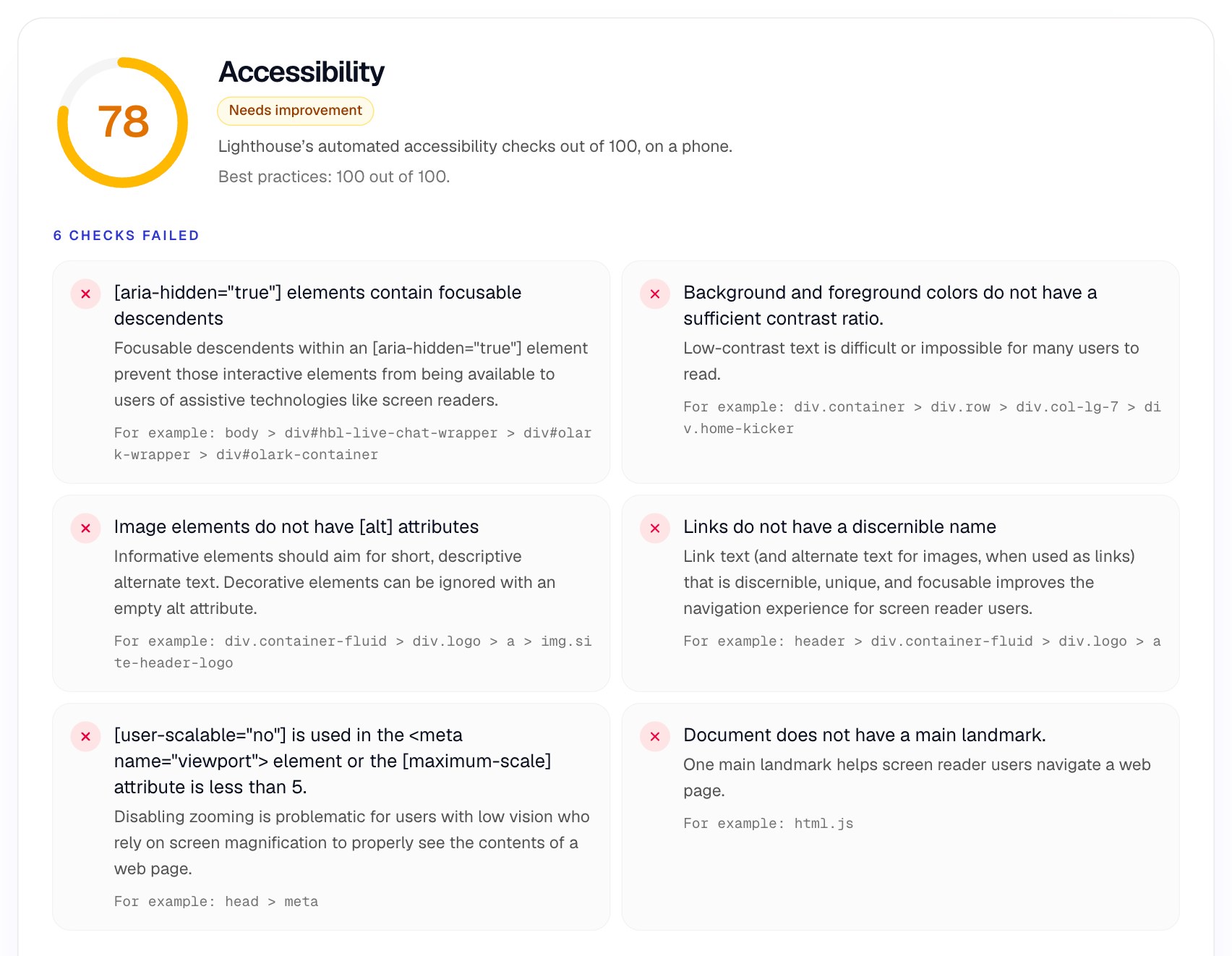
Accessibility: six failures a script could see. The page scored 78. The checks found that zoom was turned off in the page’s settings, which stops people with low vision enlarging the text; WCAG asks that text can be resized up to 200 percent. They also found low contrast text, a logo image with no alt attribute inside a link with no name, a chat widget that hides focusable controls from screen readers, and no main landmark to jump to. Every one is quick to fix. You can see how we would fix the contrast in our guide to bad color contrast examples.
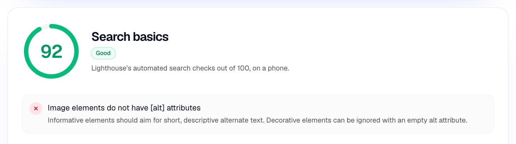
Search: good basics, one shared fix. The page passed every search basic except one, and that one was the same missing alt attribute the accessibility check flagged. Google’s own SEO starter guide describes alt text as “a short, but descriptive piece of text,” so one small change helps both screen reader users and search. Overlaps like this are common, which is another reason to audit all six areas together rather than in separate projects.
What the automated part could not tell us. A score of 92 for search basics does not mean the page answers what people searched for, and a score of 78 for accessibility says nothing about whether the page makes sense with a keyboard. When a person audited the same home page by hand, as described in our guide to UX audits, the biggest problem was one no score could show: most visitors from search were looking for a restaurant’s menu, and the first screen spoke only to restaurant owners. That is step 4 of the audit, and it is why the steps above do not stop at the tools.
The website audit checklist
Run these 42 checks on each page and journey you chose, seven in each of the six areas. Skip any that do not apply, and write down any problem the list does not cover.
Search
- The page is indexed: check it in Search Console, not by searching for it.
- Each page has its own title and description, with the words people search for.
- Each page has one clear main heading that matches its title.
- Important pages are linked from other pages, so Google and people can reach them.
- Links say where they go, with no “click here” or empty image links.
- Images that carry meaning have alt text.
- Old addresses redirect once, straight to the new page, with no chains.
Speed
- The main content appears within 2.5 seconds for three in four real visits.
- The page responds to a tap within 200 milliseconds.
- The layout shift stays at 0.1 or less; images and embeds keep their space.
- Images are sized for the screen and in a modern format.
- No large scripts or styles load that the page does not use.
- Ads, links and email campaigns point to the final address, with no redirects.
- Chat widgets and tags load after the main content, not before it.
Accessibility
- Text has at least 4.5:1 contrast, or 3:1 for large text and icons.
- Zoom is allowed, and the page works at 200% and at 320 pixels wide.
- Everything works with a keyboard, and the focus is always visible.
- Every link and button has a name a screen reader can announce.
- Every form field has a visible label.
- The page has a language set, headings in order and a main landmark.
- Nothing hidden from screen readers can still take keyboard focus.
Usability
- Within five seconds, the first screen says what this is and who it is for.
- There is one obvious next step, and its label says what happens.
- The page matches the search or ad that brought people there.
- Things that look tappable are tappable, and nothing tappable looks like plain text.
- Forms ask only for what is needed and explain errors next to the field.
- A mistake never wipes what the person already typed.
- Floating buttons, banners and pop-ups never cover the content or the next step.
Content and trust
- Prices, or how pricing works, are easy to find before people commit.
- Reviews, examples or customer names sit next to the decision they support.
- Contact details or help are easy to find on every page.
- The words are the customer’s, not internal jargon or product names.
- Nothing is out of date: prices, dates, team, opening hours, offers.
- Every page answers the questions people ask before they buy.
- The privacy policy and terms are linked and current.
Tracking and security
- Every page loads over HTTPS, with no mixed content warnings.
- Analytics records each goal once, with the right source and campaign.
- Your own team’s visits and test sign-ups are excluded from reports.
- The consent banner does what it says, and tags respect the choice.
- Search Console is connected and shows no unresolved errors.
- Broken pages return a real “not found” page with a way forward.
- Forms are protected from spam without blocking real people.
If you have audited a page before, the search and speed groups will feel familiar. The usability and content groups are the ones most likely to change your results, because they cover the moments when an interested visitor decides whether to carry on.
How to read real-visitor speed in an audit
Judge speed at the 75th percentile of real visits, separately for phones and computers, against Google’s three Core Web Vitals: loading, responsiveness and layout stability.
Google’s Web Vitals guidance says a good threshold to measure is the 75th percentile of page loads. In plain words, three in four visits should be at least this fast. Averages hide the slow visits, and the slow visits are the ones that leave. Google also says that “Core Web Vitals are used by our ranking systems,” in its explanation of page experience, although it stresses that no single signal decides a ranking.
-
Loading (LCP)3.4 s for real visitors
-
Responsiveness (INP)469 ms for real visitors
-
Stability (CLS)0.22 for real visitors
Two cautions when you write this up. Real-visitor data only exists for pages and websites with enough Chrome traffic; when a page has too little, tools fall back to the whole website, and you should say so. And a missing figure is not a good figure. It only means there was not enough data to report.
A website audit template for your findings
Record every finding with the same fields: the page, the area, what is wrong, how it is known, the fix, the severity and the effort. A spreadsheet with these columns is enough.
Here is the template, filled in with three findings from the Happy Menu check above. The severity and effort are our judgment, as they will be for your own list.
| Finding | How it is known | Fix | Severity and effort |
|---|---|---|---|
| Zoom is turned off on the home page | Measured: the viewport setting blocks zooming | Remove user-scalable=no and any maximum-scale below 5 from the viewport tag. | High Low effort |
| Main content takes 3.4 s for real phone visitors | Measured: Chrome UX Report, 28 days | Remove the redirect chain, then trim unused JavaScript and CSS. | Medium More effort |
| Logo link has no name | Measured: image with no alt attribute | Give the logo image the alt text “Happy Menu home”. | Low Low effort |
Add two more columns when you can: a screenshot with the problem marked, and the steps to see it again. A finding nobody can reproduce is a finding nobody fixes. If your team uses a tracker such as Jira or Linear, turn each row into a ticket with the evidence attached, then sort the list so high severity, low effort findings come first.
Website audit tools, and what each one misses
Free tools cover most of the evidence: Search Console for search, PageSpeed Insights for speed, Lighthouse for automated accessibility, and Analytics and Clarity for behavior. None of them uses the page the way a customer does.
- Google Search Console shows which pages are indexed, which searches bring people in and which errors Google found. It cannot tell you whether the page answers those searches.
- PageSpeed Insights shows real-visitor speed and a Lighthouse lab test. It measures one page load, not a whole journey.
- Lighthouse accessibility checks find missing names, labels and contrast failures. They cannot judge whether labels make sense or whether the page works with a keyboard.
- Google Analytics 4 shows where people leave and from which devices. It shows that people left, not why.
- Microsoft Clarity shows session recordings, rage clicks and dead clicks. It shows what happened, and someone still has to work out the fix.
- Site crawlers find broken links, redirect chains and missing titles across the whole website. They read code; they do not use the page.
The slow part of a website audit is step 4: using every page, checking every principle and writing up each finding with its evidence. That is what UX Robot’s page audits take on. Your own AI agent opens the page in a browser, taps, scrolls and presses Tab through it like a visitor, checks it against all 55 WCAG 2.2 level A and AA criteria, 50 usability checks and 41 search checks, and writes up every problem with a marked screenshot and the fix. The free plan includes five page audits a month, Pro makes page audits unlimited, and Enterprise audits whole journeys with your analytics, Search Console and Clarity data, sends issues to your tracker and rechecks them after you ship. See the plans.
Common website audit mistakes
- Treating a search audit as a website audit. A clean crawl report can sit on top of a page that loses most of its visitors.
- Chasing a score. A Lighthouse score of 100 means the automated checks passed. It does not mean the page is fast for real visitors or usable by everyone.
- Auditing on a fast computer only. On Happy Menu, every Chrome visit in the period came from a phone. Start where your visitors are.
- Auditing every page equally. Start with the pages that bring in customers and the journeys that make money.
- A long list with no order. Without severity and effort, the team fixes cosmetic issues and the costly ones stay.
- Stopping at the report. An audit is finished when the fixes are live and checked again on the real website.
Website audit questions people ask
How long does a website audit take?
The automated part takes minutes per page. Using each page as a customer would and writing up the findings takes much longer: a few hours for a small website and a key journey, and days for a large one. Narrowing the audit to the pages and journeys that matter most is the best way to keep it short.
How often should I audit my website?
Check speed and the automated accessibility and search basics every month, and after every significant release. Do a full audit of your main journeys whenever a key number such as sign-ups or sales drops, and before you increase ad spend.
What is the difference between a website audit and an SEO audit?
An SEO audit checks whether search engines can find, read and rank your pages. A website audit includes that and also checks speed, accessibility, usability, content and tracking, which decide what happens after people arrive.
Do I need a sitemap to pass a website audit?
Not always. Google says it “primarily finds pages through links from other pages it already crawled,” and that a sitemap is helpful but not required. Its sitemap guidance suggests small, well-linked websites of about 500 pages or fewer may not need one. Larger websites, and new ones with few links, benefit from one.
Can a free tool do a complete website audit?
Free tools do the automated part well, and you can do the rest yourself with this checklist. What they cannot do is use the page: the best automated accessibility tool in the UK government’s test found 40% of known barriers. The rest needs a person, or an AI agent, working through the page.
Sources
- The WebAIM Million, WebAIM, 2026: accessibility failures on the top million home pages.
- Accessibility tools audit results, Government Digital Service accessibility team, updated 2018.
- Web Vitals, Google, web.dev.
- Understanding page experience in Google Search results, Google Search Central.
- SEO Starter Guide, Google Search Central.
- What is a sitemap, Google Search Central.
- Understanding Success Criterion 1.4.4: Resize Text, W3C, 2026.
- UX Robot’s free check of happymenu.co on a phone, 6 November 2026, with Chrome UX Report data from 7 October to 3 November 2026, published with the owner’s permission.