You pay for the click. What happens next is up to your page. A good landing page experience means the person who tapped your ad lands on a page that gives them what the ad promised, loads quickly, works on their phone and makes the next step obvious. Google rates it for every keyword, and a poor rating quietly makes every click cost more than it should.
This guide explains what Google means by landing page experience, which attributes describe a good one, how to find your rating in Google Ads and how to improve a below average rating step by step. It finishes with a checklist you can run on any page you send ad traffic to, and it uses a real UX Robot audit to show what the problems look like on a real website.
In short
- Landing page experience is how relevant and useful your page is to the people who click your ad. It is one of the three parts of Quality Score.
- The attributes Google describes are relevant and useful content, a page that keeps the ad’s promise, clear and honest information, and easy navigation.
- Speed and phone usability are part of the experience: Google tells advertisers to make pages mobile friendly and quick to load.
- Your rating is shown per keyword as Above average, Average or Below average, in the Landing Page Exp. column.
- Fix the gap between what people searched for and what the first screen says before you touch anything else.
What is landing page experience in Google Ads?
Landing page experience is Google’s measure of how relevant and useful your landing page is to people who click your ad. It is one of three components of Quality Score, alongside expected clickthrough rate and ad relevance, and Google rates it for each keyword as Above average, Average or Below average.
Google’s own help pages define it in one line: “How relevant and useful your landing page is to people who click your ad.” The landing page itself is simply the page people reach after the click, usually your ad’s final URL.
Quality Score is reported on a scale from 1 to 10 for each keyword, and it combines three things: how likely your ad is to be clicked, how closely the ad matches the intent behind the search, and how well the page delivers after the click. Google is clear that Quality Score is not an input in the ad auction; it is a diagnostic tool that shows how your ads and pages affect the experience of the people who see them. Treat it as an early warning. A page that disappoints people is a page that wastes budget, whatever the score says.
Which attributes describe a good landing page experience?
A good landing page experience is relevant, useful and easy to navigate. The page offers content that matches what the person searched for and what the ad promised, gives clear and honest information such as prices, works well on a phone and loads quickly, so people can find the offer from the ad and act on it.
If you arrived here from a Google Ads certification question, that is the idea the question is testing. Google describes the experience through four factors: “the usefulness and relevance of information provided on the page”, the ease of navigation, the number of links on the page, and the expectations people have from the ad they clicked. Its older advertiser guidelines group the same ideas under three headings: relevant and original content, transparency, and site navigability. Here is what each attribute means for a real page.
| Attribute | What it means | How to check it |
|---|---|---|
| Relevant | The page is about exactly what the person searched for and the ad offered. | Read your top search terms, then read your first screen. Does it answer them? |
| Useful and original | The page has real information people need to decide, not a page of links or more ads. | List the three questions a buyer asks. Are the answers on the page? |
| Keeps the ad’s promise | The offer, price or call to action in the ad is on the page and works. | Click your own ad and look for the exact offer within a few seconds. |
| Transparent and trustworthy | Pricing is clear, the business is identifiable and personal details are only asked for when needed. | Can a stranger tell who you are, what it costs and what happens next? |
| Easy to navigate | People can find the offer and move through the page without pop-ups or dead ends getting in the way. | Try the page on a phone with one thumb. Count the taps to the main action. |
| Fast and mobile friendly | The main content appears quickly and the page fits and works on a small screen. | Check real-visitor speed and test the page at 320 pixels wide. |
Notice what is not on the list: clever design, video backgrounds or a particular color of button. Google’s guidance is about whether the page serves the person who clicked. As its advice to advertisers puts it, the word-for-word phrase from a search term does not need to be on your page; what matters is that the page delivers what the person is looking for.
How to see your landing page experience rating in Google Ads
Google shows the rating for each keyword in a Search campaign, not for the page as a whole. To find it:
- Open KeywordsIn Google Ads, go to Keywords within the Campaigns menu.
- Choose the columns iconIt sits in the upper right corner of the keywords table.
- Add the Quality Score columnsFrom the Quality score section, add Quality Score and Landing Page Exp. Expected CTR and Ad Relevance are worth adding too.
- Sort by spendStart with the keywords that cost the most and read their landing page rating first.
- Group keywords by final URLWhen several keywords share a page and all show Below average, the page is the problem, not the keywords.
Each component gets one of three statuses. Above average means the page is doing its job for that keyword. Average and Below average are Google’s way of pointing at an opportunity, and Below average on a keyword you spend heavily on is the one to fix first. If the Quality Score column shows a dash, Google says there are not yet enough searches that exactly match the keyword to rate it.
One more thing Google points out: your conversion rate does not change your landing page status, but it is a good proxy for it. If a page converts far worse than your other pages for similar clicks, treat that as the same warning.
What a poor landing page experience looks like on a real website
Problems with landing page experience are easier to recognize once you have seen a few. Here are three from a UX Robot audit of the Happy Menu home page, a restaurant discovery app, published with its owner’s permission. The audit ran on a phone in October 2026 and combined the page with the website’s own Search Console data. The visitors here came from Google search rather than ads, but the test is exactly the same: did the page give people what they came for?
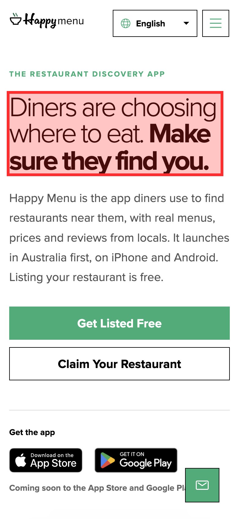
The page answered a different question. Search Console showed that people mostly arrived looking for a particular restaurant’s menu, such as a search for one restaurant’s menu with six impressions and no clicks. The first screen offered restaurant owners a free listing and had no way to find a restaurant or its menu. Nothing was broken, and the page did a good job for owners. It simply did not match the people arriving. A gap like this is easy to miss, because you cannot see it by looking at the page alone; you need the search terms or the ad beside it.
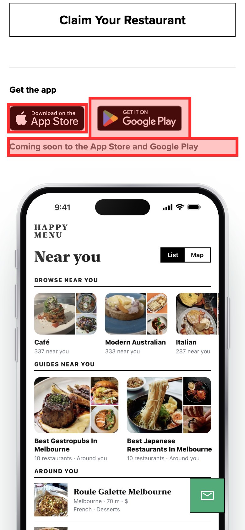
Things that look like actions must act. Tapping the App Store and Google Play badges did nothing, because the app had not launched. People have tapped those badges on thousands of websites, so a badge that does nothing feels broken. In ad terms, this is a page that shows an offer people cannot take up.
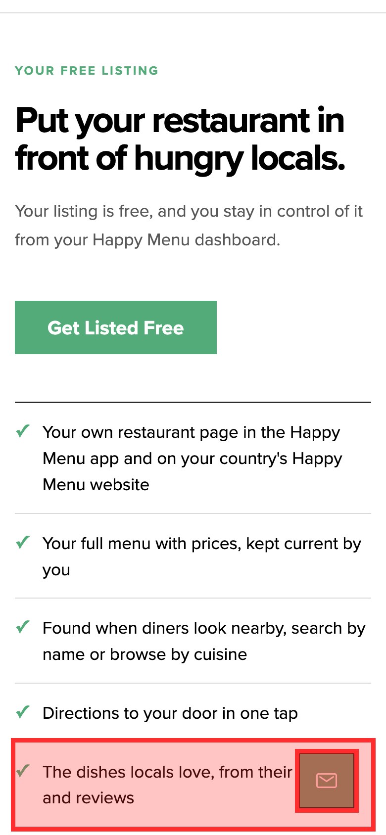
Small things get in the way on a phone. The chat button sat over the bottom right of the screen and covered text as people scrolled. On the same page, a viewport setting stopped people from zooming in, which makes text impossible to enlarge for anyone who needs it. Each problem is small, but they add up to a page that is harder to use on the device most people are holding.
The same audit also recorded what worked: the headline and the Get Listed Free button made the main step clear for owners, the page answered an owner’s questions about cost and claiming a listing, and it painted its main content in 0.9 seconds on the test connection. A good audit says what to keep, not only what to fix. You can read how to do a UX audit for the full method behind it.
How to improve a below average landing page experience
To improve a below average landing page experience, send each ad group to the page that matches its searches, repeat the ad’s offer and call to action on the first screen, make the page easy to use on a phone, speed it up and make prices and next steps clear. Then watch the rating and the conversion rate for a few weeks.
Work through these in order. The first ones cost the least and usually make the biggest difference.
1. Match the page to the search, not the other way round
Open the search terms report for the ad group and read the top twenty searches. Then open the landing page on your phone and look only at the first screen. If someone searches for flannel shirts, Google’s own example, they should land on your flannel shirts, not your home page or a general clothing category. Where one page serves several very different searches, split the ad group and give each its own page, or send it to an existing page that fits better. Even if you cannot change the website, you can usually choose a better existing page.
2. Keep the promise your ad made
Put the ad and the page side by side. The headline of the page should echo the headline of the ad, and the offer should be there in the same words: the same price, the same discount, the same free trial, the same delivery promise. If the ad says “Book a free consultation”, the button on the page should say that too, not “Learn more”. People decide in seconds whether they are in the right place, and a mismatch reads as bait and switch even when it is an accident.
3. Make the next step obvious
Give the page one main action and make it the most visible thing on the first screen. Remove links that lead away from the offer, since Google counts the number of links as part of the experience. Make sure every element that looks like a button is one, and that every button says what it does. Ask only for the details you need in a form, and say why for anything personal.
4. Be clear and honest
Show the price, or at least how pricing works, before people have to commit. Say who you are, how to contact you and what happens after they press the button. Put reviews, guarantees and returns next to the decision they support. Google’s guidelines say pages should deliver what the ad promised and that pricing should be clear, and its ad policies reject destinations that are unnecessarily difficult or frustrating to navigate.
5. Design for the phone first
Google notes that ease of navigation matters even more on mobile websites. Test the page on a real phone. Check that text is readable without zooming, that people can zoom if they want to, that buttons are large enough to tap, that nothing scrolls sideways and that no cookie banner, pop-up or chat button covers the offer. Check the page at 320 pixels wide, the narrowest common phone screen, as part of the accessibility guidance on reflow.
6. Speed it up
Google’s advice is blunt: the speed of your page can be the difference between someone bouncing or buying. The next section shows the thresholds to aim for and how to measure them.
7. Measure, then give it time
Note the rating and conversion rate for each keyword before you change anything. Give a change a few weeks before you judge it, and change one page at a time so you know what worked. If you have Google Analytics, compare engagement and conversions on the page before and after.
How fast a landing page needs to be
For a good experience, Google’s guidance is that the main content should appear within 2.5 seconds, the page should respond to a tap within 200 milliseconds and the layout should barely move as it loads, measured for 75% of real visits.
These three measures are Google’s Core Web Vitals. They come from real visitors using Chrome, which matters for ads: your own fast laptop on office Wi-Fi rarely matches a customer on a phone and a mobile connection, who is exactly the person your ad reached.
-
Loading (LCP)Main content appears
-
Responsiveness (INP)Reply to a tap or click
-
Stability (CLS)How much the layout moves
The usual causes of a slow landing page are a large hero image or video, too many tracking and chat scripts, web fonts that block the text, and pop-ups that load late and push the content down. Start with the image that forms the main content: serve it at the size the screen needs, in a modern format, and do not lazy-load it. Then remove scripts the page does not need. Every tag added for a campaign is a small cost every visitor pays.
The landing page experience checklist
Run this on every page you send paid traffic to, on a phone first. If a check fails, note it with a screenshot and fix the ones in the first group before anything else.
Relevance and the ad’s promise
- The first screen answers the top searches in the ad group.
- The page headline echoes the ad headline.
- The offer, price or discount in the ad appears on the page in the same words.
- The main button repeats the ad’s call to action.
- Each ad group goes to the most specific page that fits, not the home page.
Usefulness and trust
- The page answers the three questions a buyer asks before acting.
- Pricing, or how pricing works, is clear before people commit.
- The business is identifiable, with contact details or help in reach.
- Reviews, guarantees and returns sit next to the decision they support.
- People know what happens after they press the button.
Navigation and action
- There is one main action, visible on the first screen.
- Links that lead away from the offer are kept to a minimum.
- Everything that looks like a button works, and says what it does.
- Forms ask only for what is needed, with visible labels.
- No pop-up, banner or chat button covers the offer.
Phone, speed and access
- The main content appears within 2.5 seconds for most real visitors.
- The page responds to a tap within 200 milliseconds.
- Nothing jumps as the page loads.
- The page fits a 320 pixel wide screen and people can zoom in.
- Text has enough contrast to read, and buttons are easy to tap.
Common landing page experience mistakes
- Sending every ad to the home page. A home page has to serve everyone, so it rarely serves the person who searched for something specific.
- Repeating the keyword everywhere. Stuffing the search term into the page does not make it more relevant. Google says the exact phrase does not need to be there; the answer does.
- Testing only on a computer. Check the device report in Google Ads first. Phones are where layouts break and fixed bars cover content, and many accounts get a large share of their clicks there.
- Hiding the price. People who cannot find what something costs leave to find a page that tells them.
- Judging one week of data. Ratings and conversion rates move slowly. Change one thing, then wait.
- Forgetting accessibility. In the 2026 WebAIM Million, low contrast text was found on 83.9% of home pages. Text people cannot read is an experience problem for everyone, not only for people with low vision.
Checking all of this by hand for every landing page takes time, which is why it often gets skipped until the budget is spent. UX Robot’s page audits do the walking for you: your own AI agent checks a page for usability and WCAG 2.2, marks each problem on a screenshot, writes the steps to see it and the fix, and says whether each finding was measured or judged. The free plan covers five page audits a month, Pro removes the limit, and Enterprise audits whole journeys with your analytics, Search Console and Clarity data, sends issues to your tracker and rechecks them after you ship. See the plans.
Landing page experience questions people ask
Which attribute describes a good landing page experience?
Relevance and usefulness. Google describes a good landing page experience as a page whose information is useful and relevant to the people who clicked, that meets the expectations set by the ad and that is easy to navigate. Clear pricing, a fast load and a page that works on a phone all support it.
What does below average landing page experience mean?
It means Google expects people who click your ad for that keyword to find the page less relevant or useful than pages for similar searches. It does not mean the page is broken. Start by comparing the keyword’s search terms with the page’s first screen.
Does landing page speed affect Quality Score?
Google lists improving loading speed among its recommendations for a below average or average landing page experience, and says speed can decide whether someone leaves or buys. Aim for the Core Web Vitals thresholds above.
Does my conversion rate affect landing page experience?
Not directly. Google says conversion rate does not change your landing page status, but it is a good way to measure and improve the experience, because a page that serves people well usually converts better.
How long does it take for the rating to change?
Give a change a few weeks, and enough clicks, before you judge it. A busy keyword shows a difference sooner than a quiet one, and changing one page at a time tells you what worked.
Do I need a separate landing page for every keyword?
No. You need a page that fits each group of closely related searches. Group keywords by what the person wants, and give each group the most specific page that answers it.
Sources
- About Quality Score for Search campaigns, Google Ads Help.
- 5 ways to use Quality Score to improve your performance, Google Ads Help.
- Landing page, Google Ads Help.
- Use of online advertising to get new users to the site, Google AdSense Help: relevant and original content, transparency and site navigability.
- Destination requirements, Advertising Policies Help.
- Web Vitals, Google, web.dev.
- The WebAIM Million, WebAIM, 2026.
- Understanding reflow, W3C.
- UX Robot audit of happymenu.co on a phone, October 2026, published with the owner’s permission.