Light gray text that looks elegant in a design file. A brand green that is lovely on a logo and hard to read on a button. A form whose fields almost vanish into the page. These are the bad color contrast examples we find again and again, and every one of them makes a website harder to use for real people.
This guide shows the most common ones side by side with their fixes, each with the contrast ratio it measures and the minimum it needs. Several come from a real UX Robot audit of the Happy Menu website, published with its owner’s permission, so you can see what poor color contrast looks like on a live page and how it was measured. You will also learn how to check your own pages in a few minutes and how to fix contrast without giving up your brand.
In short
- Contrast is a number, not a matter of taste: the ratio between two colors’ brightness, from 1:1 to 21:1.
- Body text needs at least 4.5:1 against its background, large text 3:1, and the edges of buttons, fields, icons and focus outlines 3:1.
- Low contrast text is the most common accessibility failure on the web, found on 83.9% of the top million home pages in 2026.
- The usual culprits are light gray text, bright brand colors used for small text or button labels, faint field borders, links shown only by color and weak focus outlines.
- You rarely need a new brand. A darker shade of the same color for text, and dark text on bright backgrounds, fixes most problems.
What counts as bad color contrast?
Color contrast is bad when text, or a part of the interface people need to see, is too close in brightness to the color behind it. Under WCAG 2.2 at level AA, normal text needs a contrast ratio of at least 4.5:1, large text at least 3:1, and buttons, form fields, icons and focus outlines at least 3:1 against the colors next to them. Anything below that is poor color contrast.
The contrast ratio compares how light two colors are, not which hues they are. Black on white is the maximum, 21:1. The same color on itself is 1:1. Because it is about lightness, two colors can look completely different, such as red and green, and still have almost no contrast between them. That is also why a color that feels bold and saturated, like a bright orange or a fresh green, often fails when you put white text on it.
The W3C’s explanation of the minimum contrast rule sets out what “large” means: 18 point text, or 14 point bold, which it puts at about 24 pixels, or about 18.5 pixels bold, on a web page. A separate rule for non-text contrast covers what people need to see to use the page: the edge of a form field, an icon that is the only label on a button, a checkbox, a chart line and the outline that shows where the keyboard is.
| Element | Minimum ratio | Examples |
|---|---|---|
| Normal text | 4.5:1 | Body copy, labels, links, button text under about 24 pixels (18.5 pixels bold), hint text inside fields that people need to read. |
| Large text | 3:1 | Headlines and button labels of at least 24 pixels, or about 18.5 pixels bold. |
| Interface parts | 3:1 | Field borders, checkboxes, toggles, icon-only buttons and the keyboard focus outline, against the colors next to them. |
| Charts and graphics | 3:1 | Lines, bars and map areas that people need to understand the information. |
| No requirement | None | Logos and brand names, disabled controls, pure decoration and text that happens to appear in a photo. |
There is also a stricter level, AAA, which asks for 7:1 for normal text and 4.5:1 for large text. Most websites aim for AA, the level that most accessibility laws and contracts point to, and use AAA for long reading such as articles and documentation where they can.
Why poor color contrast costs you customers
Low contrast is the single most common accessibility problem on the web, and it is getting more common, not less. Every year WebAIM tests the home pages of the top million websites, and its 2026 report found:
The share of home pages with low contrast text had been slowly falling for years, then jumped back up in 2026:
Who struggles with it? The W3C wrote the rule for people with moderately low vision or weaker contrast perception, and it chose 4.5:1 to make up for the contrast loss that comes with vision of about 20/40, which it notes is typical at around age 80. People with color vision deficiency see some colors as closer together than you do, and the National Eye Institute notes that men have a much higher risk of it than women. Then there is everyone else: anyone reading a phone in sunlight, on a cheap screen turned down to save battery, or late at night with tired eyes.
For the business, the risk is easy to picture. Text that is hard to read is easy to skip. A button whose label you have to squint at asks more of people at the very moment you want them to act. A form field you cannot see is a form that is easier to get wrong. None of this shows up as an error in your analytics, which is why it so often goes unnoticed.
Nine bad color contrast examples and how to fix them
The most common bad color contrast examples are light gray body text, brand colors used for small text, white text on bright buttons, faint hint text in fields, field borders that almost disappear, links shown only by color, weak focus outlines, red and green as the only signal, and text placed over photos. Each one has a simple fix.
Here are six of them side by side with a fix. Every ratio is calculated with the WCAG formula; the bad pair is on the left and a passing pair on the right.
1. Light gray text on white
The classic. A mid gray such as #999999 looks calm and modern in a mockup, and measures 2.85:1 on white, far below the 4.5:1 that body text needs. It turns up in captions, dates, footers, small print and the “secondary” text in a design system. The fix is a darker gray: #767676 is about the lightest gray that passes on pure white, at 4.54:1, and #595959 gives a comfortable 7:1. If your design looks too heavy with darker gray, make the text smaller in weight or size rather than lighter in color.
2. A brand color used for small text
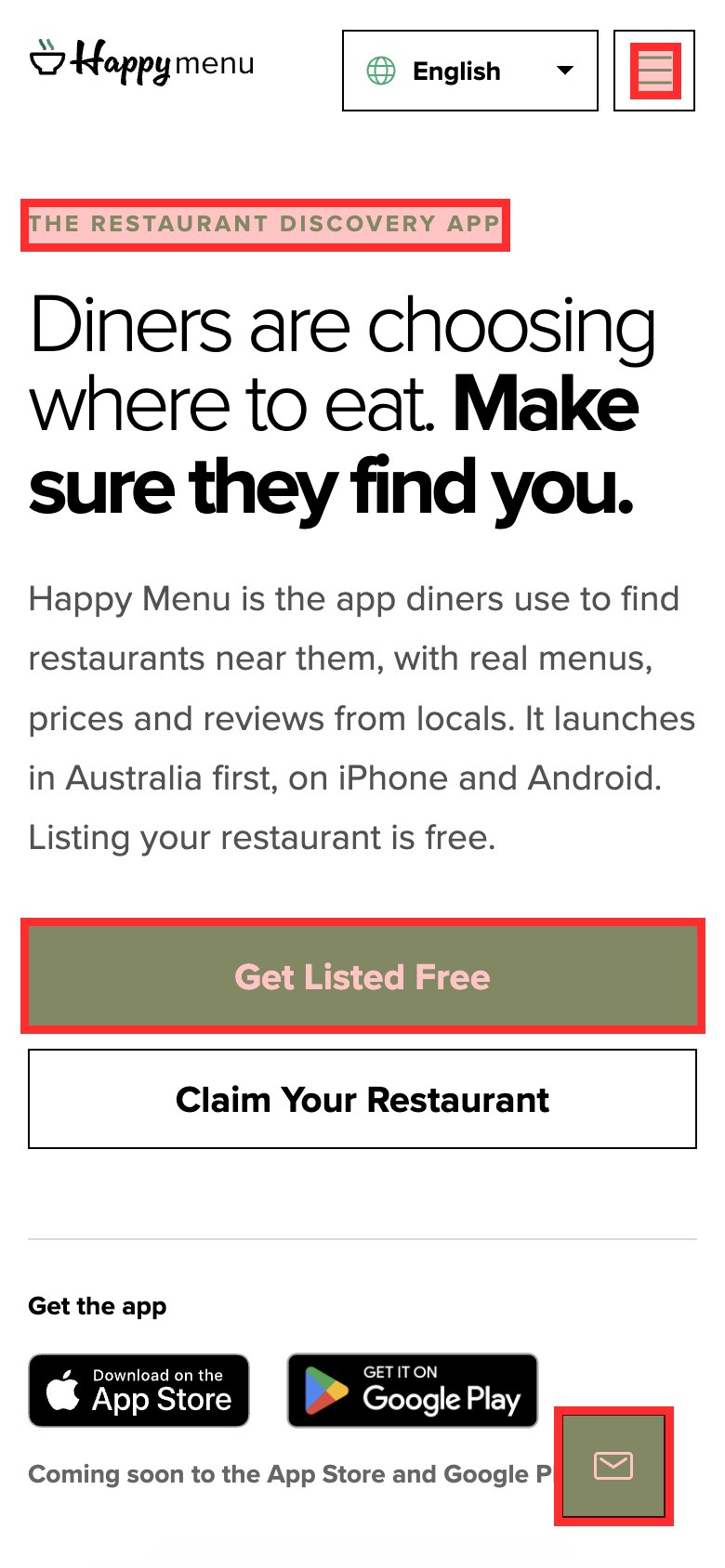
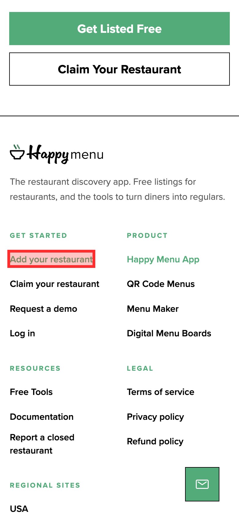
Brand colors are chosen for logos, which have no contrast requirement, and then spread to labels, links and small headings, which do. In UX Robot’s audit of the Happy Menu home page on a phone in October 2026, the brand green #00AF74 measured 2.84:1 on white. It was used for the small eyebrow label above the headline, the step numbers, the ticks in a list of benefits and the footer headings, all text that needs 4.5:1. The fix keeps the brand: use a darker shade of the same green, such as #007A50 at 5.39:1, for text, and keep the bright green for large shapes and illustrations.
3. White text on a bright button
The same green carried the main button, Get Listed Free, with white bold text at 20 pixels. Bold text that size counts as large, so it needs only 3:1, and it still fell short: the audit measured 2.84:1. Bright orange is another frequent offender: white on #FF9900 is only 2.14:1. There are two fixes. Darken the button until white text passes, or keep the bright color and switch the label to black or dark ink, which on that orange gives 9.81:1. Either way, check the hover and pressed colors too, since they often get lighter.
4. Faint hint text inside form fields
The example text inside an empty field, such as [email protected], is usually a very light gray like #AAAAAA, which measures 2.32:1. If people need to read it to fill in the field, it is text and needs 4.5:1; #767676 passes. Better still, put any instruction people need in a visible line above or below the field, because hint text disappears the moment they start typing.
5. Form fields whose borders vanish
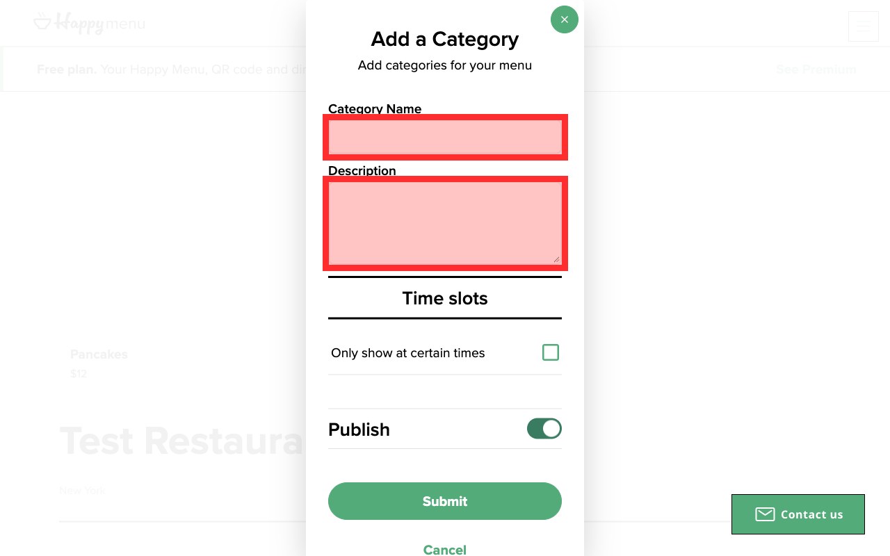
When the only thing that shows where a field is happens to be its border, that border needs 3:1. On Happy Menu’s menu editor, the screens restaurant owners use to build their menu, the Category Name and Description fields were drawn only by a 2 pixel #EEEEEE border on white: 1.16:1. On a bright screen the fields can look like empty space. A border of #8A8A8A gives 3.45:1, and a light fill inside the field makes it easier still to spot.
6. Links shown only by color
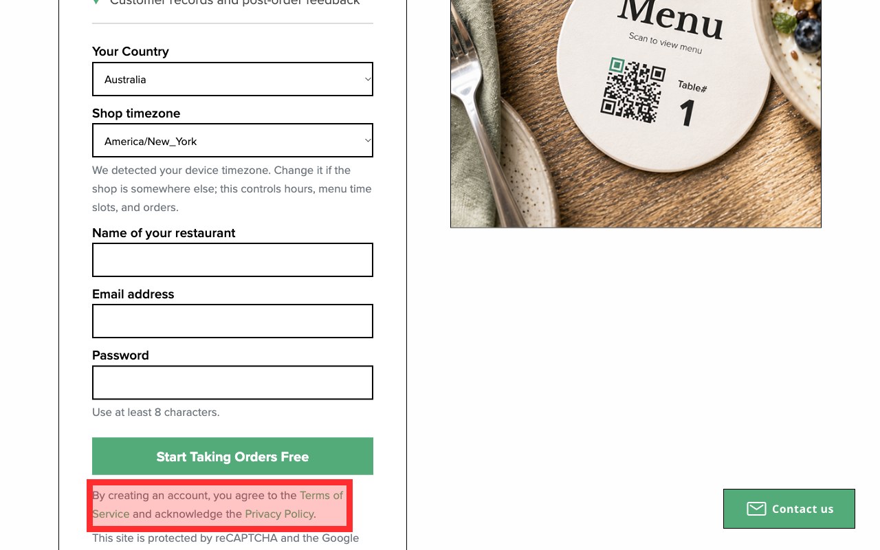
Under Happy Menu’s sign-up button, the line “By creating an account, you agree to the Terms of Service and acknowledge the Privacy Policy” showed both links in the brand green with no underline. The green measured 2.84:1 against the white page and only 1.65:1 against the gray sentence around it, so the links were hard to read and hard to tell apart from the text. The use of color rule says color must not be the only way information is shown. The simplest fix is the oldest one: underline links in text.
7. A focus outline nobody can see
People who use a keyboard, rather than a mouse or touch, rely on the focus outline to know where they are on the page. Many designs remove the browser’s outline and replace it with something subtler. On Happy Menu, a focused footer link got a green outline at 45% opacity, about 1.6:1 against white, and the language picker only a ring of about 1.3:1. Focused, the main Start Taking Orders Free button turned pale with a light blue ring of about 1.77:1. A focus outline needs 3:1 against the colors next to it. A solid 2 pixel outline in a dark color, with a little space between it and the element, works on almost any design.
8. Red and green as the only signal
Red for an error and green for success feels natural, but pure red and pure green are close in lightness, and people with the most common color vision deficiencies can find them hard to tell apart. Red text on a green background, for instance #FF0000 on #008000, measures just 1.28:1. Status badges, “in stock” labels, chart legends and form errors are the usual places. Keep the colors if you like them, but add a second signal: an icon, a word such as Error or In stock, or a pattern in a chart. Then make sure the text itself still meets 4.5:1.
9. Text over photos and gradients
White headlines over a hero photo pass where the photo is dark and fail where it is bright, such as a sky or a white shirt. Because the background changes from pixel to pixel, there is no single ratio, and the W3C lists text over a background image without enough contrast as a known failure. Measure against the lightest part of the photo behind the text. The usual fixes are a dark overlay on the photo, a solid panel behind the text, or moving the text off the photo. Remember the photo will crop differently on a phone, so check both.
How to check color contrast in ten minutes
Open the page in Chrome, run an accessibility check to list the low contrast text, then use a contrast checker on everything the automatic check cannot judge: text over images, field borders, icons, focus outlines, and hover and error states. Do it on a phone screen size as well as a computer.
- List the obvious failures automaticallyChrome’s developer tools, through Lighthouse or the Issues panel, list text that fails the contrast ratio.
- Check each failure in the color pickerInspect the element and open its text color. The picker shows the ratio and suggests a passing color.
- Test what the tools missText over photos and gradients, field borders, icons and charts need a manual check.
- Press Tab through the pageCan you always see where the keyboard is? Measure the focus outline against what is next to it.
- Check every stateHover, pressed, visited, error and success colors, and any dark mode.
- Look again on a phoneHeadlines wrap over different parts of a photo, and sticky bars sit over different content.
Google’s guide to finding and fixing low contrast text in Chrome walks through the developer tools step by step, including how to see your page as someone with a color vision deficiency would. For a single pair of colors, WebAIM’s contrast checker takes two color codes and tells you which levels they pass.
Automatic checks have limits worth knowing. They read the colors in the code, so they cannot see a photo behind the text, and they skip borders, icons and focus outlines. A page can score well and still have a sign-up form with invisible fields. That is where an audit earns its keep. UX Robot’s page audits go further than a score: your own AI agent checks the page for usability and WCAG 2.2, measures contrast on the screen as people see it, marks each problem on a screenshot, writes the steps to see it and the fix, and says whether each finding was measured or judged, which is how the Happy Menu examples above were found. The free plan covers five page audits a month, Pro removes the limit, and Enterprise audits whole journeys with your analytics, Search Console and Clarity data, sends issues to your tracker and rechecks them after you ship. See the plans.
How to fix poor color contrast without losing your brand
Give each brand color a darker shade for text and a role for large areas, pair bright backgrounds with dark text, and write the approved pairs into your design system so nobody has to guess. Most brands keep their look; what changes is where each color is allowed to go.
Contrast problems usually come from one decision repeated across hundreds of screens, so fix the decision rather than each screen:
- Split each brand color into roles. The bright version is for logos, illustrations, large shapes and backgrounds behind dark text. A darker version of the same hue is for text, links and button fills behind white text. Happy Menu’s green could stay #00AF74 on its logo and become #007A50 wherever it carries words.
- Choose the text color for each background, not the other way round. On bright yellows, oranges, light greens and sky blues, dark text nearly always passes and white nearly never does.
- Write down the approved pairs. A short table in your design system, listing each background with the text colors allowed on it and their ratios, stops new pages bringing the problem back.
- Give interface parts their own tokens. A border color for fields at 3:1 or more, a focus outline color that passes on every background you use, and error and success colors that pass as text.
- Check dark mode separately. Light gray on near black has the same problem as gray on white, and saturated brand colors often glow too brightly to read on dark backgrounds.
- Recheck after every redesign. Contrast drifts back when someone adds a new shade, a new banner or a new photo. Make it part of your release checks.
If you are planning a bigger change, our guide on how to do a UX audit shows where contrast fits among the other checks, and the guide to a good landing page experience covers the pages where unreadable buttons cost the most.
A color and contrast checklist
Use this on every page of a journey, from the first screen to the confirmation. It covers the color and contrast checks at WCAG 2.2 level AA that catch the most problems.
Text
- Body text, labels and links measure at least 4.5:1 against their background.
- Large text, at least 24 pixels or about 18.5 pixels bold, measures at least 3:1.
- Small print, captions, dates and footers meet the same 4.5:1 as everything else.
- Text people need inside empty fields measures 4.5:1, or the instruction sits outside the field.
- Text over photos and gradients passes against the lightest part behind it, on a phone too.
Buttons and links
- Button labels pass against the button color, including hover and pressed states.
- Links in text are underlined, or otherwise marked by more than color.
- Icon-only buttons, such as menu, close and chat, measure at least 3:1.
- Buttons without a fill have a border of at least 3:1.
Forms
- Field borders, checkboxes and toggles measure at least 3:1 against the page.
- Error messages pass as text, and say what is wrong in words, not only in red.
- Required fields are marked with a word or symbol, not only a color.
- The focused field is clearly different from the others.
Focus, status and charts
- The keyboard focus outline measures at least 3:1 on every background it appears on.
- Status labels such as in stock, paid or failed use a word or icon as well as a color.
- Chart lines and bars measure at least 3:1, with labels or patterns rather than color alone.
- Dark mode, if you have one, passes the same checks.
Color contrast questions people ask
What is a good color contrast ratio?
At least 4.5:1 for normal text and 3:1 for large text, buttons, field borders, icons and focus outlines meets WCAG 2.2 level AA. For long reading, aim higher: 7:1 for normal text meets level AAA and is easier on everyone’s eyes.
Do logos need to meet contrast requirements?
No. Text that is part of a logo or brand name has no contrast requirement. The problem starts when the logo’s colors are reused for labels, links and buttons, which do.
Do disabled buttons need good contrast?
WCAG does not set a contrast minimum for inactive controls. Be careful, though: a disabled button nobody can read leaves people wondering what they missed. Say near the button what still needs doing.
Is gray text on white always bad?
No, only light gray. On white, #767676 is about the lightest gray that reaches 4.5:1, and anything darker passes for normal text. Lighter grays can work for large headings at 3:1, but not for body copy.
Which colors are the hardest to get right?
Bright yellows, oranges, light greens and sky blues, because they are very light. They rarely pass with white text, so pair them with dark text or use a darker shade where they carry words. Red and green together are another pair to avoid as the only signal.
Will fixing contrast fix accessibility?
It fixes the most common problem, but not all of them. Keyboard access, labels, alternative text and zoom matter as much. Contrast is a good place to start because it is easy to measure and usually quick to fix.
Sources
- The WebAIM Million, WebAIM, 2026: low contrast text on the top million home pages, 2019 to 2026.
- Understanding Success Criterion 1.4.3: Contrast (Minimum), W3C.
- Understanding Success Criterion 1.4.11: Non-text Contrast, W3C.
- Understanding Success Criterion 1.4.1: Use of Color, W3C.
- Understanding Success Criterion 1.4.6: Contrast (Enhanced), W3C.
- Color blindness, National Eye Institute.
- Make your website more readable, Chrome for Developers.
- Contrast checker, WebAIM.
- UX Robot audits of happymenu.co on a phone and a computer, October 2026, published with the owner’s permission.