Most websites lose customers quietly. Nobody complains about a button that looks like a link, a price that appears one step too late or a form that forgets what you typed. They just leave. A UX audit is how you find those moments before they cost you another month of sales.
This guide walks through how to do a UX audit on a real website, step by step: what to look at, in what order, how to write up what you find and how to decide what to fix first. It ends with a 42-point UX audit checklist you can copy, and it uses a real audit, of the Happy Menu home page, as the example throughout.
In short
- A UX audit is an expert review of how well a website helps people reach their goal, backed by evidence rather than taste.
- Audit one journey at a time, from the first screen to the finish line, and do it on a phone first.
- Combine three kinds of evidence: what you can see in the interface, what you can measure, and what real visitors did.
- Every finding needs a screenshot, the steps to see it, why it matters, a fix and a severity.
- Fix the high impact, low effort problems first, then check again after every release.
What is a UX audit?
A UX audit is a structured review of a website or app that finds where people struggle to understand, decide or act, and recommends fixes. It checks the interface against proven usability principles, accessibility standards and speed measures, and uses analytics and session recordings to show which problems affect the most people.
You will also hear it called a UX review, a usability audit or a UX design audit. Whatever the name, a good one answers three questions for every screen in a journey: can people tell what this is and what to do next, can everyone use it, including people using a keyboard or a screen reader, and is anything slowing them down or making them doubt the next step?
It helps to be clear about what an audit is not. It is not usability testing, where you watch real people try your website; an audit is an expert review, so it predicts problems rather than proving how often they happen. It is not a full WCAG conformance audit either, which a specialist signs off criterion by criterion. And it is not a redesign. The output is a ranked list of specific problems with specific fixes, which your team can act on next week.
When a UX audit pays for itself
The problems an audit finds are common, which is exactly why they are worth looking for. Independent research puts numbers on how common:
Run an audit when the cost of not knowing is highest:
- Before you spend on ads. Paying for clicks that land on a confusing page is the most expensive way to learn about it.
- When a number drops. Sign-ups, checkouts or leads fall and nobody can say why. An audit turns a vague worry into a list of suspects.
- Before a redesign. Knowing what is actually broken stops you rebuilding the parts that work and keeping the parts that do not.
- After a big release. New features break old journeys. A quick audit of the main journey catches it before customers do.
- On a schedule. Websites change every week. Teams that audit their key journeys after every release fix problems while they are small.
How to do a UX audit, step by step
Here is the whole process at a glance. Each step is explained below, with what to look for and the mistakes to avoid.
- Choose one journey and write its user storyWho is the visitor, what do they want, and what counts as done?
- Gather the evidence you already haveAnalytics, search data, session recordings and support questions.
- Walk the journey as a customer, on a phone firstEvery screen, every tap, noting where you hesitate.
- Review each screen against usability principlesClarity, feedback, consistency, error prevention and trust.
- Test accessibilityContrast, keyboard, labels, focus, zoom and alternative text.
- Measure speed for real visitorsLoading, responsiveness and stability, from real-visitor data.
- Write up every finding with its evidenceA screenshot, the steps to see it, why it matters and a fix.
- Prioritize by impact and effortSo the team knows what to fix this week and what can wait.
- Fix, then check againConfirm each fix on the live website, and repeat after each release.
1. Choose one journey and write its user story
The most common mistake is auditing pages instead of journeys. Customers never experience your home page in isolation; they arrive with a goal and move through several screens to reach it. A page can look fine on its own and still fail the person halfway through the journey.
So start with a user story: As a [type of visitor], I want to [goal], so that [reason]. For an online store it might be “As a first-time shopper, I want to buy running shoes in my size, so that I have them for Saturday’s race.” Then decide where the journey starts (often the page your ads or search results send people to) and where it ends (the order confirmation, the booked call, the submitted form). Write both down. They keep the audit focused and stop it turning into a list of personal preferences.
2. Gather the evidence you already have
Before you look at a single screen, look at what visitors actually did. Your analytics show where people drop out of the journey and on which devices. Search Console shows what people searched for before they landed, which tells you what they expected to find. Session recordings and heatmaps, from a free tool such as Microsoft Clarity, show rage clicks, dead clicks and how far people scroll. Your support inbox shows the questions the website failed to answer.
You are not looking for answers yet, just leads: the step where half the visitors leave, the button people keep tapping that does nothing, the search that brings people who then bounce. Each lead tells you where to look hardest in the next steps.
3. Walk the journey as a customer, on a phone first
Now follow the user story yourself, from the starting page to the finish line, on a phone. For most websites, most visitors are on a phone, and that is where layouts break, buttons crowd together and sticky bars cover the content. Repeat the journey on a computer afterwards.
Go slowly and take a screenshot of every screen. Note each moment you hesitate, guess, scroll back, or wonder whether something worked. Those moments are your first findings. Stop before anything you cannot undo, such as paying, publishing or contacting someone, and use test details where a form needs them.
4. Review each screen against usability principles
Next, check every screen against well-tested usability principles. You do not need to memorize a list. Ask plain questions instead. Does the page say what it is and what to do next within a few seconds? Does every action show that it worked? Do things that look the same behave the same? Can people undo a mistake? Does the page prevent errors, or only complain about them afterwards? Is anything asking people to remember information from a previous screen?
Pay special attention to trust and reassurance near the moments of commitment: prices, totals, delivery dates, cancellation terms and what happens after you press the button. A missing answer at that moment is often the whole reason a journey fails.
5. Test accessibility
Accessibility problems lock some customers out completely and make the website harder for everyone else. Check the journey against WCAG 2.2 at level AA, the level most laws and contracts refer to. The checks that catch the most problems are quick:
- Contrast. Body text needs a contrast ratio of at least 4.5:1 against its background, and large text at least 3:1.
- Keyboard. Put the mouse away and press Tab through the journey. Can you reach and use everything, and can you always see where you are?
- Labels and names. Every form field needs a visible label, and every link and button needs words, not just an icon.
- Zoom and reflow. The page should work at 200% zoom and fit a 320 pixel wide screen without scrolling sideways.
- Images. Images that carry meaning need alternative text that says what they show.
6. Measure speed for real visitors
A slow page feels broken, and a page that jumps around as it loads makes people tap the wrong thing. Google measures this with three Core Web Vitals, judged at the 75th percentile of real visits: how fast the main content appears, how quickly the page responds to a tap, and how much the layout shifts. Use real-visitor data where you can, because a test on your own fast laptop and connection rarely matches what customers on a phone experience.
-
Loading (LCP)Main content appears
-
Responsiveness (INP)Reply to a tap or click
-
Stability (CLS)How much the layout moves
Google’s free PageSpeed Insights shows these figures for any public page with enough traffic, alongside a lab test that explains what is slowing it down.
7. Write up every finding with its evidence
A finding nobody can reproduce is a finding nobody fixes. For each problem, record the same six things:
- A screenshot of the exact screen, with the problem marked.
- How to see it: the steps that bring the problem back, such as “Open the page on a phone. Scroll to Get the app. Tap the App Store badge.”
- What happened and what should have happened.
- Why it matters to the customer and the business, in one or two sentences.
- How it is known: measured, such as a contrast ratio, or an expert’s judgment. Be honest about which.
- A fix specific enough to build, and a severity.
8. Prioritize by impact and effort
An audit with 80 equal findings gets ignored. Rank each finding by how much it hurts the journey and how many people it affects, then by how hard it is to fix. The prioritizing section below shows a simple severity scale and how to sort findings into what to fix first.
9. Fix, then check again
A finding is only finished when the fix is live and the problem is gone. Recheck each fixed issue on the live website, with the same steps you used to find it, before you mark it done. Then audit the journey again after each release, because new work has a habit of breaking old journeys.
A real UX audit, start to finish
To show what this looks like in practice, here is a UX Robot audit of the Happy Menu home page, a restaurant discovery app, published with its owner’s permission. The audit ran on a phone in October 2026 and combined the page itself with the website’s own Search Console data. It recorded 13 failed checks. Here are some of the most telling.
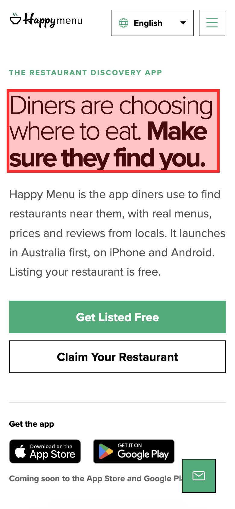
The page answered the wrong question. Search Console showed that eight of the page’s ten top searches were for a particular restaurant’s menu, yet the first screen spoke only to restaurant owners, with no way to find a restaurant or its menu. Nothing on the page was broken. It simply did not serve the people arriving. Only evidence from real searches reveals a problem like this; a review of the screen alone would have missed it.
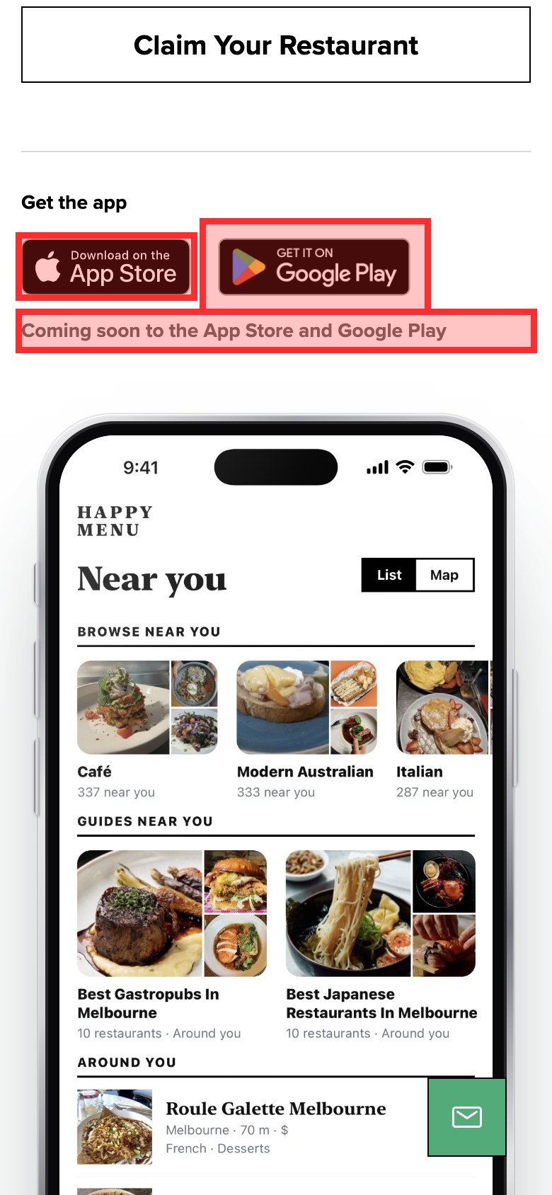
Things that look like buttons should be buttons. The App Store and Google Play badges were plain images, because the app had not launched yet. People have tapped those badges on thousands of websites, so they tap them here too, and nothing happens. The fix is small: link them to a waiting list, or show a notice that does not look like a store button.
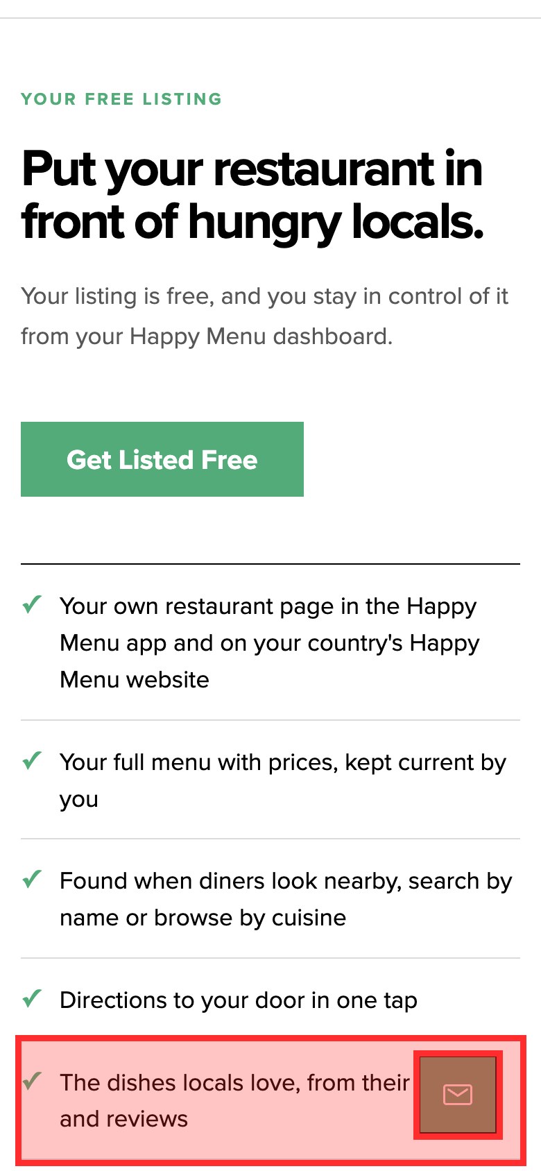
Accessibility problems hid in the brand colors. The brand green measured 2.84:1 against white, below the 4.5:1 that small text needs, and it was used for labels, step numbers and the white text on the main button. At 320 pixels wide, the language picker covered half the logo and the whole page scrolled sideways.
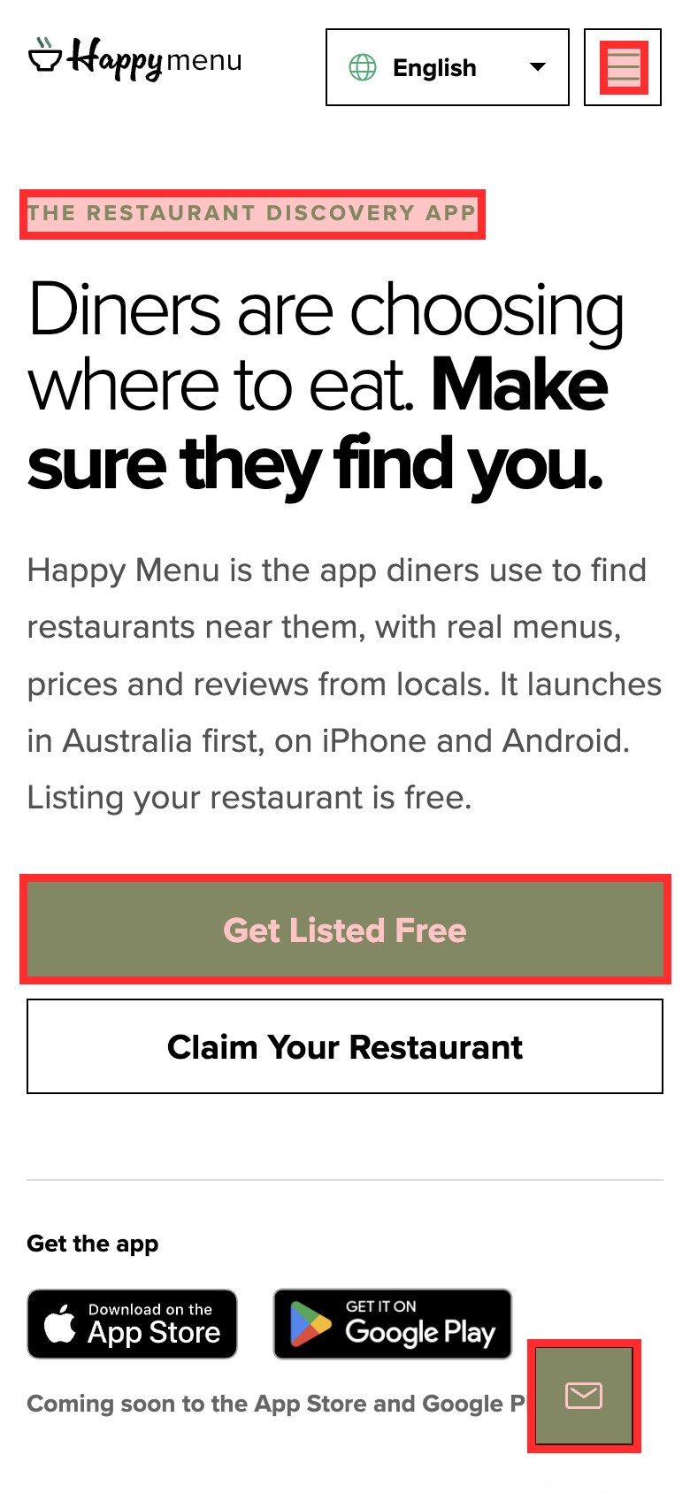
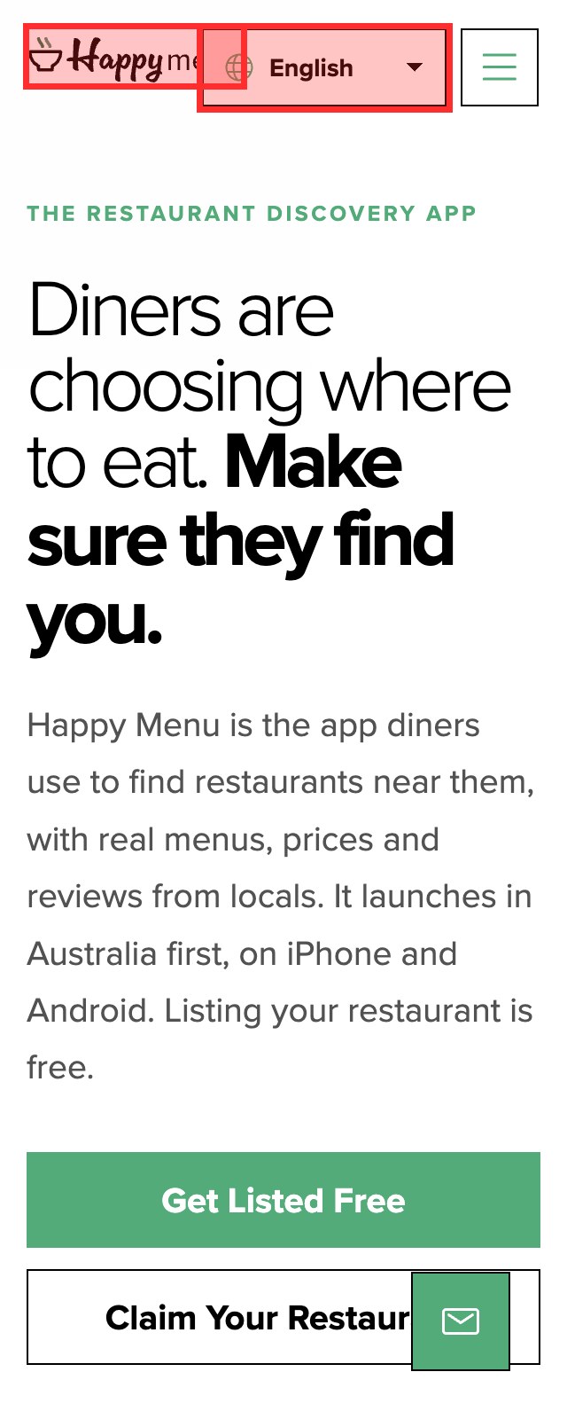
Every one of these findings came with its screenshot, the steps to see it, a fix and whether it was measured or a judgment, which is what turned the audit into a to-do list rather than a report that sits in a folder. You can read how UX Robot tests, or see a whole journey audited across three competitors.
The UX audit checklist
Use this checklist on every screen of the journey you chose. It is a starting point, not a script: if a check does not apply, skip it, and if you find a problem it does not cover, write it down anyway.
First impression and clarity
- Within five seconds, the page says what it offers and who it is for.
- The page matches what people searched for or the ad they clicked.
- There is one obvious next step, and it says what it does.
- Headlines and buttons use the customer’s words, not internal jargon.
- The most important information is not hidden behind tabs, carousels or accordions.
- Nothing that looks clickable is just decoration, and nothing clickable looks like plain text.
- Pop-ups and banners do not cover the content on arrival.
Navigation and finding things
- People can tell where they are and how to get back.
- Menu labels are specific, and the most common tasks are one tap away.
- Search finds products or pages by the words people actually use.
- Links say where they go; nothing relies on “click here”.
- Links that open a new tab or leave the website say so.
- Filters and sorting keep the person’s place and choices.
- Dead ends always offer a way forward, including error pages.
Forms and actions
- Every field has a visible label that stays visible while typing.
- Forms ask only for what is needed, and say why for anything personal.
- Errors appear next to the field, in plain words, saying how to fix them.
- A mistake never wipes what the person already typed.
- Buttons show that they are working and confirm when they are done.
- The right keyboard appears on a phone for email, number and phone fields.
- Tap targets are at least 24 by 24 pixels with space between them.
Trust and reassurance
- The full price, including fees and shipping, appears before the final step.
- Delivery dates, returns and cancellation terms are easy to find before committing.
- Contact details or help are visible when people hesitate.
- Reviews, guarantees and security signals sit next to the decision they support.
- Nothing in the journey surprises people with an extra step or charge.
- People know what happens after they press the final button.
- Confirmation pages and emails repeat what was agreed.
Accessibility (WCAG 2.2 AA)
- Text has at least 4.5:1 contrast, or 3:1 for large text and for icons.
- Everything works with a keyboard, in a sensible order, with no traps.
- The keyboard focus is always clearly visible.
- Every link and button has an accessible name.
- Meaningful images have alternative text; decorative ones are hidden from screen readers.
- The page works at 200% zoom and at 320 pixels wide without sideways scrolling.
- Color is never the only way information is shown.
Speed and stability
- The main content appears within 2.5 seconds for most real visitors.
- The page responds to a tap within 200 milliseconds.
- Nothing jumps as the page loads; images and ads keep their space.
- Images are sized for the screen and in a modern format.
- Fixed headers, chat buttons and banners never cover the content.
- The journey still works on a slow connection.
- Fonts load without hiding the text.
How to write up and prioritize findings
Give every finding a severity so the team can sort the list in seconds. Four levels are enough, and the classic approach from rating usability problems weighs three things: how often the problem happens, how badly it affects people, and whether they can work around it. Here is the scale, with how we would rate findings from the Happy Menu audit.
| Severity | What it means | Happy Menu example |
|---|---|---|
| Critical | Stops people finishing the journey, or locks some people out entirely. | None on this page. |
| High | Many people struggle or leave, and there is no easy way around it. | The first screen ignores what most searchers came for. |
| Medium | Slows people down or confuses them, but most get through. | Store badges that look tappable but do nothing. |
| Low | A small annoyance or polish problem. | A focus ring that is hard to see in the footer. |
Then sort each finding by impact and effort. High impact and low effort is where to start. Here is how we would sort six of the Happy Menu findings; the placement is our judgment, as it will be for your own list.
- Store badges that do nothing
- Zoom turned off
- A first screen for menu searchers
- Brand green contrast
- Logo link with no name
- Faint focus ring in the footer
- Nothing from this audit
Present the results as a short list, not a slide deck: the five things to fix first, each with its screenshot and fix, followed by everything else in order. If you use a tracker such as Jira or Linear, turn each finding into a ticket with the evidence attached, so nobody has to go back to the report to understand it.
UX audit tools that help
You can do a good audit with a phone, a notebook and a few free tools. These cover most of the evidence:
- Google Analytics 4 for where people drop out of the journey, by device and by source.
- Google Search Console for what people searched for before they arrived.
- Microsoft Clarity for free session recordings, heatmaps, rage clicks and dead clicks.
- PageSpeed Insights for real-visitor speed and a lab test that explains it.
- Your browser’s developer tools for contrast, the accessibility tree and how the page looks at any screen size.
The slow part is not the tools; it is walking every screen, checking every principle and writing up each finding with its evidence. That is the part UX Robot’s page audits take on: your own AI agent audits a page for usability and WCAG 2.2, marks each problem on a screenshot, writes the steps to see it and the fix, and says whether each finding was measured or judged. The free plan covers five pages a month, Pro removes the limit, and Enterprise audits whole journeys with your analytics, Search Console and Clarity data, sends issues to Jira or Linear and rechecks them after you ship. See the plans.
Common UX audit mistakes
- Auditing pages, not journeys. Customers experience a sequence of screens. Problems often live between pages: a promise on one that the next does not keep.
- Opinions without evidence. “The blue feels cold” starts an argument. “The button text measures 2.84:1 and needs 4.5:1” starts a fix.
- Only checking on a computer. Phones are where layouts break and most visitors are.
- A hundred findings with no order. Without severity and effort, the team fixes the easy cosmetic issues and the expensive problems stay.
- Calling it done when the report is delivered. An audit is done when the fixes are live and confirmed.
- Auditing once a year. Websites change weekly. Check the main journeys after every significant release.
UX audit questions people ask
How long does a UX audit take?
One journey of five to ten screens can easily take an experienced reviewer a day or two by hand, including the write-up. An AI agent can audit a page in a fraction of that time, which makes it practical to audit after every release instead of once a year.
How much does a UX audit cost?
It depends on how many journeys and screens are covered and who does it. You can audit a journey yourself for free with this guide and the free tools above. UX Robot’s free plan audits five pages a month with your own AI agent, Pro audits as many pages as you like, and Enterprise covers whole journeys.
What is the difference between a UX audit and usability testing?
A UX audit is an expert review that predicts where people will struggle. Usability testing watches real people try the website, which shows how often and how badly problems happen. They work best together: audit first to fix the obvious problems cheaply, then test with people to find the ones an expert cannot predict.
Is a UX audit the same as an accessibility audit?
No. A UX audit includes accessibility checks, but a formal accessibility audit tests every WCAG success criterion on every page, usually by a specialist with assistive technology, and results in a conformance statement. A UX audit uses the most important accessibility checks as part of a wider review.
Who should do a UX audit?
Someone who did not build the website, because the people who built it know where everything is and cannot see it fresh. That can be a UX specialist, a colleague from another team or an AI agent, as long as every finding is backed by evidence.
Sources
- The WebAIM Million, WebAIM, 2026: accessibility failures on the top million home pages.
- Cart abandonment rate statistics, Baymard Institute.
- Usability heuristics for user interface design, Nielsen Norman Group.
- Severity ratings for usability problems, Nielsen Norman Group.
- Web Content Accessibility Guidelines (WCAG) 2.2, W3C.
- Web Vitals, Google, web.dev.
- UX Robot audit of happymenu.co on a phone, October 2026, published with the owner’s permission.