If your business serves customers in the United States, sooner or later someone asks whether your website is ADA compliant. This ADA compliance checklist answers that in plain words: what the Americans with Disabilities Act asks of a website, which technical standard to aim for, and the checks that find most of the barriers real people run into.
Every point comes from a primary source, the Department of Justice, the W3C or WebAIM, fetched and quoted with its date. The examples come from real UX Robot audits of the Happy Menu website, published with its owner’s permission, so you can see what each problem looks like on a live page and how it was found. One note before we start: this guide explains the standards and how to test against them. It is not legal advice, and if you have received a demand letter or need a legal opinion, speak to a lawyer.
In short
- The ADA applies to the websites of businesses open to the public and of state and local governments, according to the Department of Justice.
- The ADA does not list website rules for businesses. The Department points to the Web Content Accessibility Guidelines (WCAG) as helpful guidance, and its rule for state and local governments sets WCAG 2.1 Level AA.
- Aim for WCAG 2.2 Level AA: content that meets 2.2 also meets 2.1 and 2.0, so you cover every standard in use.
- 95.9% of the top million home pages had automatically detected WCAG failures in 2026, and low contrast text alone was on 83.9% of them.
- Automated tools find only part of the problem. A full check needs a keyboard, a phone screen, zoom and a screen reader as well.
What does ADA compliance mean for a website?
ADA compliance for a website means people with disabilities can find information and complete tasks on it as well as anyone else: reading the content, using every control with a keyboard or a screen reader, filling in forms and watching videos with captions. In practice, websites measure this against the Web Content Accessibility Guidelines, WCAG, at Level AA.
The Americans with Disabilities Act is, in the words of the Department of Justice, “a federal civil rights law that prohibits discrimination against people with disabilities in everyday activities.” It was written in 1990, before most businesses had a website, and the Department says that “when Congress enacted the ADA in 1990, it intended for the ADA to keep pace with the rapidly changing technology of our times.”
Its guidance on web accessibility and the ADA, published on March 18, 2022, is direct about who is covered: “The Americans with Disabilities Act applies to state and local governments (Title II) and businesses that are open to the public (Title III).” What it does not do is list the rules a business website must follow. It says: “The Department of Justice does not have a regulation setting out detailed standards, but the Department’s longstanding interpretation of the general nondiscrimination and effective communication provisions applies to web accessibility.”
So where does a business find the detail? The same guidance names two standards: “These include the Web Content Accessibility Guidelines (WCAG) and the Section 508 Standards, which the federal government uses for its own websites.” It adds that businesses “have flexibility in how they comply with the ADA’s general requirements of nondiscrimination and effective communication. But they must comply with the ADA’s requirements.” That is why every serious ADA compliance checklist for websites is, underneath, a WCAG checklist.
The guidance also lists the barriers it sees most on websites. They make a good first draft of your checklist, because each one is a problem a real customer meets:
Who has to comply, to which standard, and by when
Businesses open to the public are covered by Title III of the ADA, which has no dated website deadline or named standard. State and local governments are covered by Title II, whose 2024 rule requires WCAG 2.1 Level AA, now from April 26, 2027 for larger governments and April 26, 2028 for smaller ones. Federal agencies follow Section 508, which uses WCAG 2.0 Level AA.
Three versions of the same guidelines turn up in US rules, which is the main source of confusion. Here is which one applies to whom, with each source:
| Who | Rule | Standard | When |
|---|---|---|---|
| Businesses open to the public | ADA Title III | No regulation sets one. The Department of Justice points to WCAG and Section 508 as helpful guidance. | Now, under the ADA’s general requirements |
| State and local governments of 50,000 people or more | ADA Title II, 2024 rule | WCAG 2.1 Level AA | April 26, 2027 |
| State and local governments under 50,000 people, and special district governments | ADA Title II, 2024 rule | WCAG 2.1 Level AA | April 26, 2028 |
| Federal agencies | Section 508 | WCAG 2.0 Level A and AA | In force |
The government dates have moved, so check any article that still quotes 2026. The Department’s fact sheet on the web rule states: “The Web Content Accessibility Guidelines (WCAG) Version 2.1, Level AA is the technical standard for state and local governments’ web content and mobile apps.” It then records the change: “On April 20, 2026, the Federal Register published the Department’s Interim Final Rule (IFR) extending the compliance date for State and local government entities with a total population of 50,000 or more to April 26, 2027. The compliance date for public entities with a total population of less than 50,000, or any special district government, is extended to April 26, 2028.”
For federal agencies, the Section 508 standards say that “electronic content shall conform to Level A and Level AA Success Criteria and Conformance Requirements in WCAG 2.0.” And the guidelines themselves have moved on. The W3C’s WCAG overview, updated on September 17, 2026, says “WCAG 2.2 was published on 5 October 2023, and an update was published on 12 December 2024.”
Which should you aim for? The newest one. The W3C explains that “content that conforms to WCAG 2.2 also conforms to WCAG 2.1 and WCAG 2.0.” Meeting WCAG 2.2 Level AA covers every standard in the table, and the few things 2.2 adds, such as bigger tap targets and a focus outline that is never hidden, are things your customers on phones will thank you for anyway.
The most common website accessibility failures
The most common website accessibility failure is low contrast text, found on 83.9% of the top million home pages in 2026. Then come images with no alternative text, form fields with no label, links with no text, buttons with no text and pages with no language set.
Every year WebAIM runs automated tests on the home pages of the top million websites. Its 2026 report, from tests run in February 2026, is a clear picture of where websites fall short:
Two things stand out. First, most of these are quick to fix: a darker text color, a line of alt text, a label tag, a word inside an icon button. Second, these are only the failures a script can see. WebAIM itself warns that “absence of detected errors does not indicate that a page is accessible or conformant.” When the UK’s Government Digital Service built a page with 142 known barriers and ran it through 13 automated tools, the best one found 40% of them and the worst 13%. A clean automated score is a good start, not a finish line.
Here is what an automated check finds on a real page. UX Robot’s free check of the Happy Menu home page, on a phone, scored 78 for accessibility and listed six failures, each with an example element to find it by:
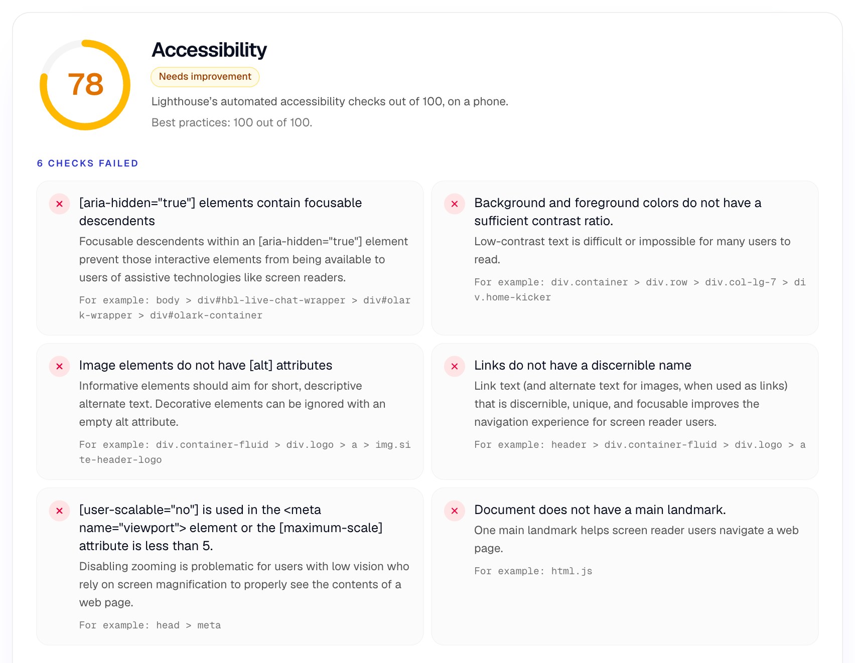
Four of the six are among the most common failures above, and two of them are really one problem: the logo image has no alt attribute, so the link around it has no name, and a screen reader user hears only that there is a link. Giving the image the alt text “Happy Menu home” fixes both. Turning zoom back on is a one-line change to the page’s viewport tag.
The ADA website compliance checklist
Check six areas on every important page: images and media, text and color, keyboard and focus, forms, page structure, and phones and zoom. Each item below is a WCAG 2.2 Level AA requirement or follows directly from one, written as a question you can answer yes or no.
Start with the pages that matter most to your customers: the home page, your top landing pages, and every step of the journeys people come to complete, such as booking, buying, signing up or getting in touch. A barrier on step three of a checkout stops the customer as surely as one on the home page. The W3C’s quick reference lists every requirement with techniques if you want the full detail behind an item.
Images, video and audio
- Every image that carries meaning has alt text that says what it shows or does.
- Decorative images have an empty alt attribute, so screen readers skip them.
- An image inside a link, such as a logo, has alt text that names where the link goes.
- Charts and infographics have the same information in text nearby.
- Videos have accurate captions, not only automatic ones you have never checked.
- Audio and video with important visual information have a transcript or audio description.
- Nothing plays sound automatically for more than a few seconds without a way to stop it.
Text and color
- Body text, labels and links measure at least 4.5:1 against their background.
- Large text, at least 24 pixels or about 18.5 pixels bold, measures at least 3:1.
- Field borders, icons and the keyboard focus outline measure at least 3:1.
- Color is never the only way to show something: links in text are underlined, and errors say what is wrong in words.
- Text is real text, not a picture of text.
- Link text, read with its sentence, says where the link goes, so “Read more” says what there is more of.
Keyboard and focus
- Every link, button, menu and form control works with the Tab, Enter, Space and arrow keys.
- The focus moves in an order that follows the page, and never gets stuck.
- You can always see where the keyboard focus is, and sticky headers or chat buttons never cover it.
- A “Skip to main content” link lets people jump past the navigation.
- Pop-ups and menus can be opened and closed with the keyboard, and focus returns to where it was.
- Nothing hidden from screen readers can still take keyboard focus.
Forms
- Every field has a visible label that stays visible while people type.
- Required fields are marked with a word or symbol, explained once at the top.
- Errors appear next to the field, say what is wrong and how to fix it, and are announced to screen readers.
- Name, email, address and phone fields allow the browser to fill them in.
- People can review and correct an order, booking or legal agreement before it is final.
- Time limits can be turned off or extended, unless they are essential.
- Sign-in does not depend on solving a puzzle or remembering something, without another way through.
Page structure
- Each page has a unique, descriptive title.
- The page’s language is set, so screen readers pronounce it correctly.
- Headings describe each section and go in order, with one main heading.
- The page has a main landmark, so people can jump straight to the content.
- Every button and link has a name a screen reader can read, including icon-only ones.
- Navigation and help links appear in the same place on every page.
Phones and zoom
- Zoom is allowed, and text can be enlarged to 200% without anything being cut off.
- At 320 pixels wide, the page fits the screen and never scrolls sideways.
- Tap targets are at least 24 by 24 pixels, or spaced so a finger cannot hit the wrong one.
- The page works in both portrait and landscape.
- Anything done with a swipe or drag can also be done with a single tap.
Some of these have exact measurements behind them. The W3C’s reflow requirement asks that content works “without requiring scrolling in two dimensions” at “a width equivalent to 320 CSS pixels,” which it notes is what a 1280 pixel wide screen becomes at 400% zoom. The target size minimum, new in WCAG 2.2, says “the size of the target for pointer inputs is at least 24 by 24 CSS pixels,” with exceptions such as links inside a sentence. For contrast, our guide to bad color contrast examples shows each ratio with a passing fix.
What the checklist finds on a real website
On Happy Menu, a full audit found problems no automated score showed: a focus outline too faint to follow, a header that broke on a small phone, form fields with borders that almost vanished and legal links shown only by color. Each one breaks a checklist item above.
UX Robot audited Happy Menu’s home page, sign-up and menu editor on a phone and a computer in October 2026. These findings come from those audits, each measured on the screen as people see it.
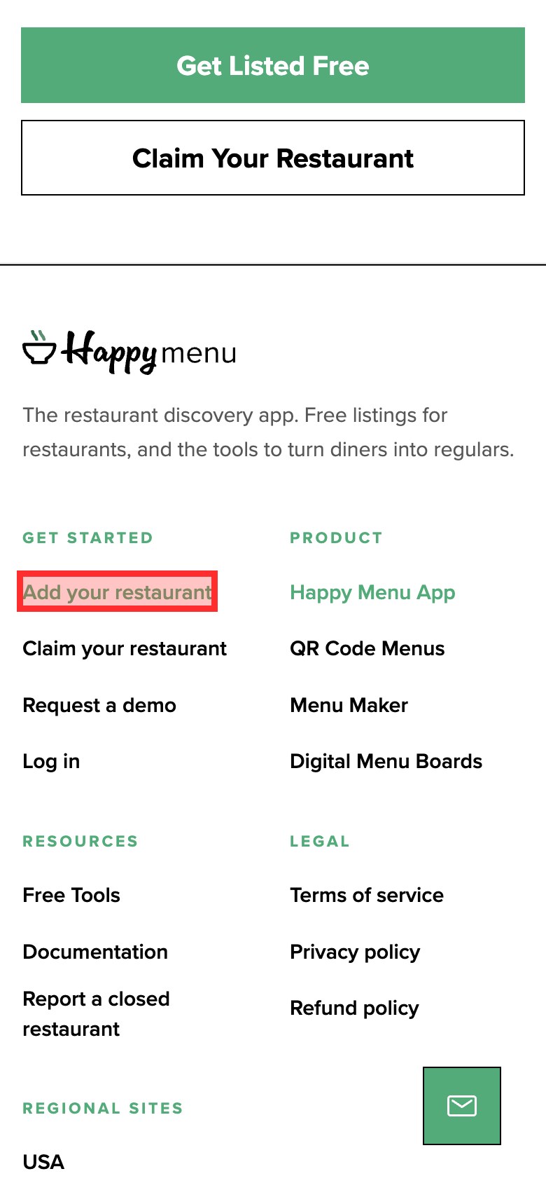
Keyboard and focus. People who use a keyboard rely on the focus outline to know where they are. On Happy Menu, a focused footer link got a green outline at 45% opacity, about 1.6:1 against white, and the language picker only a ring of about 1.3:1. The fix is a solid outline of at least 2 pixels in a dark color, with a little space around the element, which works on almost any design.
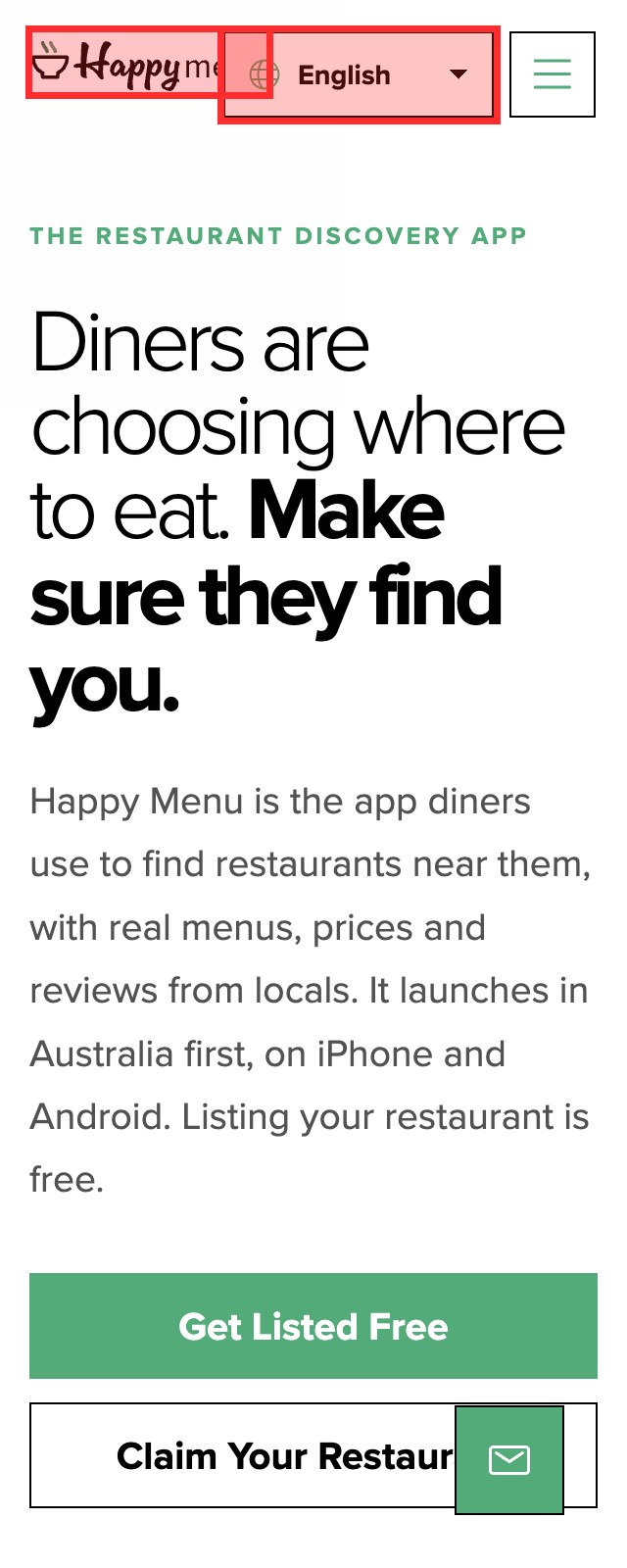
Phones and zoom. At 320 pixels wide, the width that the reflow requirement names, the language picker covered the right half of the logo and the whole page scrolled sideways by 34 pixels. Together with zoom being turned off, that is two of the five items in the phones and zoom group failing on the first screen. Let the header wrap, or move the language picker into the menu on narrow screens.
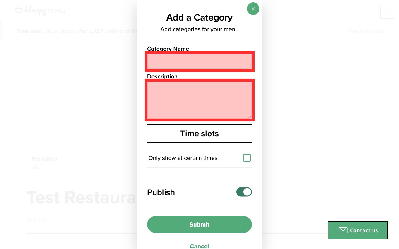
Forms. In the menu editor, the screens restaurant owners use to build their menu, the Category Name and Description fields were drawn only by a 2 pixel #EEEEEE border on white, which measures 1.16:1. Interface parts need 3:1, so a border of #8A8A8A, at 3.45:1, makes the fields visible again.
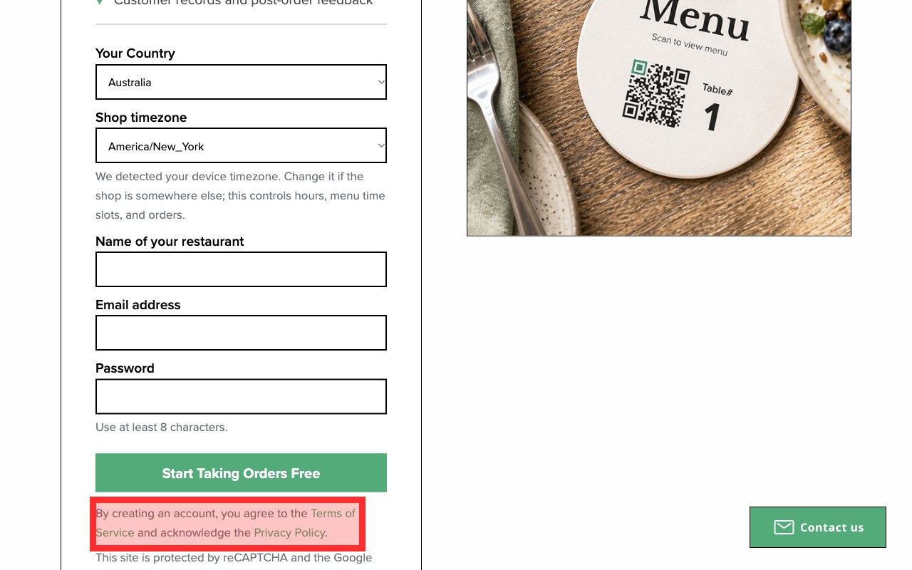
Color alone. Under the sign-up button, the links to the Terms of Service and Privacy Policy were green with no underline, at 2.84:1 against the page and only 1.65:1 against the gray sentence around them. These are the links people need before agreeing to something, and color was the only thing marking them out. Underline them.
None of these four appeared in the automated score, and UX Robot’s audit of the home page found a bigger problem no checklist covers: a first screen that spoke only to restaurant owners while most visitors from search wanted a menu. That is not an accessibility failure, but it is the kind of problem that decides whether people get what they came for, and you only find it by using the page as a customer would.
How to test your website against the checklist
Run an automated check on each important page, then test by hand: go through every journey with only a keyboard, zoom to 200% and narrow the window to 320 pixels, listen to the page with a screen reader, and measure contrast on anything a tool cannot judge. Plan a day for a small website.
- List the pages and journeysHome, top landing pages, and each step of booking, buying, signing up and contacting you.
- Run an automated check on each pageLighthouse in Chrome, WAVE or a free check. Note each failure and the element it names.
- Put the mouse awayComplete every journey with Tab, Shift and Tab, Enter, Space and the arrow keys. Can you always see where you are?
- Zoom and narrow the screenZoom to 200%, then make the window 320 pixels wide. Nothing should be cut off or scroll sideways.
- Listen with a screen readerVoiceOver on a Mac or iPhone, or NVDA on Windows. Are images, buttons, links and form errors announced clearly?
- Measure what tools missText over photos, field borders, icons, focus outlines, and hover and error states.
- Write up each findingThe page, a screenshot, the steps to see it, who it affects, the fix and how you will check it is fixed.
If testing by hand is the part you never get to, that is where an audit helps. UX Robot’s page audits have your own AI agent use the page on a phone or a computer, check it for usability and WCAG 2.2, measure contrast on the screen as people see it, mark each problem on a screenshot and write the steps to see it and the fix, saying whether each finding was measured or judged. That is how the Happy Menu findings above were found. The free plan covers five page audits a month, Pro removes the limit, and Enterprise audits whole journeys with your analytics, Search Console and Clarity data, sends issues to your tracker and rechecks them after you ship. See the plans. An agent’s audit is evidence for your team to act on, not a legal certification, and testing with disabled people is still the best way to know your website works for them.
How to fix what you find and keep it fixed
Fix barriers that stop a journey first, then the ones that repeat across every page, then the rest. Make the fixes part of your design system and release checks, publish a way for people to tell you about problems, and recheck after every redesign.
- Fix what blocks a task first. A checkout button a keyboard cannot reach, a form error a screen reader never announces or a sign-up that needs a mouse stops someone completely. Those come before anything cosmetic.
- Fix the template, not the page. Low contrast, missing labels and empty buttons usually come from one shared component. Fixing the header, the button style or the form field fixes every page that uses it.
- Write the rules down. Approved color pairs with their ratios, a focus outline style, label and error patterns, and alt text guidance for whoever publishes content. New pages then start accessible instead of being fixed later.
- Check before you ship. Add an automated accessibility check to your release process and a quick keyboard pass to every new page or feature.
- Tell people how to reach you. Publish a page that says what standard you aim for, what you know is not right yet, and how to report a problem or get the information another way. Then answer quickly.
- Recheck after every redesign. Accessibility drifts back when someone adds a banner, a widget or a new shade. The chat widget behind Happy Menu’s hidden focusable controls is a typical example of a third-party tool bringing a failure with it.
Be wary of any plugin that promises compliance with one line of code. The checklist tests your website’s own markup, labels and keyboard behavior, so fix the website itself. For how accessibility fits with the rest of a review, see our guides on how to do a UX audit and the website audit checklist.
ADA compliance questions people ask
Does the ADA apply to my business website?
If your business is open to the public, the Department of Justice’s guidance says the ADA applies to it, and it applies its nondiscrimination and effective communication requirements to websites. Whether a specific website or claim is covered is a legal question, so ask a lawyer for advice on your situation.
What are the ADA website requirements for 2026?
For businesses, nothing new was dated for 2026: the ADA’s general requirements apply, and WCAG Level AA is the usual measure. For state and local governments, an interim final rule published on April 20, 2026 moved the WCAG 2.1 Level AA deadlines to April 26, 2027 for those of 50,000 people or more, and April 26, 2028 for smaller ones and special districts.
Is WCAG 2.1 or WCAG 2.2 the right target?
Aim for WCAG 2.2 Level AA. The W3C says content that meets 2.2 also meets 2.1 and 2.0, so you cover the government rule and Section 508 at the same time.
What is the most common ADA website violation?
Low contrast text, found on 83.9% of the top million home pages in WebAIM’s 2026 tests. Missing alt text, at 53.1%, and missing form labels, at 51%, come next.
Can a free tool make my website ADA compliant?
No tool can on its own. Automated checks find the failures a script can see, and the UK government’s test of 13 tools found the best caught 40% of the barriers it planted. Use a tool to start, then test with a keyboard, zoom, a phone screen and a screen reader.
Does a PDF or video on my website need to be accessible?
Yes, if people need it. The Department of Justice lists videos without captions among the barriers it sees, and the government rule covers web content generally. Caption videos, and make PDFs accessible or publish the same information as a web page.
Sources
- Guidance on Web Accessibility and the ADA, U.S. Department of Justice, March 18, 2022.
- Fact Sheet: New Rule on the Accessibility of Web Content and Mobile Apps Provided by State and Local Governments, U.S. Department of Justice, with the April 20, 2026 interim final rule.
- Introduction to the Americans with Disabilities Act, U.S. Department of Justice.
- Information and Communication Technology standards (Section 508), U.S. Access Board.
- WCAG 2 Overview, W3C, updated September 17, 2026.
- How to Meet WCAG 2.2 (Quick Reference), W3C.
- Understanding Success Criterion 1.4.10: Reflow, W3C.
- Understanding Success Criterion 2.5.8: Target Size (Minimum), W3C, updated November 2, 2026.
- The WebAIM Million, WebAIM, 2026 report, tests run in February 2026.
- Accessibility tool audit, Government Digital Service, last updated April 13, 2018.
- UX Robot’s free check of happymenu.co on November 6, 2026, and UX Robot audits of happymenu.co on a phone and a computer in October 2026, published with the owner’s permission.