Independent public comparison
We asked Qantas and Virgin Australia to sell one adult an economy flight from Melbourne to Sydney on Wednesday 18 November 2026, chose the earliest comparable nonstop service and continued to payment. We are not affiliated with either airline. This records the public journeys on 27 September 2026; fares and availability can change.
The Melbourne–Sydney flight test
Book one adult, one way, Melbourne to Sydney on 18 November 2026, choosing the earliest practical nonstop economy flight.
QF1500, 06:00–07:30, Red e-Deal at A$185 with checked baggage and seat selection included.
VA803, 06:00–07:25, Choice at A$145 with one 23kg checked bag and standard-seat choice included.
Australia, unsigned-in desktop Chrome at 1440 × 1000 pixels, prices in Australian dollars.
Payment on both sites. No payment details were entered and no booking was made.
Comparable early flights with one checked bag and standard seat choice, plus all optional extras and payment fees disclosed before purchase.
The 30-second result
Virgin Australia offered the comparable fare for A$40 less and made optional extras easy to refuse. Qantas gave the clearer final consent step.
Virgin Australia wins on value and itinerary: its Choice fare was A$145, arrived five minutes earlier and included the bag and standard seat needed for this comparison. Qantas’ A$185 Red e-Deal also included baggage and a seat, and its payment page separated contract acceptance from optional extras more clearly. Virgin’s final “Yes, I agree to the above” checkbox followed both mandatory terms and a marketing paragraph, making the scope of agreement harder to understand. The cheaper journey should keep its price advantage while fixing that consent ambiguity.
Both found an early nonstop flight; Virgin’s interface leaked internal labels
Qantas returned QF1500 from Melbourne at 06:00, arriving Sydney at 07:30. Virgin returned VA803 at the same departure time, arriving at 07:25. Both made the date, airports and nonstop nature of the itinerary checkable before fare selection.
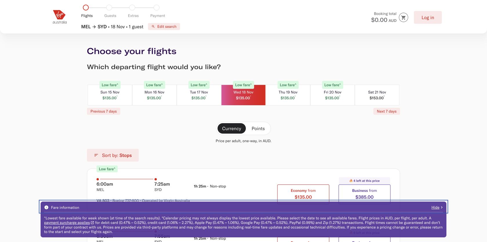
The visible Virgin journey was usable, but parts of its accessible labelling exposed untranslated keys instead of meaningful names. Qantas later showed similar unresolved strings in accessible names. These do not always appear visually, yet they matter to speech-input and screen-reader users and signal that localisation tokens are reaching production components.
Virgin made the fare ladder easier to compare and won the comparable price
Qantas offered the Red e-Deal at A$185. It included checked baggage and seat selection, charged A$121 to change and offered a credit rather than a cash refund, also subject to the A$121 fee. The fare card kept the central restrictions visible before selection.
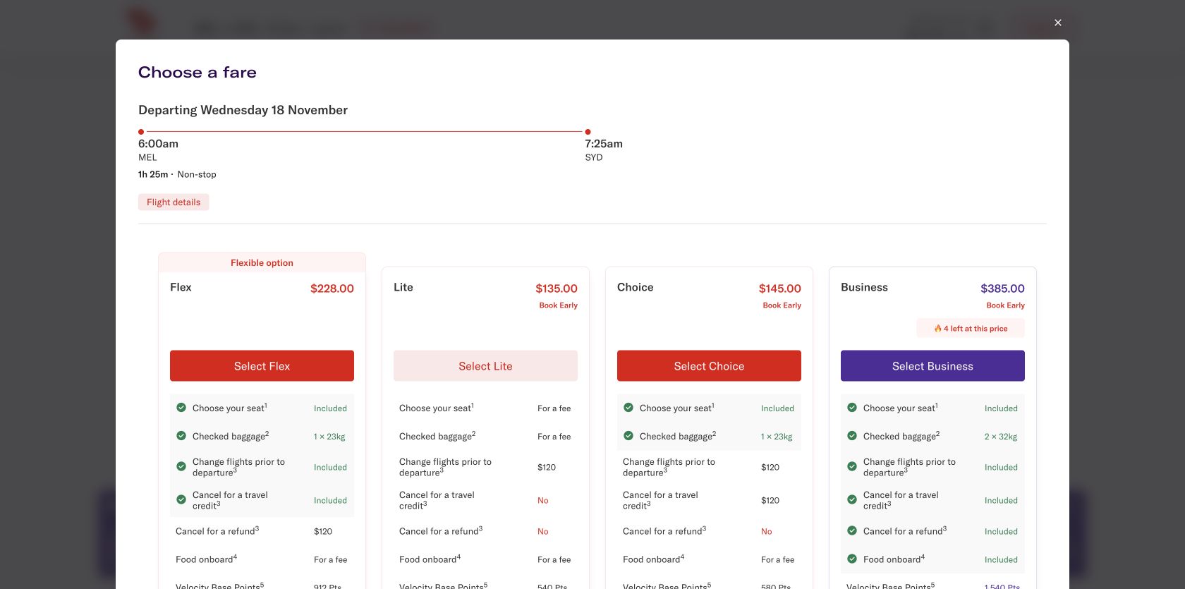
Virgin placed four fares side by side: Lite at A$135, Choice at A$145, Flex at A$228 and Business at A$385. Choice was the fair comparison because it added one 23kg checked bag and standard-seat choice; its change or credit fee was A$120. That made the like-for-like fare A$40 cheaper than Qantas.
Round winner / Virgin Australia
The comparable itinerary arrived earlier and cost A$40 less, with the relevant inclusions visible before selection.
Optional extras remained off, although both journeys demanded attention
Qantas offered a Business upgrade from A$953, car hire and A$40 travel insurance. Insurance required an explicit choice and “No” was available; it was not silently added. Virgin offered Cancel for Any Reason at A$35 for a 100% refund or A$23 for 80%, then opened a guest path through a login interruption. Its seat map distinguished paid Economy X seats from complimentary standard rows, and skipping seat choice led to a clear confirmation that a seat would be assigned.
Virgin’s extras page kept the included 23kg bag visible and offered Cover-More insurance for A$17.50 plus a A$3.77 climate contribution. Neither was preselected. Qantas similarly left carbon-related additions off at payment. Both avoided the most damaging pattern—adding a paid extra without affirmative action—but the number of decisions still lengthened a simple domestic booking.
Both disclosed payment fees; Virgin blurred contract and marketing consent
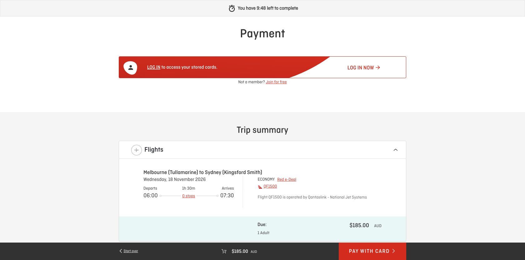
Qantas reached payment with A$185 due and card selected. It disclosed percentage fees by method: debit Mastercard 0.31%, debit Visa 0.30%, Mastercard credit and American Express 0.76%, Visa credit 0.89%, PayPal 0.69%, Zip 1.5%, other cards 1.38% and non-Qantas UATP 1.75%, capped at A$22 a passenger. PayID and BPAY were fee-free. A ten-minute countdown made the remaining decision window explicit.
Virgin reached payment with A$145 due. It offered Apple Pay, Google Pay, card, PayPal, PayID, Zip, Velocity Points and Travel Bank, with PayID carrying no surcharge. Its displayed ranges ran from 0.47–0.52% for debit, 1.06–2.27% for credit, 0.47–1.06% for Apple Pay, 0.47–0.52% for Google Pay, 0.99% for PayPal and 1.27% for Zip.
The problem came at the final checkbox. Mandatory contract terms and a paragraph about receiving marketing appeared together before “Yes, I agree to the above,” while the validation message called the checkbox terms and conditions. A customer should not have to infer whether purchase acceptance also opts them into marketing. Contract acceptance and optional communications need separate, plain-language controls.
Passenger validation was stronger than some optional-step state
Qantas’ empty passenger submission produced a complete error summary. Virgin’s empty submission moved focus to Title and displayed the required-field messages, giving keyboard users a concrete starting point. Both recovered with reserved non-customer test details and reached payment. Virgin also confirmed the consequence of skipping seat selection rather than silently moving on.
Round result / Draw
Qantas gave a useful summary; Virgin placed focus at the first invalid passenger field and explained skipped seating.
Both phone experiences had field warnings; Virgin’s interaction delay was severe
These p75 phone Chrome UX Report records cover different scopes from 29 August to 25 September 2026: the whole Qantas public origin and Virgin Australia’s exact homepage. They are not measurements of the search, fare, passenger or payment pages above, and they cannot identify which page caused a metric. Virgin’s 802ms INP and 0.63 CLS are strong signals to investigate shared interaction and layout components; Qantas should prioritise loading and movement while protecting its good interaction result.
Scores diverged, but both need manual work on names and controls
The configured mobile PageSpeed run scored Qantas 100 for accessibility and 73 for best practices, while still flagging a label/name mismatch. Virgin scored 73 for accessibility and 96 for best practices; findings included focusable elements hidden from assistive technology, invalid ARIA values, unnamed buttons, contrast, heading order, list structure, restricted zoom and small targets.
An automated 100 is not a conformance certificate. The unresolved localisation keys encountered in accessible names require manual inspection on both sites. Follow-up should cover keyboard fare selection, announcement of price changes, accessible names, focus through seat maps and modals, zoom, consent wording and error recovery from every mandatory field.
All ten Nielsen usability heuristics
Keep itinerary, total and timer visible.
Qantas made the payment deadline explicit; both carried the selected flight to payment.
Translate fees into dollars.
Both disclosed percentages; showing the actual surcharge for the current total would be faster to understand.
Preserve refusal and skip routes.
Insurance, seating and climate extras could be declined without losing the itinerary.
Remove internal localisation keys.
Accessible names should use the same human language as the visible interface.
Separate marketing from purchase terms.
Virgin’s combined “agree to the above” wording creates avoidable consent ambiguity.
Keep fare restrictions in the comparison.
Both exposed change and refund conditions before selection.
Let simple trips bypass extras quickly.
A one-way domestic booking still crossed several secondary-offer decisions.
Make the itinerary dominant.
Cars, insurance and upgrades should not compete visually with the flight being purchased.
Start at the first passenger error.
Virgin did this directly; Qantas provided the broader error summary.
Explain fare and fee consequences in context.
Customers need refund, change, baggage, seat and payment-fee consequences before commitment.
What each team should keep
- Qantas: included baggage and seat, visible restrictions, complete passenger error summary, fee-free payment choices and an explicit timer.
- Virgin Australia: strong fare comparison, A$40 comparable saving, earlier arrival, optional extras left off, guest route and useful first-error focus.
What we would change first
Separate contract acceptance from optional marketing.
What
Use one required checkbox naming the fare rules and conditions, plus a separate empty optional marketing checkbox.
Where
The review area immediately before payment.
Why
“Agree to the above” follows two different purposes and obscures what is mandatory.
Measure
Validation errors, consent rate, unsubscribes, complaints and payment progression.
Investigate the 802ms interaction delay and 0.63 layout shift first.
What
Profile main-thread tasks around search controls, reserve promotional space and stabilise late-loading content.
Where
Homepage search and shared booking-shell components.
Why
The exact homepage’s p75 phone INP and CLS were both poor.
Measure
Exact-page p75 INP and CLS alongside completed searches and fare progression.
Block unresolved localisation tokens from release.
What
Add automated checks for token-shaped accessible names and supply human fallbacks.
Where
Search, fare and booking controls.
Why
Internal keys can make otherwise visible controls meaningless to assistive technology.
Measure
Release-test failures, unnamed controls and screen-reader task completion.
Show the fee in dollars for the selected method.
What
Calculate the actual surcharge beside each method and update the final total immediately.
Where
The payment selector and sticky trip total.
Why
A percentage table makes customers perform arithmetic at the last step.
Measure
Payment-method switching, exits, completion and fee-related contacts.
What this public comparison cannot see
We tested one passenger, one route, one date and one moment’s fares. We did not enter payment details, book, fly, change or cancel a ticket, check a bag, use an airport service or claim insurance. Both journeys reached payment.
We cannot say which airline operates more reliably or retains more customers. GA4 could measure fare switching, extras exits, consent errors and payment progression; Microsoft Clarity could reveal hesitation around seat maps and terms; Search Console could monitor route-query and landing-page discovery; booking, disruption and support data could connect interface promises to the travelled experience.