Independent public comparison
We asked VIA Rail and Megabus to sell one adult a Toronto-to-Montréal trip on Wednesday 18 November 2026, selected a late-morning direct service on each and continued as a guest to payment. We are not affiliated with either operator. This records the public journeys on 27 September 2026; schedules and prices can change.
The Toronto–Montréal test
Book one adult, one way, Toronto to Montréal on 18 November 2026, choosing a direct late-morning departure and continuing to payment.
Train 64, 11:38–17:11, 5h 33m. Escape fare C$55 plus tax: C$62.15 total.
Union Station service, 11:00–18:10, 7h 10m. C$14.99 fare plus fee and tax: C$22.58 total.
Canada, unsigned-in desktop Chrome at 1440 × 1000 pixels, prices in Canadian dollars.
Payment on both sites. No payment details were entered and no ticket was purchased.
Direct late-morning public transport, one adult, the included baggage and final pre-payment total. Modes and trip times differ.
The 30-second result
Megabus was C$39.57 cheaper and had the cleaner guest checkout. VIA Rail arrived 59 minutes earlier, despite leaving 38 minutes later.
Megabus wins the public booking journey on price and simplicity: its C$22.58 total, free unassigned seat and included baggage stayed visible through payment. VIA Rail’s C$62.15 Escape itinerary was 1h 37m shorter and its checkout explained fare restrictions and baggage in more detail. VIA’s date control entered an invalid “NaN/NaN/NaN” state during recovery, and checkout stated that passengers begin receiving promotional emails after purchase rather than asking first. Those are avoidable trust costs in an otherwise more informative journey.
Megabus kept the search conventional; VIA’s date field could become impossible
Both route pages exposed origin, destination, date and passenger count without requiring an account. VIA used custom radio controls whose visible labels were the dependable click target. Entering a date, changing from round trip to one way and returning to the date produced “NaN/NaN/NaN.” Re-entering 11/18/2026 restored the search.
That is a genuine UX failure rather than an access block: the interface let the customer create a nonsensical date through ordinary controls. The customer could recover, but only by recognising the technical string as invalid and replacing it. An empty VIA passenger search did better, linking to “Please select passenger(s)” and moving focus there.
VIA’s later departure still reached Montréal 59 minutes sooner
VIA train 64 departed at 11:38 and arrived at 17:11, a 5h 33m direct trip. Megabus departed Toronto Union Station at 11:00 and arrived at 18:10, a 7h 10m direct trip. VIA therefore left 38 minutes later but arrived 59 minutes earlier.
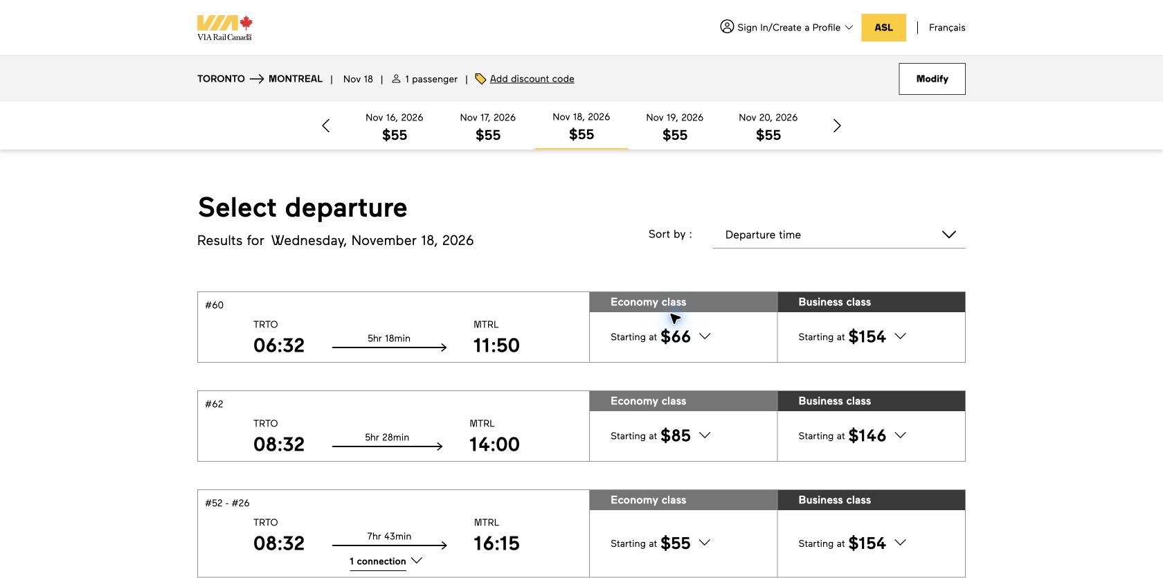
Round winner / VIA Rail
The selected train was 1h 37m shorter and arrived almost an hour earlier.
Megabus was C$39.57 cheaper; VIA explained the trade-offs more fully
VIA’s Escape fare was C$55 before tax, non-refundable and non-exchangeable. Economy cost C$65 and Plus C$75. Standard seat selection would cost C$7 if chosen, but the automatically assigned seat 5D did not add a charge. The recap total was C$62.15: C$55 fare plus C$7.15 tax.
Megabus started at C$14.99, added a C$4.99 booking fee and C$2.60 HST, then showed C$22.58 due. A general unassigned seat was free. The basket also named one item of luggage up to 20kg or 50lb plus a small hand item as included. Optional reserved seats and C$0.25 text alerts stayed off.
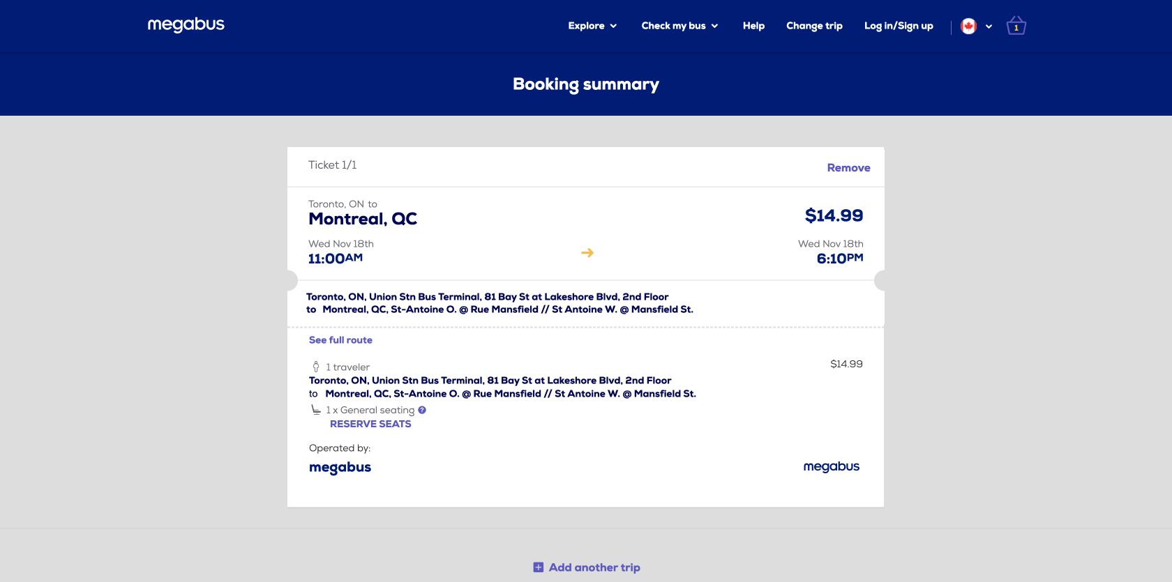
Round winner / Megabus
The final pre-payment total was C$39.57 lower, and paid seat or alert extras remained unselected.
Both offered guest checkout; VIA imposed promotional email after purchase
VIA’s recap offered guest checkout and preserved the selected itinerary, fare and total. Its passenger and contact step asked for identity, address, phone, email confirmation and preferred language. The baggage step stated that Escape included one personal item and one medium carry-on; an additional large item cost C$25. Payment accepted credit and debit cards, showed C$62.15 remaining and required acceptance of the purchase terms.
The trust problem sat in the contact copy: VIA said all passengers would begin receiving promotional emails after purchase and could unsubscribe later. Transactional travel information and optional marketing are different purposes. Marketing should require an empty, affirmative choice rather than follow automatically from buying a ticket.
Megabus’ secure guest checkout preserved the itinerary and total. Its offers checkbox was empty and affirmative—customers could choose to receive offers. Card payment was the safe stopping point, with no account required and no optional text alert or reserved seat added.
VIA’s passenger recovery led; both payment forms left focus behind
VIA’s zero-passenger search linked the specific problem and moved focus to it. Its passenger and contact validation also named missing requirements. Megabus named the missing email after an empty Continue attempt, but focus stayed on Continue. At payment, an empty Pay attempt displayed the required card errors while focus remained on Pay. The messages existed; the next keyboard action was not surfaced.
Round winner / VIA Rail
Its passenger error provided both a specific message and the correct focus destination.
Megabus met all three good phone field thresholds
These p75 phone Chrome UX Report records cover the exact public route URLs from 29 August to 25 September 2026. They are not measurements of the live search, results or payment states above, and they cannot identify which component caused a metric. Megabus met all three good thresholds. VIA’s 2.53s Largest Contentful Paint narrowly entered needs improvement; interaction and visual stability remained good.
Independent diagnostics filled a gap when VIA’s configured run timed out
VIA’s configured mobile PageSpeed request ended with a document timeout rather than a usable Lighthouse result. A separate Chrome Lighthouse snapshot of the exact route page scored 97 for accessibility and 100 for best practices, flagging label/name mismatches and small touch targets. The configured Megabus run scored 80 for accessibility and 96 for best practices; its findings included unnamed buttons and links, contrast, heading order, missing image alternatives and label/name mismatches.
These scores are diagnostic signals, not accessibility verdicts. Manual testing should cover VIA’s custom trip-type controls and date recovery, keyboard progress through results and baggage, Megabus’ seat choices, focus after validation, zoom, visible focus and the accessible names of every action.
All ten Nielsen usability heuristics
Show a valid date after every mode change.
VIA exposed “NaN/NaN/NaN” instead of a usable one-way date.
Connect schedule to elapsed time.
Both named departure and arrival; VIA also made its shorter duration easy to compare.
Keep optional seats and alerts off.
Megabus preserved a free unassigned seat and left text alerts unselected.
Make control and label one target.
VIA’s trip-type label worked more reliably than clicking the custom radio itself.
Validate dates before rendering.
A technical not-a-number string should never become customer-visible state.
Persist fare, restrictions and baggage.
VIA carried more of the travel contract through each checkout step.
Preserve guest checkout.
Both allowed a one-off traveller to reach payment without creating an account.
Keep optional services secondary.
Reserved seats and alerts should not obscure itinerary and total.
Move focus to the first invalid input.
VIA did this for passengers; Megabus left focus on submitted actions in observed tests.
Explain mode-specific trade-offs.
Fare rules, baggage, station location, duration and fees all belong before commitment.
What each team should keep
- VIA Rail: shorter trip, visible fare restrictions, detailed baggage information, complete guest journey and strong passenger-error recovery.
- Megabus: much lower total, transparent fee arithmetic, included baggage and seat, optional extras left off, affirmative marketing choice and fast stable route-page field results.
What we would change first
Ask before sending promotional email.
What
Separate operational trip messages from an empty, affirmative marketing checkbox.
Where
The contact step and booking confirmation preferences.
Why
Buying transport should not automatically enrol every passenger in promotions.
Measure
Consent, unsubscribe, complaint and deliverability rates.
Make trip-type changes preserve a valid date.
What
Normalise the date value when switching one-way and round-trip modes and block technical placeholders from rendering.
Where
The route-search date model and custom controls.
Why
Ordinary input produced “NaN/NaN/NaN” and forced manual repair.
Measure
Invalid date states, date re-entry, search failure and successful results.
Focus and announce the first checkout error.
What
Move focus from Continue or Pay to a linked error summary, then the first invalid field.
Where
Guest email and card-payment forms.
Why
Messages appeared but the next keyboard action remained behind.
Measure
Repeat submits, recovery time and checkout completion.
Fix component accessibility without losing field performance.
What
Align accessible names with labels, enlarge small targets and supply text alternatives and names.
Where
Search controls, route-page actions, images and checkout controls.
Why
Both diagnostic runs identified component-level accessibility defects.
Measure
Automated failures, keyboard task completion and exact-page p75 Core Web Vitals.
What this public comparison cannot see
We tested one adult, one route, one date and one departure on each mode. We did not enter payment details, purchase, travel, check baggage, change or cancel a ticket, experience a disruption or contact support. Both journeys reached payment.
We cannot say which operator is more reliable or better for every traveller. GA4 could measure date repair, fare choice, extras and payment progression; Microsoft Clarity could show control failures and error recovery; Search Console could monitor route-query and landing-page discovery; operational, refund and support data could connect the booking promise to the completed trip.