UX Robot / Public field notes
We test the journeys people actually have to finish.
Clear, independent comparisons of important website journeys. We use the same task, the same conditions and screenshots that show exactly what happened.
01
Latest comparisons
-
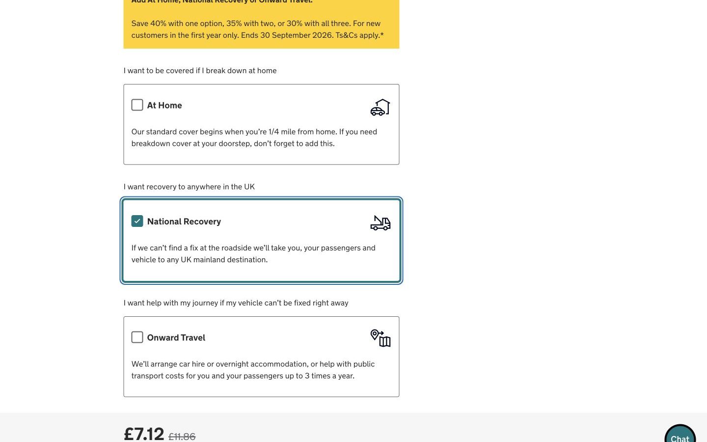
The AA vs Green Flag: which breakdown-cover journey is clearer?
The AA reveals a usable price before personal details; Green Flag explains the cover cleanly but delays the cost.
-
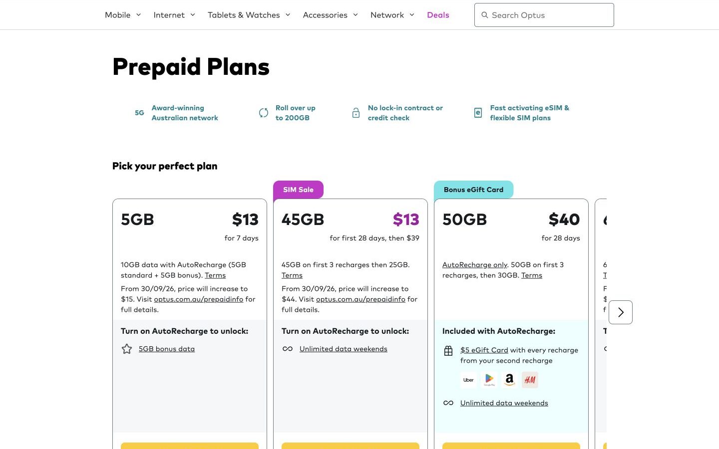
Telstra vs Optus: which prepaid eSIM journey explains the real deal?
Telstra makes eSIM activation predictable; Optus compares plans well but stalled at the activation hand-off.
-
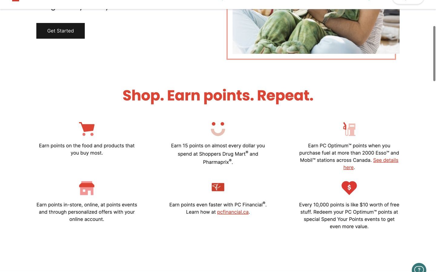
PC Optimum vs Blue Rewards: which rewards journey earns trust sooner?
PC Optimum quantifies points before registration; Blue Rewards starts lightly but leaves value and malformed-email recovery unclear.
-
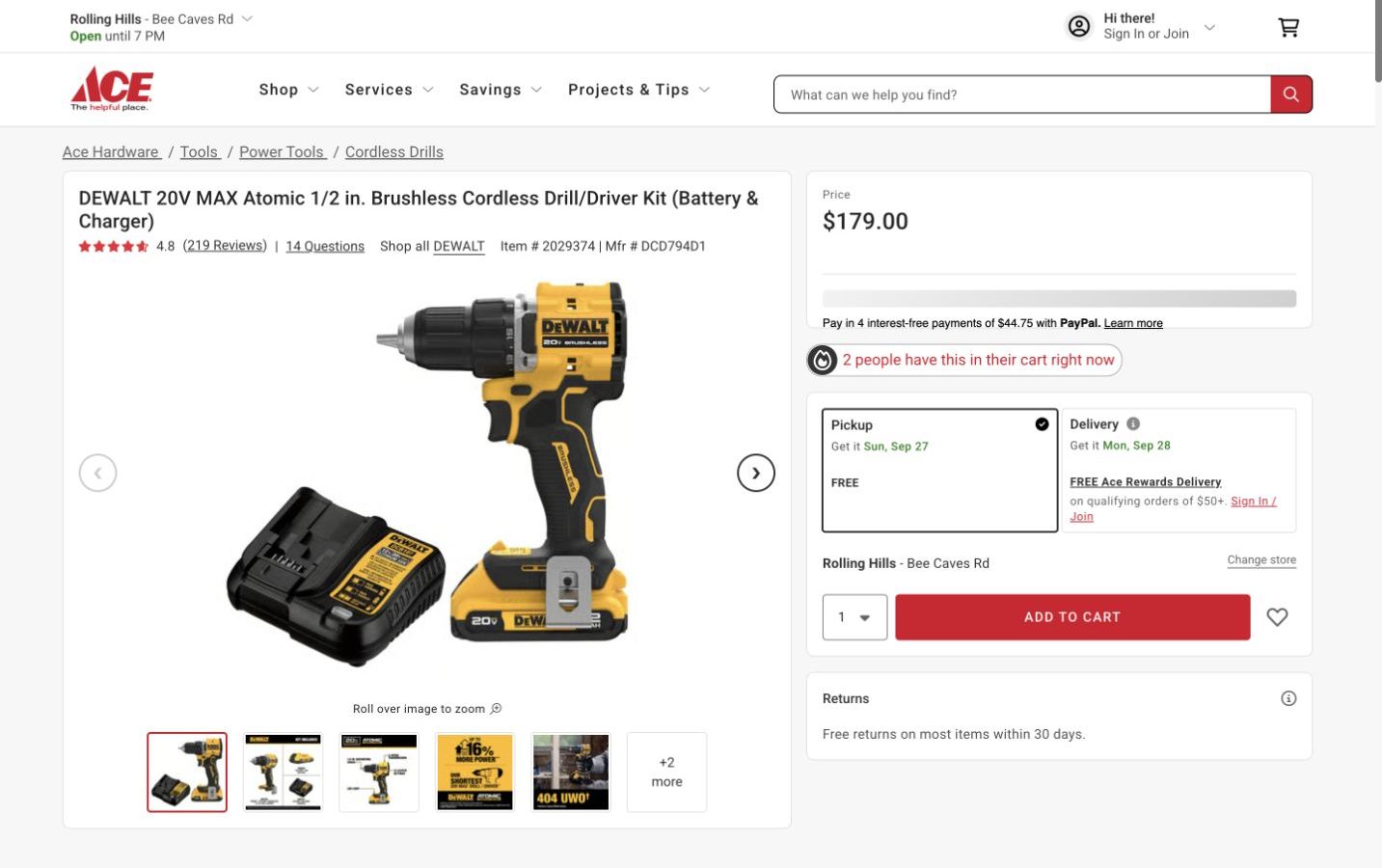
Lowe’s vs Ace Hardware: which cordless-drill pickup journey is clearer?
Ace makes the complete kit and guest checkout easier to understand; Lowe’s makes local pickup harder to set than it should be.
-
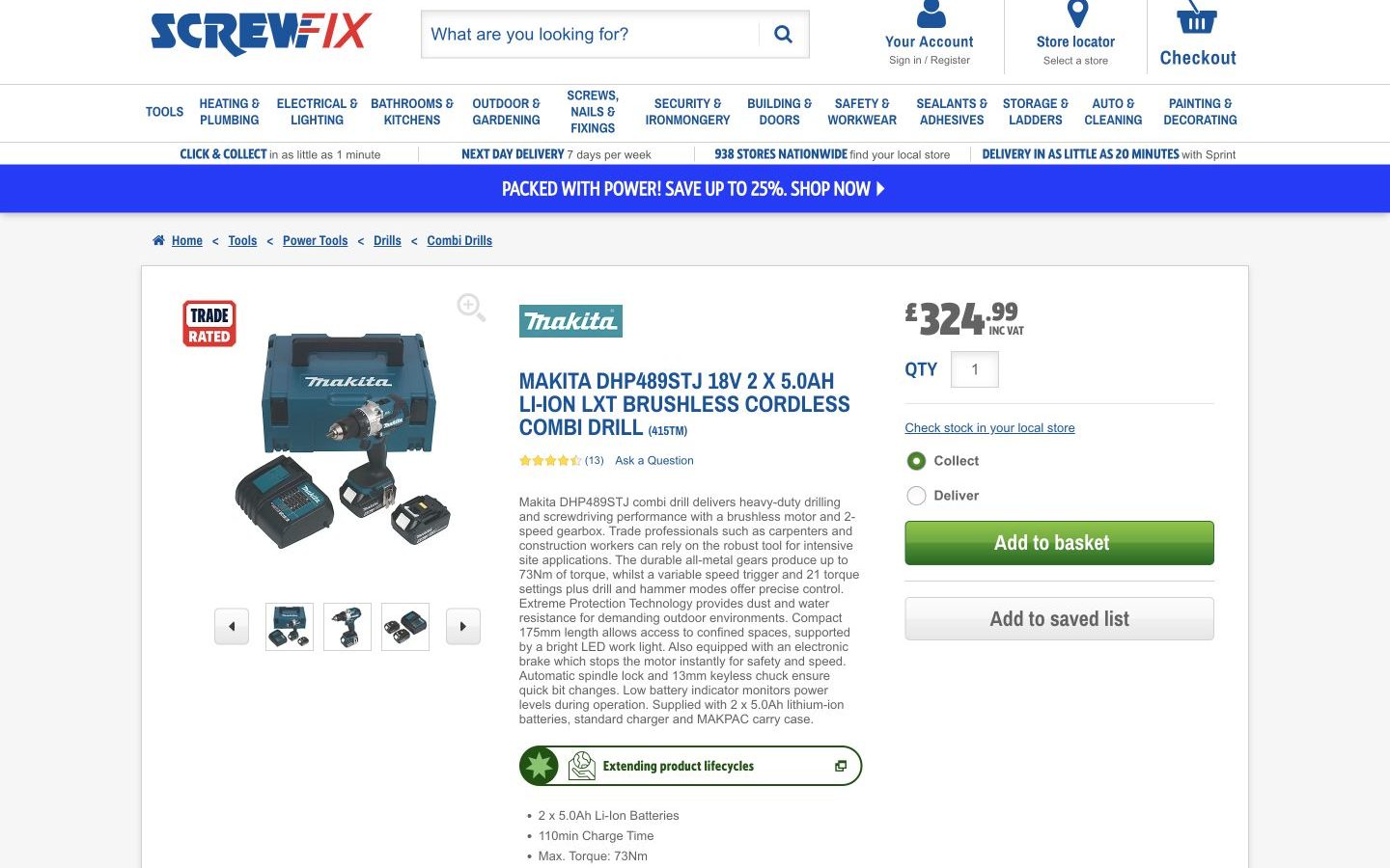
Screwfix vs Toolstation: which Makita collection journey handles failure better?
Toolstation clearly handles unavailable stock; Screwfix accepts Birmingham and then leaves the collection results blank.
-
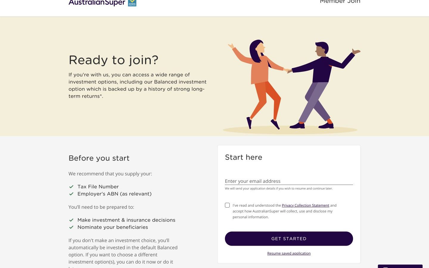
AustralianSuper vs Rest: which joining journey explains the product better?
AustralianSuper explains its admin fee and default investment before personal details; Rest makes the facts harder to assemble.
-
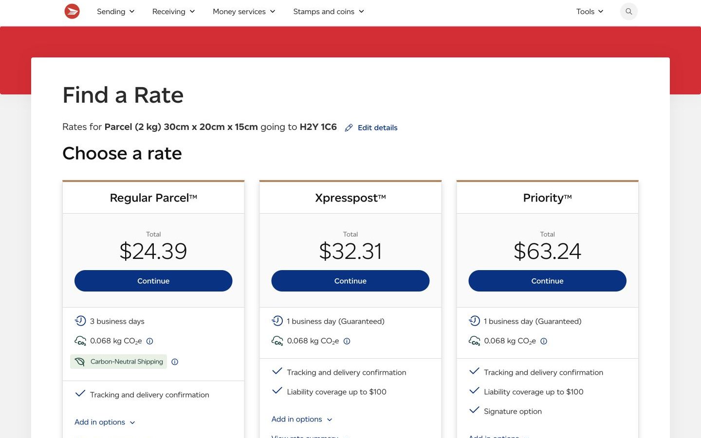
Canada Post vs Purolator: which parcel quote is easier to choose?
Canada Post gives the occasional sender a clearer speed-and-price ladder; Purolator makes next-day time windows easy to scan.
-
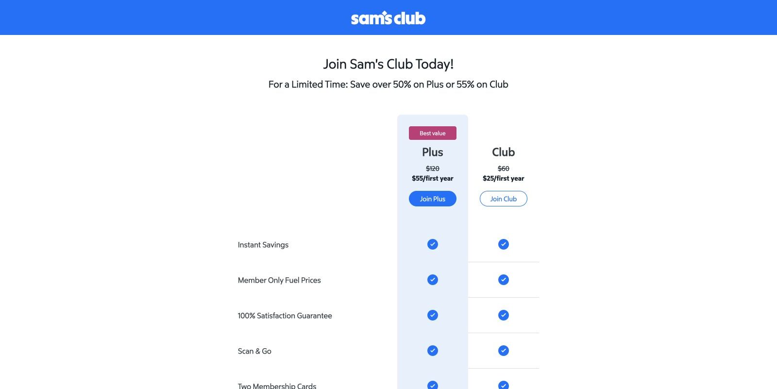
Costco vs Sam’s Club: which basic membership journey is clearer?
A hands-on US comparison of plan choice, promotional pricing, form recovery, accessibility and mobile performance.
02
A fair test, not a hot take
01 / Same task
Comparable journeys
Both websites get the same realistic goal, location, device and stopping point.
02 / Visible evidence
Show where it happened
Important findings include the exact page, page area and an annotated screenshot.
03 / Plain English
Useful fixes
Every recommendation explains what to change, where to change it and why it matters.
Your website has evidence these public comparisons cannot see
See what real visitors are trying to do—and where they get stuck.
UX Robot connects your analytics, search data and behaviour evidence, then turns it into a practical, prioritised audit.