Independent public comparison
We asked the National Trust and English Heritage to sell the same kind of membership: one adult aged 26 or over, paying annually, then continued to the first personal-details step. We are not affiliated with either charity. This records the public journeys on 27 September 2026; prices and offers can change.
The individual membership test
Compare one-year individual memberships, choose the adult 26+ option and reach the first personal-details step without creating an account or paying.
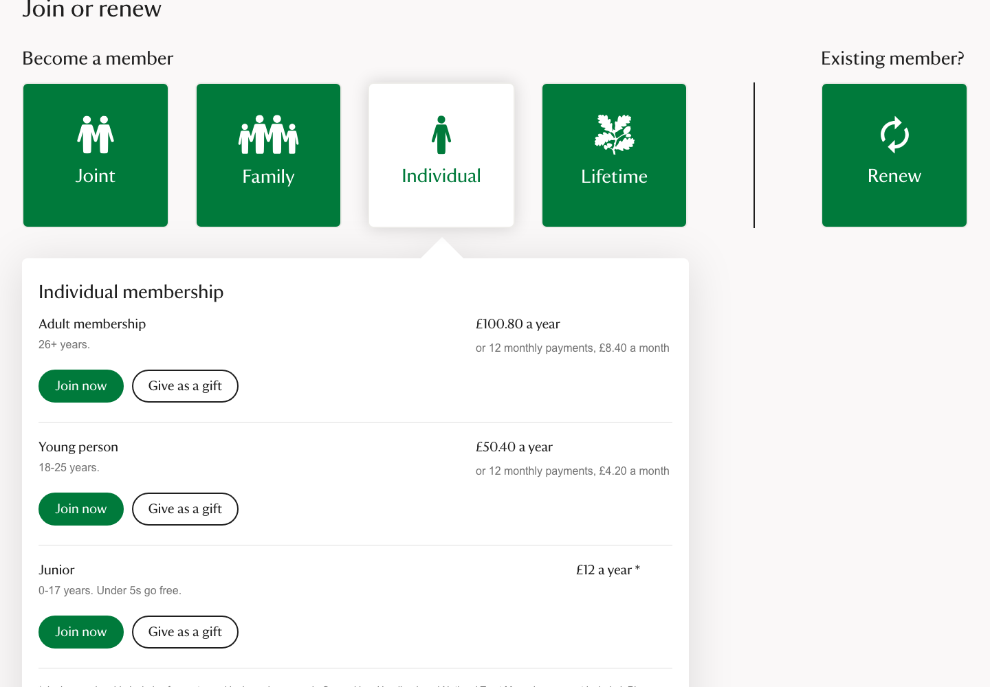
Adult individual membership: £100.80 a year or 12 monthly payments of £8.40.
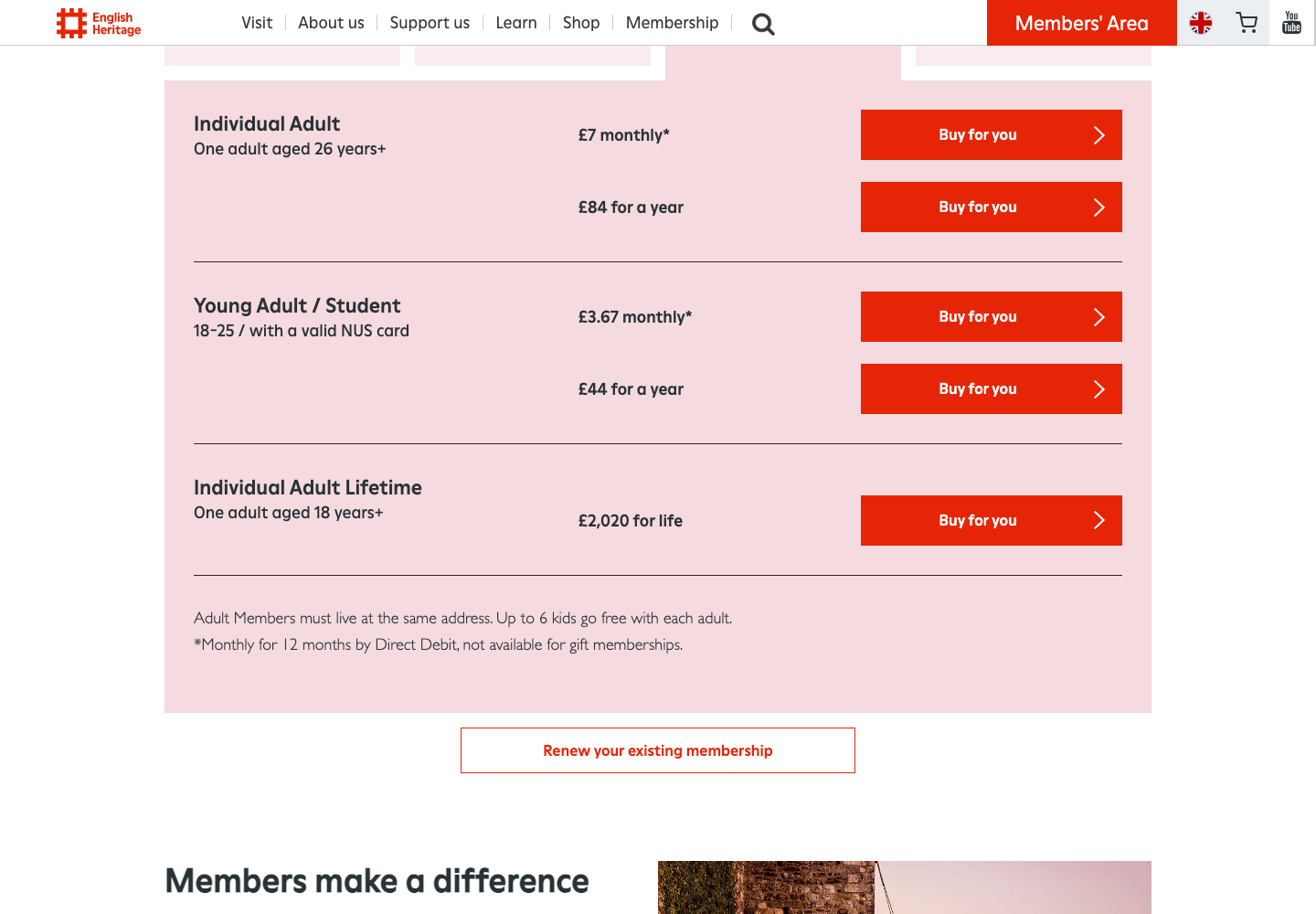
Individual Adult membership: £84 a year or £7 monthly by Direct Debit.
United Kingdom, unsigned-in desktop Chrome session at 1440 × 1000 pixels, prices in pounds sterling.
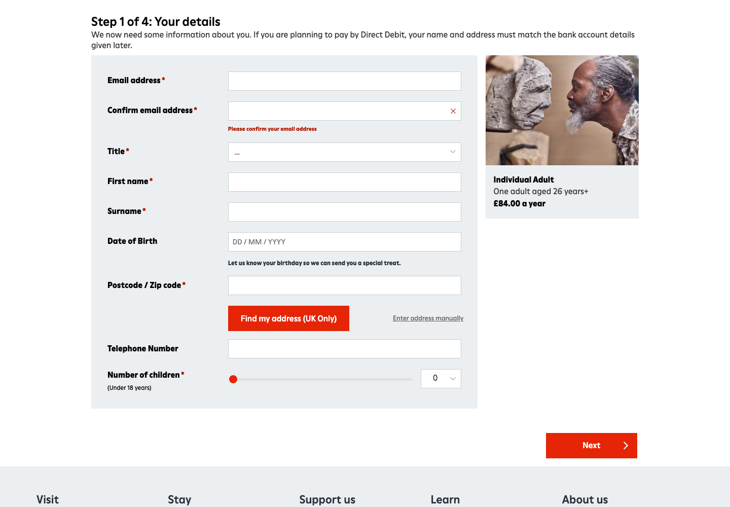
The first personal-details form and an empty required-field validation attempt. No account or membership was created.
Annual individual membership. The organisations cover different places and benefits, so price alone is not like-for-like value.
The 30-second result
English Heritage made the annual price and checkout step easier to understand. National Trust offered the broader place count.
English Heritage wins this public joining task. Its comparable adult plan cost £16.80 less for the year, kept the £84 selection visible beside the details form and named the missing email confirmation beside the field. National Trust clearly separated adult, young-person and junior options and promoted access to more than 500 places, but its first checkout step required account creation and the observed empty submission produced only “Please check the information you’ve provided” at the top of the form. The winner is about clarity and recovery, not which collection of places is better value for a particular visitor.
Both found the right membership, but English Heritage made the payment choices more repetitive
National Trust used four large membership-type tabs: Joint, Family, Individual and Lifetime. Selecting Individual revealed Adult, Young person and Junior rows with the age rule, annual price, monthly equivalent and separate “Join now” and “Give as a gift” actions. The hierarchy made it easy to rule out the wrong audience before committing.
English Heritage used Family, Joint, Individual and Senior cards, then exposed both monthly and annual rows for the chosen type. That made the two payment schedules visible, but repeating the same “Buy for you” label beside each amount asked the customer to infer which button belonged to which schedule. The price was unambiguous; the action labels could carry more information.
Round result / Draw
National Trust made the audience choices easier to scan. English Heritage made the two payment schedules easier to compare.
English Heritage was £16.80 cheaper; National Trust advertised wider access
The National Trust adult plan cost £100.80 for a year, or £8.40 across 12 monthly payments. Its public page promised free entry to more than 500 places, free parking at most National Trust car parks, a handbook and three magazines a year. An annual Direct Debit also advertised a guest pass under the current offer.
English Heritage charged £84 for a year, or £7 monthly for 12 months by Direct Debit. It described unlimited visits to more than 400 historic sites, free parking at most sites, free or reduced-price events and entry for up to six children or grandchildren under 18 per adult member within the family group.
The annual difference is simple: English Heritage was £16.80 cheaper for the tested adult tier. The value comparison is not simple. Place mix, geography, parking, children, events and the likelihood of repeat visits matter more than the raw count for many customers. Both sites should help people turn those benefits into a realistic “places near me” value before joining.
English Heritage kept the selection visible and gave the more useful error
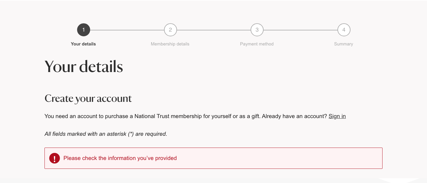
National Trust opened a four-step checkout: Your details, Membership details, Payment method and Summary. The page immediately said an account was required to buy a membership, then asked for email and password before the remaining identity and contact fields. When the empty form was submitted, the observed feedback was a single general banner: “Please check the information you’ve provided.” That confirms a problem without telling the customer where to begin.
English Heritage also used four steps and stopped first at Your details. It kept an Individual Adult card with “£84.00 a year” beside the form, so the customer could verify what they were buying. The form asked for email, confirmation, title, name, optional date of birth, postcode, optional telephone and number of children. After an empty Next attempt, it placed “Please confirm your email address” beside the confirmation field. That local instruction gave the customer a concrete recovery point.
Round winner / English Heritage
The chosen plan stayed visible and the observed error identified a recovery action beside the affected field.
Real visitors saw good loading and layout stability; interaction needs attention
These are exact-page p75 phone records from the Chrome UX Report for 29 August to 25 September 2026. “p75” means 75% of qualifying visits were at or faster than the stated value. Both pages met the good thresholds for Largest Contentful Paint and Cumulative Layout Shift. Interaction to Next Paint was above the 200ms good threshold on both, with English Heritage slower at 285ms.
The configured mobile PageSpeed runs reinforced different engineering priorities. National Trust’s result named late discovery of the largest image, render-blocking CSS and tag-management JavaScript, unused JavaScript and heavy image delivery. English Heritage’s result attributed more than five seconds of its lab LCP to element render delay and also named render-blocking CSS and JavaScript, unused code and forced reflow. Lab diagnostics explain where to investigate; the field records show that loading still met the public good threshold for most qualifying phone visits.
The automated checks found structural barriers on both start pages
National Trust scored 92 for accessibility in the configured mobile PageSpeed run. It identified invalid ARIA on the cookie layer and a cookie dialog without an accessible name. English Heritage scored 83 and returned a broader set: unnamed mobile controls and input fields, skipped heading levels, no page language, a link without a name and disabled or restricted page zoom.
Those are actionable component defects, not a complete accessibility verdict. Manual testing should still cover keyboard access to the membership cards, focus movement after errors, announcement of price and payment schedule, zoom, screen-reader labelling and recovery from every required field. Automated scores do not prove accessibility or WCAG conformance.
All ten Nielsen usability heuristics
Keep the chosen product visible.
English Heritage preserved the £84 annual card beside the details form; National Trust’s progress indicator showed the stage but not the chosen price in the captured area.
Translate membership into likely visits.
Place counts are useful, but nearby places and visit frequency would make value more concrete.
Separate self, gift and renewal routes.
Both sites made these intentions visible before personal details.
Name the payment schedule in the action.
English Heritage repeated “Buy for you” beside two different schedules instead of saying annual or monthly.
Confirm price before identity.
English Heritage’s summary reduced the chance of completing details for the wrong product.
Keep age rules with each tier.
Both plan selectors did this well.
Support annual and Direct Debit comparison.
Both showed a monthly equivalent without making the customer calculate it.
Reduce repeated calls to action.
English Heritage’s repeated identical buttons made the selected schedule easier to misread.
Name the first field that needs attention.
English Heritage supplied a local message; National Trust’s visible banner was too general.
Explain the product differences before checkout.
Both listed benefits, but local place discovery would better answer “which membership suits me?”
What each website gets right
National Trust
- Audience and age rules are easy to scan.
- Annual and monthly amounts reconcile exactly.
- Self, gift and renewal routes are clearly separated.
- The breadth of access and parking benefit are stated early.
English Heritage
- The tested adult plan is cheaper.
- The selected plan and price remain visible at personal details.
- The four-step structure sets expectations.
- The observed validation message is specific and local.
What we would change first
Turn the general banner into a linked error summary.
What
Name every invalid field, move focus to the summary and link each item to its field.
Where
The first step at join.nationaltrust.org.uk after an unsuccessful Continue action.
Why
“Please check the information you’ve provided” confirms failure without telling the customer where to recover.
Measure
Repeat submissions, time to first corrected field, abandonment and keyboard completion.
Name the schedule in every purchase action.
What
Replace repeated “Buy for you” labels with “Choose £7 monthly” and “Choose £84 annually”.
Where
The Individual section on the public join page.
Why
Two identical labels ask the customer to preserve row context while acting.
Measure
Back navigation, schedule switches, checkout exits and payment-schedule support queries.
Connect benefits to nearby places and likely visits.
What
Offer a postcode-led preview of nearby included places, parking and simple break-even examples.
Where
Before the membership-type selector and beside the annual price.
Why
“More than 500” and “more than 400” do not reveal which product is useful to one household.
Measure
Place-preview use, membership selection, checkout progression and cancellations attributed to poor fit.
Fix the accessibility contracts and retest manually.
What
Name dialogs and controls, correct ARIA and heading order, set the page language and preserve browser zoom.
Where
National Trust’s cookie layer and English Heritage’s join-page navigation, carousel and document shell.
Why
The configured mobile audits found structural issues that can obstruct interpretation and navigation.
Measure
Automated component regressions plus successful keyboard, zoom and screen-reader membership selection.
Investigate the components behind p75 interaction delay.
What
Profile membership tabs, carousels, consent layers and tag execution during real interactions; reduce main-thread work where it delays feedback.
Where
The exact membership and join templates measured by CrUX.
Why
Phone INP was 218ms for National Trust and 285ms for English Heritage, above the 200ms good threshold.
Measure
Exact-page phone INP at p75 alongside plan selection and checkout progression.
What this public comparison cannot see
These memberships cover different properties, geographies, events and family benefits. We did not create accounts, enter identity or address details, choose Direct Debit or card payment, submit payment, join, renew, cancel or visit a property. We stopped at the first personal-details step.
We cannot say which membership converts, retains or satisfies people better. GA4, Search Console and Microsoft Clarity could show which benefits people seek, where plan selection stalls, how errors recover and whether nearby-place discovery improves completed memberships.