Independent public comparison
We gave both US websites the same planning job and followed each booking journey to the payment boundary: one adult travelling one way from central New York to Boston on 15 October 2026. We are not affiliated with Amtrak or Greyhound. This is a review of one public journey on one day—not a judgement on either transport service as a whole.
The test
Find the lowest published direct fare departing between 9:00 a.m. and noon from a central New York terminal to Boston South Station for one adult, then continue to payment.
Before entering payment details or buying a ticket. We used a reserved example.com email and fictional traveller details.
US websites in desktop Chrome on the same computer, with no mobile emulation. Prices are a captured example, not a value comparison between train and bus travel.
24 September 2026.
The 30-second result
Greyhound made the checkout shorter. Amtrak made the ticket safer to choose.
Greyhound kept the full price and booking summary in view on one page. Amtrak did more to explain what each fare allowed before selection. Both then weakened trust: Greyhound preselected an accommodation referral, while Amtrak used unequal language and social proof when asking about travel protection. There is no clean overall winner.
The journey at a glance
Amtrak
More pages, stronger fare explanation
- Search New York Penn to Boston South Station.
- Choose the 10:01 a.m. Northeast Regional.
- Compare Sale, Value and Flex terms.
- Review extras and enter traveller details.
- Choose whether to add travel protection.
$68 shown through to payment; stopped before purchase.
VS
Greyhound
One checkout, persistent total
- Search New York to Boston.
- Remove the preselected accommodation option.
- Choose the 9:40 a.m. direct Greyhound trip.
- Review seats, baggage and contact details.
- Reach the available payment methods.
$35.98 shown in results and at payment; stopped before purchase.
Round 1: setting up the trip
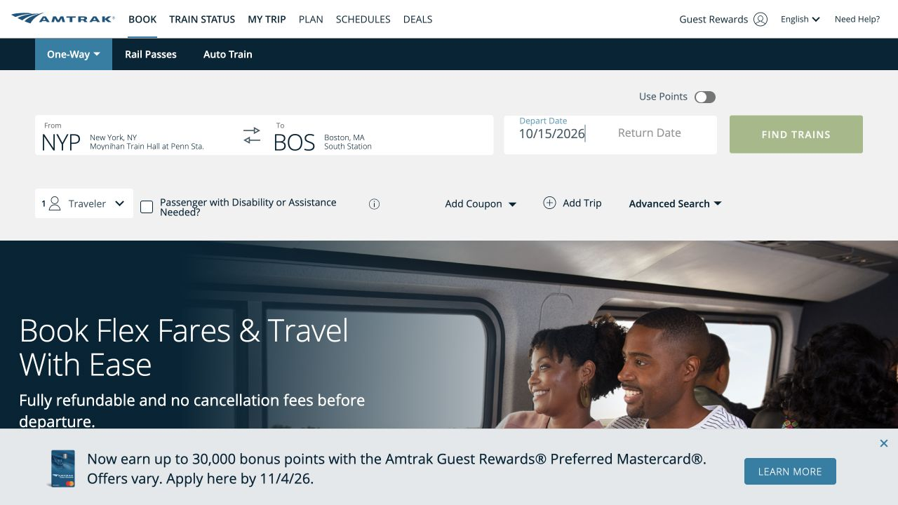
Both forms made the essential route, date and passenger choices visible. The important difference was whether the interface added an unrelated choice for the traveller.
Amtrak kept the search focused on rail travel
Amtrak displayed the full station names behind the NYP and BOS codes, made one-way travel explicit and kept optional controls such as coupons and accessibility needs separate from the main route. That reduced the risk of choosing the wrong Boston station.
Greyhound quietly added an accommodation choice
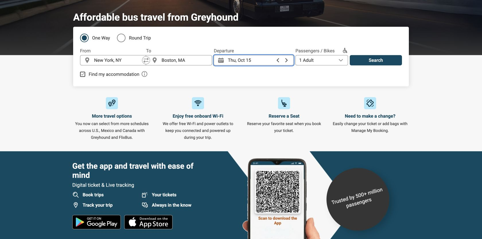
Greyhound’s route and date fields were compact and easy to scan. However, “Find my accommodation” was selected before we made a choice. We cleared it before searching so the bus task would not open or involve an accommodation partner. An optional referral should begin unchecked.
Round winner / Amtrak
The starting form respected the task without adding a default referral.
This is a user-control issue, not a complaint about accommodation itself. Nielsen Norman Group’s practical checkbox guidance recommends leaving optional choices unchecked by default.
Round 2: choosing the departure
A fare is not only a price. People also need to understand time, terminal, transfers and what happens if plans change.
Amtrak put the trade-off inside the selection
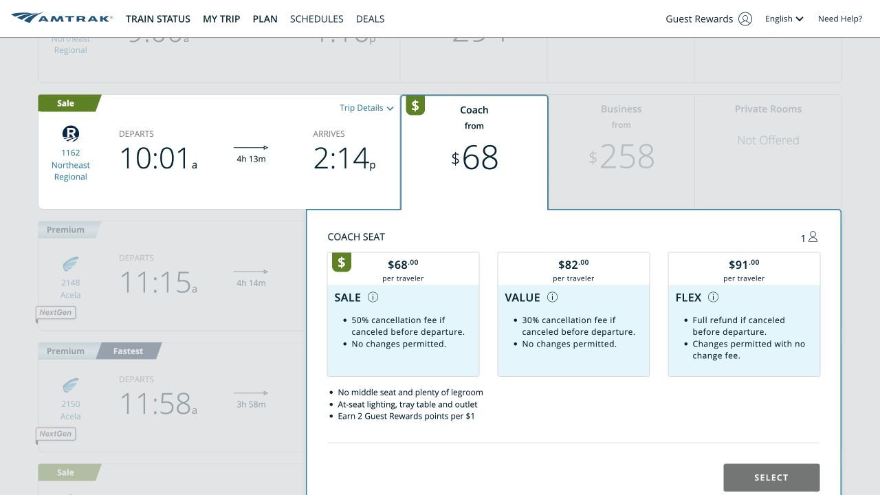
Amtrak returned 13 departures. We chose train 1162, leaving at 10:01 a.m. and arriving at 2:14 p.m. The expanded Coach choice compared three fare families side by side: Sale at $68, Value at $82 and Flex at $91. Cancellation fees, change restrictions and refund flexibility were visible before selection.
Greyhound made the timetable clear but the action labels generic
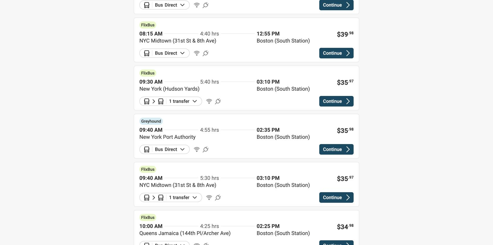
Greyhound returned 64 options spanning Greyhound and FlixBus, direct and connecting trips, and several New York departure points. Filters for departure time, transfers, price and duration helped. We chose the direct 9:40 a.m. Greyhound from New York Port Authority to Boston South Station, arriving at 2:35 p.m. for $35.98.
The visible cards did not show change or refund terms, and every trip action in the accessibility tree had the same name: “Continue”. Sixty-four identical action names force a screen-reader user to recover the surrounding trip context each time.
Round winner / Amtrak
The fare rules were part of the decision, not homework for later.
Greyhound’s station and transfer information was useful, but Amtrak gave stronger recognition rather than recall by placing the conditions beside each price.
Round 3: details, extras and payment
Greyhound compressed the remaining work into one numbered page. Amtrak split it into clearer stages, then put two promotional decisions in the path.
Greyhound kept the total stable and visible
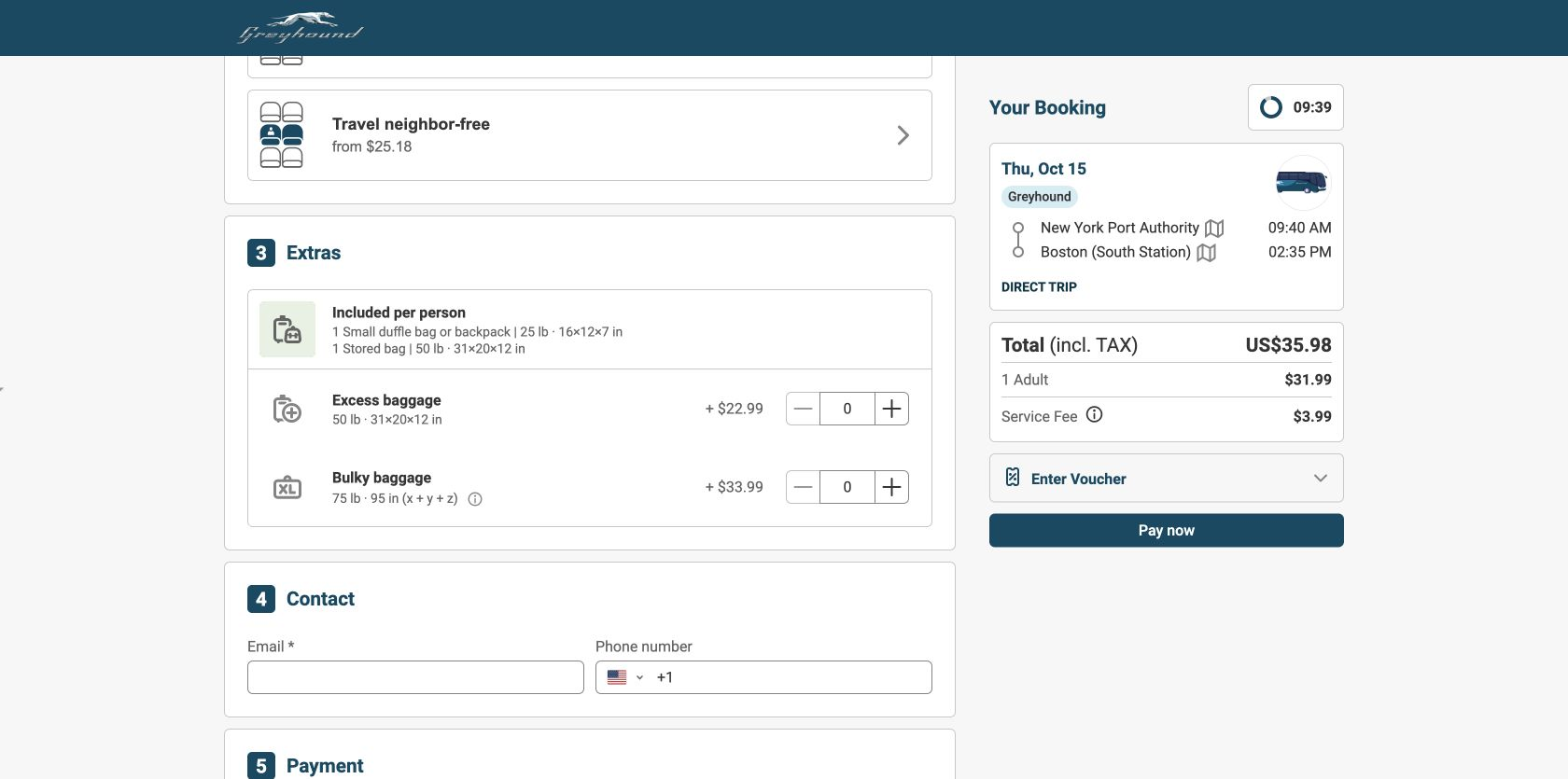
The checkout numbered Passengers, Seat Reservation, Extras, Contact and Payment. Its persistent summary preserved the route and showed a tax-inclusive total of $35.98—the same amount as the result card—made up of a $31.99 adult fare and a $3.99 service fee. Included baggage was stated before optional extra and bulky bags. Only first name, last name and email were required before payment; phone was optional.
Amtrak asked for more information and added more decision friction
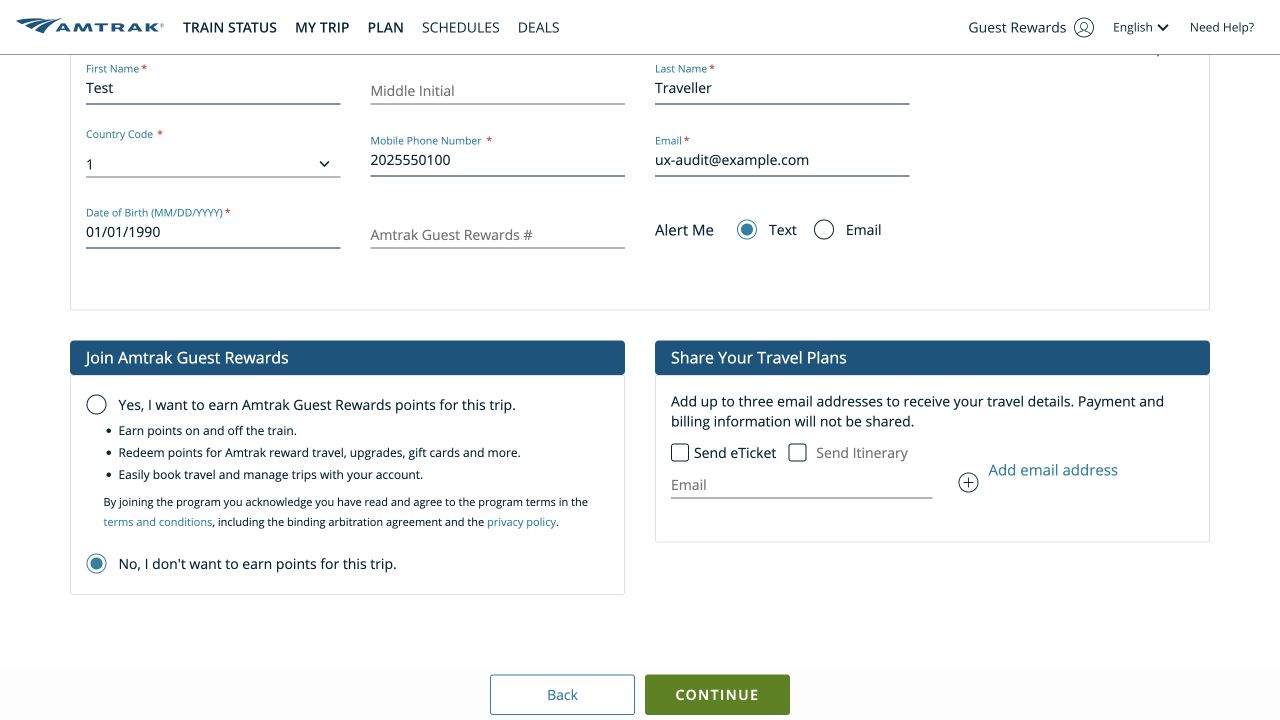
Amtrak required first and last name, mobile number, email and date of birth. It then asked whether the traveller had a Guest Rewards number and offered two ways to share travel plans. In the accessibility tree, both share checkboxes were named “Send eTicket” even though the second visible label was “Send Itinerary”.
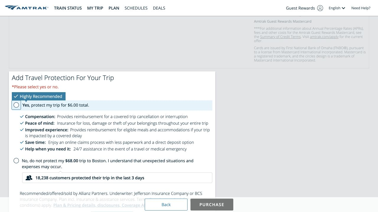
At payment, a credit-card promotion preceded a required travel-protection choice. “Yes” was marked “Highly Recommended”; the decline option said the traveller understood that unexpected situations and expenses might occur, and the dialog added that 18,238 customers had protected a trip in the previous three days. This makes the two valid choices feel unequal. Neutral language can still explain coverage without pressuring the decline.
Round winner / Greyhound
One page preserved the route, total and next step.
Greyhound still needs clearer ticket conditions and accessible action names. Within checkout itself, however, the numbered sequence and stable total reduced backtracking and memory load.
What real-user performance data says
Greyhound’s desktop origin was good on all three Core Web Vitals. Both phone origins need work beyond loading speed, and Amtrak’s phone interaction and layout stability are the clearest warnings.
These are 75th-percentile Chrome UX Report origin results for 26 August–22 September 2026. “p75” means 75% of qualifying visits were at or better than the number shown. Google’s good thresholds are LCP at or below 2.5 seconds, INP at or below 200 milliseconds and CLS at or below 0.10.
Scope: these Chrome UX Report figures cover each entire website, not the booking pages tested above. They are useful for spotting broad performance patterns, but they cannot tie a slow interaction or layout shift to a particular page.
Amtrak’s 747-millisecond phone INP is the standout concern, and its phone CLS is also poor. Greyhound’s phone experience needs improvement for both interaction and stability, while its desktop origin is good on all three metrics. Page-level profiling is needed before attributing any result to the search or checkout journey.
Automated accessibility and quality checks
The mobile Lighthouse checks found a much larger automated quality gap on Amtrak’s public start page. The booking-journey inspection then exposed control-name problems that a single page score could not cover.
Mobile Lighthouse accessibility score.
Mobile Lighthouse best-practices score.
Mobile Lighthouse accessibility score.
Mobile Lighthouse best-practices score.
These lab runs used the mobile strategy on the public start pages—Amtrak and Greyhound—on 24 September 2026. Amtrak’s automated accessibility failures included invalid ARIA, low-contrast text, a missing image alternative, unnamed links and visible-label/access-name mismatches. Its quality diagnostics also flagged layout-shift culprits, forced reflow, render-blocking resources and image-delivery opportunities. Greyhound’s remaining automated issues included heading order, small or tightly spaced targets, two SVG images without accessible text and a stretched image.
The scores describe those start-page snapshots, not the session-dependent results and checkout screens. They are diagnostic leads rather than a verdict on the entire booking journey.
Two different “Share Your Travel Plans” checkboxes shared the accessible name “Send eTicket”. The payment terms checkbox had no accessible name in the inspected tree. One trip-summary image was announced as “undefined”.
All 64 result actions were exposed as “Continue”. The name did not identify a departure time, operator or terminal, so the control made less sense when read outside its visual card.
These map to WCAG 2.2 requirements around names, labels and programmatic relationships. Give every control a name that matches its visible purpose and supplies enough context. Then test the complete journey with keyboard-only navigation and screen readers.
This is not a compliance verdict. An accessibility-tree inspection and automated checks cover only part of the experience. They do not establish WCAG conformance and cannot replace testing by people who use assistive technology.
All ten Nielsen usability heuristics
The review considered every heuristic across the observed journey. A strength or concern appears only where the interface supplied evidence.
Keep the itinerary and price in sight.
Greyhound’s persistent summary did this particularly well. Amtrak also preserved the chosen train and fare across its staged flow.
Use full station names around transport codes.
Both sites paired cities with actual terminals. Amtrak explained NYP and BOS, while Greyhound distinguished Port Authority, Hudson Yards, Queens and South Station.
Optional extras should begin as the traveller’s choice.
Greyhound’s selected accommodation referral and Amtrak’s unequal protection language both made opting out harder than it needed to be.
Name repeated actions with enough context.
“Continue” is visually conventional, but 64 identical accessible names do not tell a screen-reader user which trip each button continues.
Confirm the terminal before commitment.
Full station names, times and persistent summaries reduced the risk of buying a trip from the wrong place. Greyhound’s variety made this especially important.
Put the restriction beside the fare.
Amtrak’s side-by-side Sale, Value and Flex terms let people compare without remembering rules from another page. Greyhound did not expose equivalent change or refund terms in the inspected result or checkout summary.
Help people reduce a long result set.
Greyhound’s sorting and filters for time, transfer, price and duration supported faster scanning. Amtrak’s smaller set needed less reduction.
Keep promotions subordinate to the booking.
Greyhound’s single page contained several extras but retained a clear sequence. Amtrak’s credit-card offer and protection dialog interrupted the final payment stage.
Both forms named the problem and recovered after correction.
Greyhound focused the first missing field and identified the required first name, last name, email and payment choice. Amtrak named the invalid phone number, email address and date of birth. After we corrected the non-payment fields, both forms cleared those errors: Amtrak enabled Continue, while Greyhound left only the unselected payment method. We did not enter payment details, authorise payment or buy a ticket.
Baggage help was timely; ticket-condition help was uneven.
Both sites explained baggage before payment. Amtrak also surfaced fare conditions during selection; Greyhound’s inspected flow left change and refund rules less visible.
What each website gets right
Amtrak
- Full station names support confident route selection.
- Fare restrictions are visible before selection.
- The chosen train and $68 fare persist through the journey.
- Baggage and paid extras are explained before payment.
- Origin-level LCP is good on phone and desktop.
Greyhound
- Filters help people navigate a large, mixed result set.
- Times, transfers, operators and terminals are visible on each card.
- The result price matches the tax-inclusive checkout total.
- The one-page checkout keeps the itinerary in view.
- Desktop origin-level LCP, INP and CLS are all good.
What we would change first
Each recommendation states what to change, exactly where to change it, why it matters and how to tell whether it worked.
Make the travel-protection decision neutral and balanced.
What
Give Yes and No equivalent prominence, remove consequence-focused language from the decline label and place factual coverage details outside both choices.
Where
The travel-protection dialog on the payment page, after traveller details.
Why
“Highly Recommended”, social proof and the warning attached to No can pressure a valid optional decision.
Measure
Protection selection reversals, payment-page exits, completion rate and protection-related complaints or refund requests.
Leave “Find my accommodation” unchecked.
What
Require an explicit opt-in before involving an accommodation partner.
Where
The checkbox directly below the route, date and passenger fields on the Greyhound homepage.
Why
A bus search should not carry an unrelated referral choice that the traveller must notice and reverse.
Measure
Deliberate accommodation opt-ins, immediate toggle-offs, unexpected partner-tab exits and completed bus searches.
Give every Continue button a trip-specific accessible name.
What
Keep the visible label short, but include operator, departure time, origin and destination in its accessible name.
Where
Every trip card in the New York–Boston results list.
Why
Sixty-four identical “Continue” controls are ambiguous when read outside their visual cards.
Measure
Screen-reader task success, assistive-technology abandonment and automated checks for repeated context-free action names.
Repair the accessible names on sharing and agreement controls.
What
Name “Send eTicket” and “Send Itinerary” separately, label the payment terms checkbox and replace the “undefined” image description.
Where
Share Your Travel Plans, trip summary and the payment agreement.
Why
Labels that do not match the visible purpose make review and consent harder for assistive-technology users.
Measure
Automated name-and-label violations, screen-reader completion and errors or support contacts around shared itineraries and terms.
Put change and refund conditions beside the selected fare.
What
Add a concise, expandable ticket-conditions summary to the result card and preserve it in the booking summary.
Where
The selected trip card and the right-hand checkout summary.
Why
The inspected journey explained baggage and extras but did not expose equivalent change or refund terms before payment.
Measure
Condition-summary opens, post-purchase change and cancellation contacts, refunds and checkout completion.
Prioritise interaction delay and layout stability, not just loading.
What
Profile slow interactions and unexpected movement on the highest-traffic search and booking templates, beginning with Amtrak phone INP.
Where
Origin templates contributing to the current p75 INP and CLS results.
Why
LCP is good for all four origin/device groups, while interaction and stability fall outside the good range in three.
Measure
Template-level INP and CLS at p75, search completion, result-to-checkout progression and rage or dead clicks.
What this public test cannot tell us
Prices, availability, result counts and promotional messages can change. Train and bus travel are different services, so the captured fares are context rather than proof of better value. The journeys were inspected in one desktop Chrome session; a complete study would repeat them across phone breakpoints, browsers, locations, keyboard navigation and screen readers. One isolated Amtrak test browser also failed to load its station picker; because the same step worked in Chrome, we treated that as an environment limitation rather than a customer-facing defect.
We cannot see either company’s private analytics, experiments, customer segments, inventory logic or support data. We therefore cannot say which journey converts better or how common an observed problem is. With GA4, Search Console and Microsoft Clarity connected, UX Robot could show where travellers hesitate or leave, which queries and devices are affected and whether each change improves the real journey.