Independent public comparison
We compared the public application journeys for RBC Day to Day Banking and TD Minimum Chequing in Canada. This is a UX comparison, not financial advice, and we are not affiliated with either bank. It records the public journeys on 28 September 2026; fees, offers and eligibility can change.
The low-cost chequing test
Understand the lowest regular-fee chequing account, start a new-customer application and stop before identity submission.
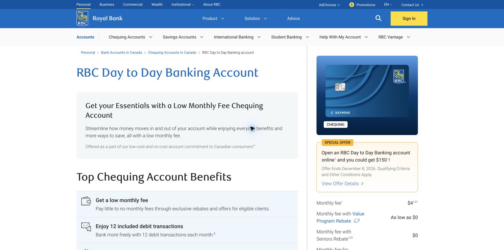
$4 a month, 12 included debit transactions and unlimited Interac e‑Transfers; displayed rebates can reduce the fee.
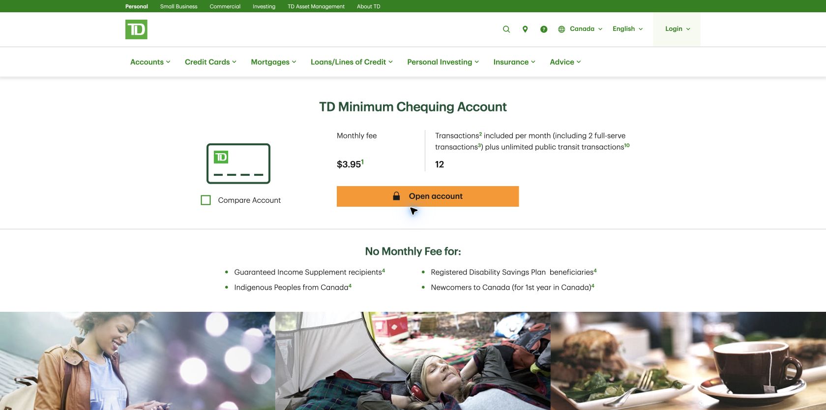
$3.95 a month, 12 transactions including two full-service transactions and unlimited public-transit payments.
Canada, unsigned-in desktop Chrome at 1440 × 1000, prices in Canadian dollars.
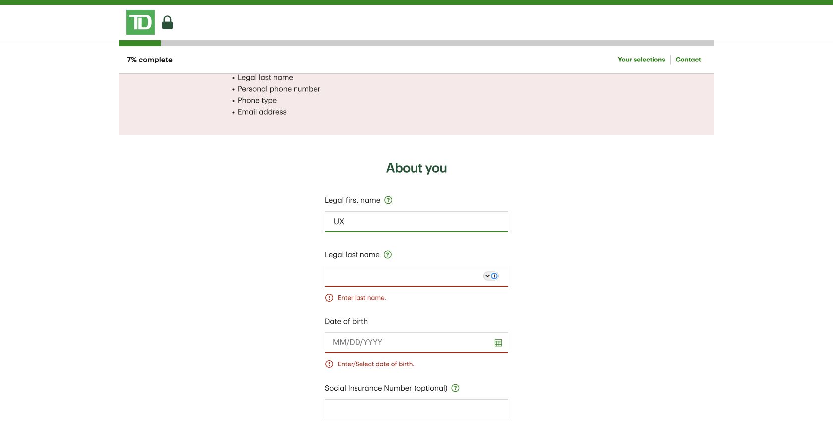
Required personal details before identity evidence or account submission. No identity document, account or application was submitted.
Continue with required details empty, inspect the summary and focus, then correct First name.
The 30-second result
TD wins the application handoff; RBC explains suitability better before the form.
TD repeatedly named the Minimum Chequing Account, offered three identity routes, showed 7% progress and recovered from an empty submission with a linked error summary. RBC was stronger at explaining who the account suits and what extra transactions cost, but its first application screen showed a cart count of one beside a visibly blank “You’ve selected” area. Both recovered correctly when First name was fixed.
RBC does more to prevent a poor account fit
RBC presents Day to Day Banking at $4 a month with 12 debit transactions, unlimited Interac e‑Transfers, public-transit payments outside the monthly limit and no minimum balance. More importantly, “ideal for” and “may not be ideal” sections explain the light-transaction use case. The page also exposes the $1.25 over-limit charge, ATM fees, draft and overdraft costs, and fee-rebate routes.
TD presents Minimum Chequing at $3.95 a month with 12 transactions, two full-service transactions and unlimited public-transit payments. It clearly lists the $1.25 extra-transaction charge and Interac e‑Transfer fees, and it identifies fee waivers for eligible groups. The five-cent monthly difference is negligible beside usage rules, so both banks are right to foreground limits rather than price alone.
Round winner / RBC
Its suitability and “not ideal” guidance better supports an informed decision before application.
TD keeps the chosen product visible; RBC renders an empty selection panel
RBC first asked whether we were an existing customer, then offered the mobile app or the browser. Choosing the browser led to “Let’s get started.” A cart badge showed one item, but the adjacent “You’ve selected” panel was blank. Continue still worked, yet the customer had to trust that the right account remained attached to the application.
TD inserted an optional prompt to add an Everyday Savings Account. “No thanks, open a chequing account only” was available, so the upsell was dismissible, but it still interrupts a customer who has already chosen a product. After dismissal, TD clearly restated “TD Minimum Chequing Account,” listed what was needed and offered identity by ID and selfie, an existing financial institution, or manual questions.
Round winner / TD
The selected account and next requirements remain explicit, despite the avoidable savings upsell.
Both banks deliver useful error summaries
RBC’s About you step responded to an empty Next attempt with “There are 4 errors,” a “Go to first error” control and specific inline messages. Focus landed on the alert. Entering “UX” in First name and moving on cleared that field and reduced the count from four to three.
TD’s contact-information step showed 7% progress and explained that each Continue saves the application and emails a return link. An empty Continue produced “We need your help!” with six linked fields plus inline messages. Correcting First name removed it from the summary. This is a strong error-recovery contract: overview, specific field guidance, focus and live update agree.
TD has the stronger phone field and lab record
These are p75 phone Chrome UX Report results for the exact public account pages from 30 August to 26 September 2026. Both load and remain visually stable within the good thresholds. TD also meets the good interaction threshold; RBC’s 221ms INP narrowly needs improvement.
The configured mobile PageSpeed runs scored RBC 96 for accessibility and 92 for best practices, compared with TD’s 97 and 100. RBC’s exact account page included four images without alternative text. TD’s findings were an unnamed consent dialog and a visible-label/accessibility-name mismatch. These high automated scores do not prove WCAG conformance; identity and application components still need keyboard and screen-reader testing.
All ten Nielsen usability heuristics
Name the selected account at every step.
TD does; RBC’s first application summary was visibly blank.
Explain monthly limits as common activity.
RBC’s suitable/not-suitable framing translates the transaction cap well.
Keep alternative identity routes available.
TD offered three routes instead of forcing a selfie.
Do not interrupt a confirmed product with another sale.
TD’s savings prompt adds an extra decision before application.
State document and contact requirements first.
TD previews what applicants need before starting.
Repeat fee, account and allowance.
Applicants should never infer which product a generic form is creating.
Support app and browser completion.
RBC explicitly offered both routes before personal details.
Remove empty and optional interruptions.
RBC’s blank product panel and TD’s cross-sell both consume attention without advancing the account.
Synchronise summary, field and focus.
Both passed the tested First-name recovery loop.
Keep fee exceptions understandable.
Rebates, waivers and additional charges need plain-language eligibility beside the headline fee.
What we would change first
Render an authoritative selected-account card.
What
Show account name, monthly fee, transaction allowance and a change link before Next.
Where
The “Let’s get started” screen beside the one-item cart badge.
Why
The observed “You’ve selected” region was blank.
Measure
Backtracking, product-switch attempts, application starts and completed applications.
Move the secondary account offer after the core application.
What
Defer the savings invitation or reduce it to a non-blocking option in review.
Where
Immediately after Open account.
Why
The customer has already selected Minimum Chequing and must dismiss another product to proceed.
Measure
Upsell dismissal, exit rate, time to application and genuine multi-product uptake.
Fix the named component defects and test the full identity flow.
What
Add RBC image alternatives; name TD’s dialog and align visible and accessible labels; manually test focus and screen-reader announcements.
Where
The exact product templates and application components.
Why
Automated scores are high, but the remaining defects still affect comprehension.
Measure
Zero component regressions plus successful assisted-technology completion to the identity boundary.
Bring p75 INP below 200ms.
What
Profile account-page controls and reduce unnecessary script and layout work.
Where
The Day to Day product page and its shared navigation/components.
Why
The exact-page field record was 221ms.
Measure
p75 INP alongside offer-detail views and application starts.
What this public comparison cannot see
We stopped before submitting personal data or identity evidence and did not open an account. We did not assess credit, eligibility, approval, account servicing or which fee structure suits an individual. This article compares interface clarity only.
Public testing cannot show which bank completes more applications. GA4 could connect account-detail engagement, cross-sell dismissal, application progress, validation recovery and completion; Search Console could show fee and transaction-limit questions that start the journey; Microsoft Clarity could reveal hesitation around RBC’s blank summary and TD’s optional savings prompt.