Independent public comparison
We compared Origin Energy and EnergyAustralia electricity-only plans for postcode 3000 on the CitiPower network, using the same public Melbourne apartment address to test address matching. We stopped before entering an NMI, identity or account details. We are not affiliated with either retailer. This records the public journeys on 26 September 2026; prices, discounts and eligibility can change.
The Melbourne electricity-plan test
Compare electricity-only residential plans for the same central Melbourne location and reach the last safe step before identity or account information.
Postcode 3000, CitiPower network. The same public apartment address was attempted on both sites.
Each displayed estimate used 4,000 kWh a year on a residential flat tariff and included GST and displayed discounts.
Origin Go Variable and EnergyAustralia Home 365, with the other visible postcode-level options retained for context.
At address or meter confirmation. No NMI, personal identity, account creation or switch request was submitted.
Neither site matched the apartment address. The comparison is therefore of each site’s postcode/CitiPower defaults, not an address-specific quote.
The 30-second result
EnergyAustralia made the annual comparison faster. Origin explained the underlying rate better.
This journey has no fair overall winner because neither retailer confirmed the address. EnergyAustralia’s cards put four annual estimates and their difference from the Victorian Default Offer into one view; Home 365 was the lowest displayed estimate at $1,333 a year. Origin’s Go Variable estimate was $1,377 and its expanded rate panel disclosed 24.15c/kWh plus 112.67c a day. Origin named the failed meter match and offered an NMI route, while EnergyAustralia’s address search simply returned zero options.
EnergyAustralia made four postcode-level outcomes easy to scan
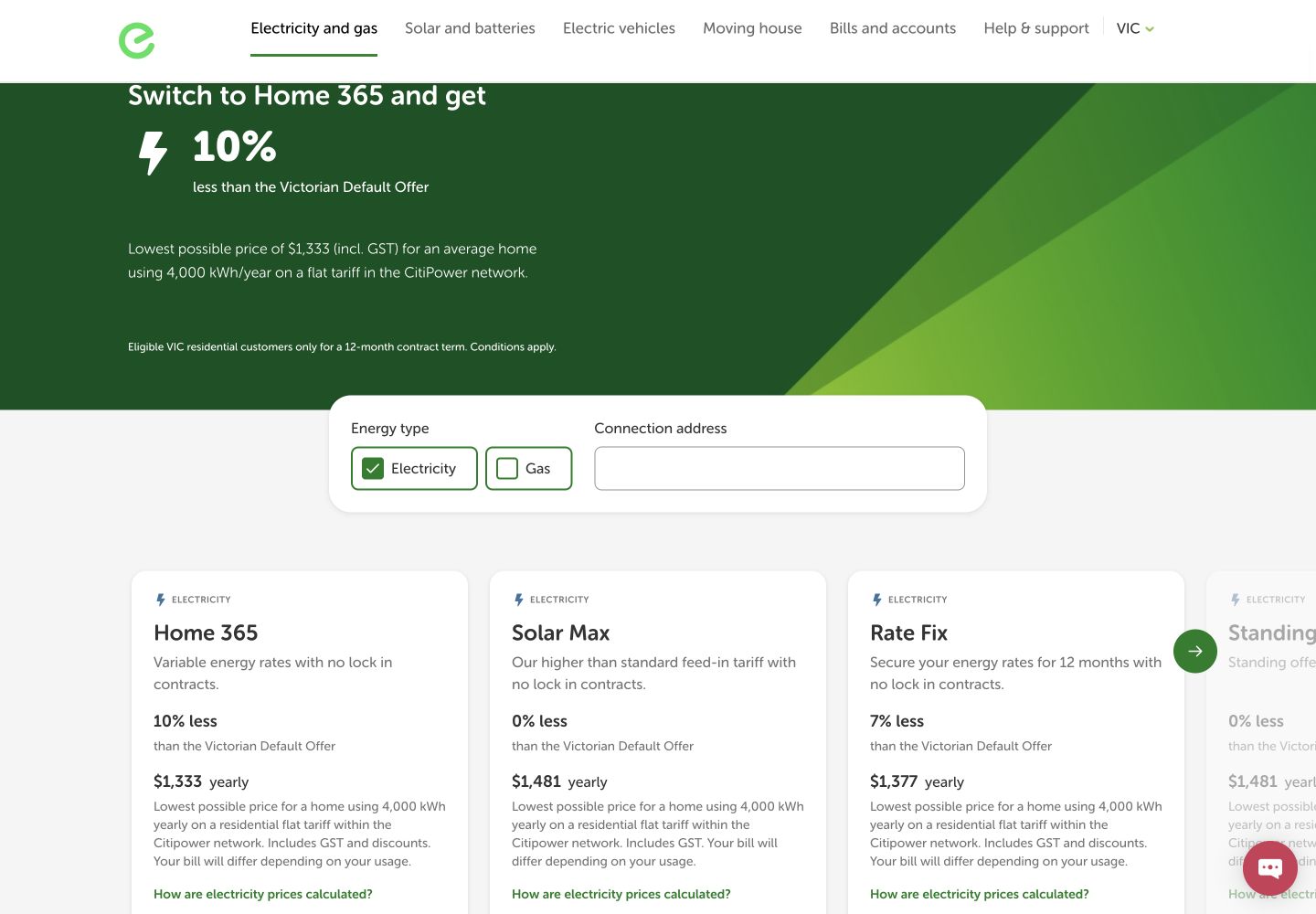
For postcode 3000 and the CitiPower network, EnergyAustralia showed Home 365 at $1,333 a year and 10% below the Victorian Default Offer, Solar Max at $1,481 and 0% below, Rate Fix at $1,377 and 7% below, and Standing Offer Home at $1,481. The cards repeated that the figures assumed 4,000 kWh a year on a flat tariff. Home 365 also named the 12-month eligibility period and a 6c/L Mobil fuel benefit at 7-Eleven.
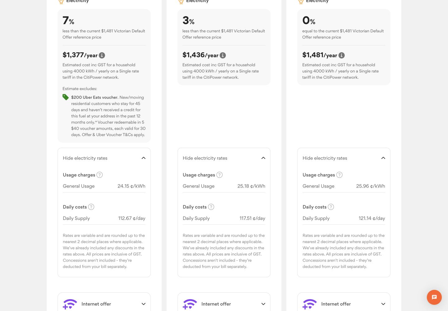
Origin showed Go Variable at $1,377 a year, 7% below the $1,481 Victorian Default Offer; Everyday Rewards Variable at $1,436, 3% below; and Basic at $1,481. Go Variable was a variable-rate plan with no exit fee and a 12-month benefit period. A $200 Uber Eats voucher was shown separately and excluded from the estimate, avoiding an inflated annual-price comparison.
Origin exposed the rate equation; EnergyAustralia asked for an address first
Origin’s expanded Go Variable panel disclosed a single-rate usage charge of 24.15c/kWh and a daily supply charge of 112.67c, both including GST. Everyday Rewards Variable showed 25.18c/kWh and 117.51c a day. Those numbers let a customer challenge the annual estimate against their own bill.
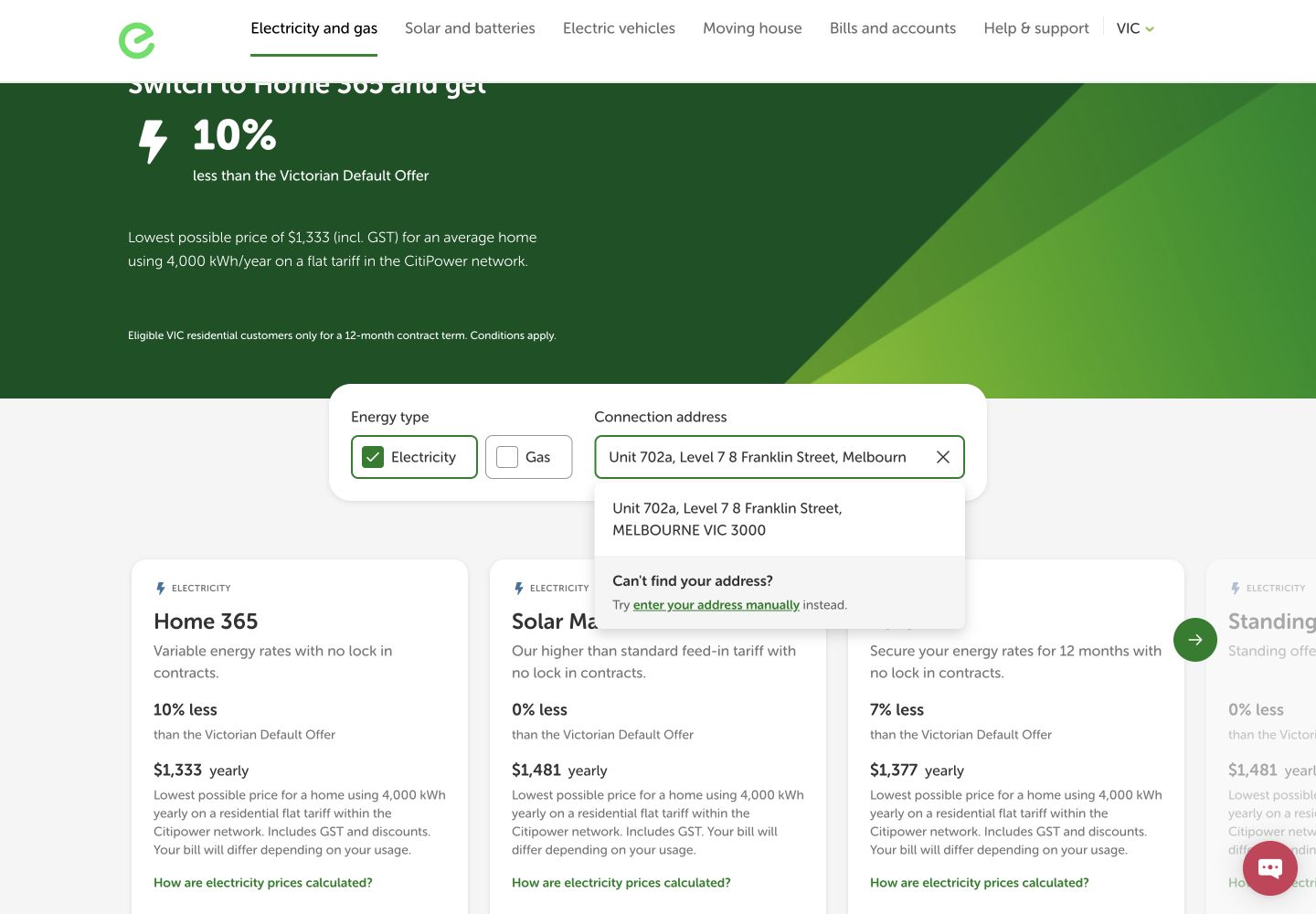
EnergyAustralia’s rate area continued to say that postcode 3000 was a default and asked for a connection address to show specific rates. That is defensible for accuracy, but it left the customer able to compare annual estimates without seeing the inputs needed to verify them.
The same address failed with very different recovery help
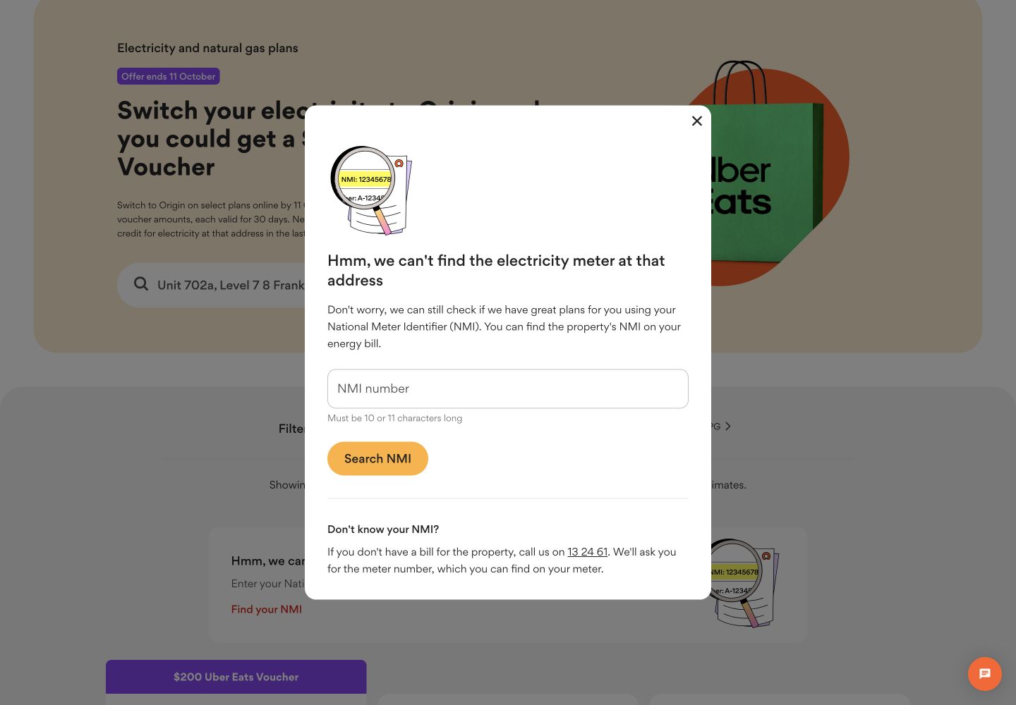
Origin responded “Hmm, we can’t find the electricity meter at that address” and offered an NMI path. That named the failure and the identifier that could resolve it, although an NMI is not something every customer can recall without finding a bill. We stopped there. EnergyAustralia’s autocomplete returned “0 options available” for the same address, without an equally prominent explanation or alternate path in the observed state.
Origin loaded faster; both plan pages moved and responded too slowly on phones
These are 75th-percentile Chrome UX Report results for the exact plans URLs on phones, collected from 28 August to 24 September 2026. Origin met the good LCP threshold, but both exact pages missed good INP and CLS. EnergyAustralia’s 0.20 CLS was twice the 0.10 good threshold.
The configured mobile PageSpeed run scored Origin 97 for accessibility and 50 for best practices. It flagged heading order and a missing main landmark, and its diagnostics identified a hero layout-shift culprit. EnergyAustralia scored 93 for accessibility and 73 for best practices; it flagged unnamed links and small touch targets, while diagnostics named a footer layout shift, font loading and 3.34 seconds of LCP resource-load delay. Automated checks do not establish WCAG conformance.
What each website gets right
- Origin: transparent unit and supply rates, an explicit meter-match error, an NMI recovery route and incentives kept outside the annual estimate.
- EnergyAustralia: a compact multi-plan comparison, a prominent Victorian Default Offer benchmark and plainly stated annual usage assumptions.
All ten Nielsen usability heuristics
State whether pricing is postcode or address specific.
Both retained the postcode default after the address failed, but that distinction could be more persistent.
Translate estimates back to the bill.
Origin’s usage and daily charges supported that translation.
Let people compare before identifying themselves.
Both exposed plan-level information without requiring an account.
Use the same estimate assumptions on every card.
EnergyAustralia repeated the 4,000 kWh basis well.
Do not imply address precision after a match fails.
The fallback should visibly remain labelled postcode/CitiPower default.
Keep rate inputs beside annual estimates.
Origin reduced the need to find and remember numbers from a separate bill.
Offer address, postcode and NMI routes.
Origin offered the strongest alternate identifier; both could explain where to find it.
Separate price from promotions.
Origin correctly kept its voucher out of the annual estimate.
Name what failed and what to do next.
Origin did this; EnergyAustralia’s zero-option state did not.
Explain the VDO, network and NMI in context.
Short definitions would make the regulatory vocabulary usable.
What we would change first
Replace “0 options” with an address-recovery panel.
What
Explain why a unit may not match and offer address variants, postcode comparison and NMI help.
Where
The connection-address autocomplete.
Why
The observed state gave no actionable recovery route.
Measure
Successful matches after zero results, help use and plan progression.
Bring tariff components into the comparison view.
What
Add expandable usage and daily charges to each annual-estimate card.
Where
The postcode-level plan list.
Why
The strongest evidence currently requires opening a second layer.
Measure
Rate-detail opens, plan comparison time and progress to address confirmation.
Stabilise cards and reduce interaction delay.
What
Reserve component space, fix identified shift culprits and reduce main-thread work.
Where
Hero, plan cards, footer and address components on phone layouts.
Why
Both exact pages missed good p75 INP and CLS.
Measure
p75 INP and CLS alongside plan opens and completed quote progression.
Fix named structural and control defects, then test the full flow.
What
Restore a main landmark, repair heading order, name links and enlarge touch targets.
Where
Plans page structure, mobile navigation and footer links.
Why
The lab findings identify concrete barriers that need manual confirmation.
Measure
Component regression tests plus keyboard and screen-reader quote completion.
What this public comparison cannot see
Because neither site matched the apartment, these are postcode/CitiPower default estimates rather than address-specific quotes. We did not supply an NMI, usage profile, concession status, solar details, identity or switch authorisation. Eligibility, final rates, billing, support and switching outcomes are outside this test.
Public evidence cannot say which journey converts better. With consented GA4, Search Console and Microsoft Clarity data, the next comparison would connect address failures, rate-detail use, plan selection and quote progression to completed switches.