Independent public comparison
We asked Expedia and Booking.com to find a refundable Manhattan hotel for two adults for one night, 20–21 October 2026. We compared an available room through the last safe step before guest details or payment. We are not affiliated with either company. This records the public journeys on 26 September 2026; inventory, prices and policies can change.
The refundable Manhattan hotel test
Find a refundable Manhattan room for two adults, compare the total and cancellation terms, and reach the final safe step.
Manhattan, New York.
Check in Tuesday 20 October 2026; check out Wednesday 21 October 2026; one room, two adults.
Omni Berkshire Place on Expedia and The Jewel Hotel NY on Booking.com. These are journey specimens, not hotel recommendations.
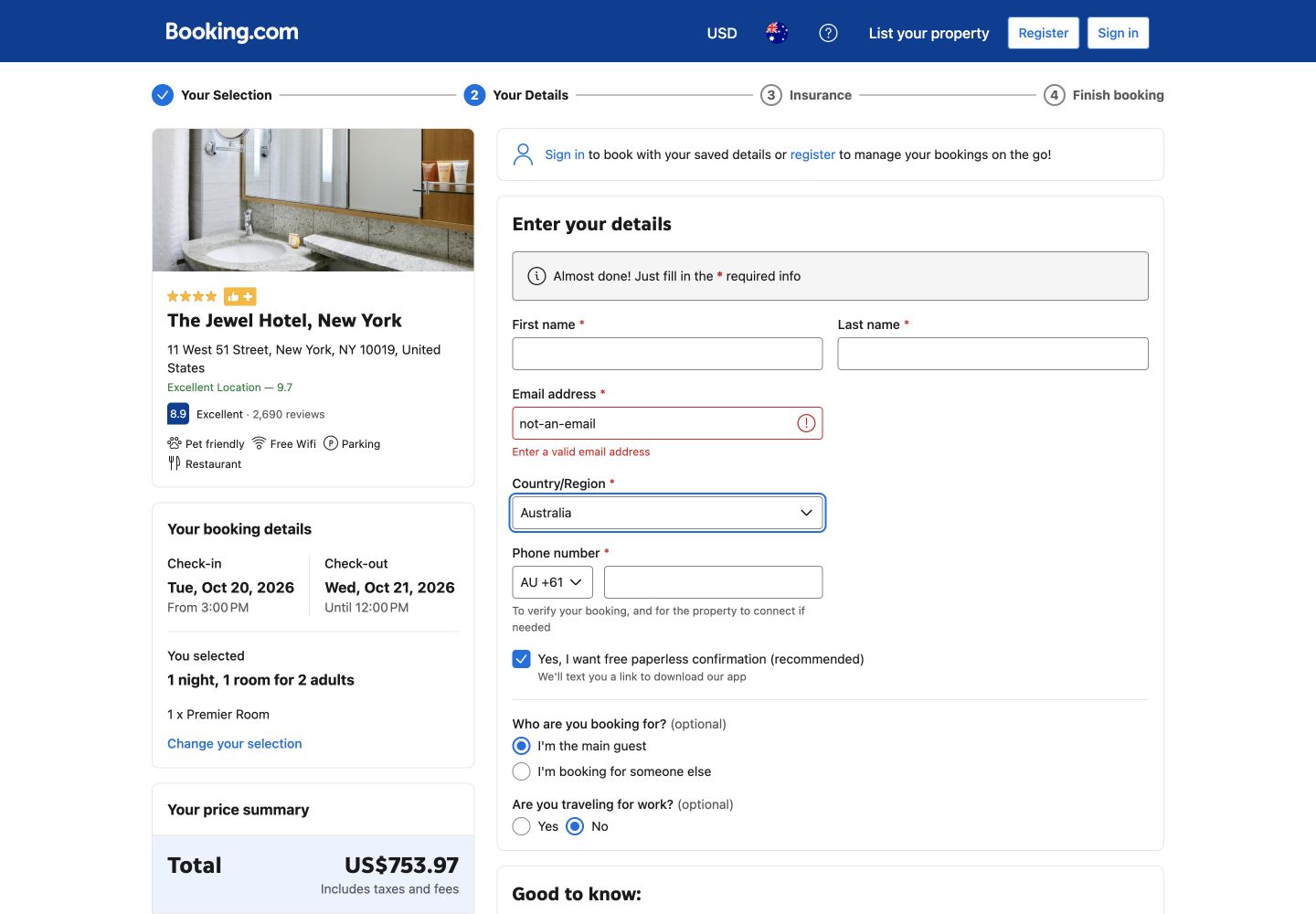
At the guest-details screen. No identity, payment details, booking or payment authorisation was submitted.
Unsigned-in public Chrome session on desktop, followed by phone-width review. Fully refundable/free cancellation was required; different live inventories mean the properties are not price-matched equivalents.
The 30-second result
Booking.com made the refundable room easier to compare. Expedia made the amount due at the hotel exceptionally clear.
Booking.com narrowly wins this public journey. Its room table kept price, cancellation deadline and pay-at-property terms together, and the observed Premier Room total was US$753.97. Expedia was stronger at the checkout handoff: it reconciled the US$989.20 total into taxes, destination fee, tax on fees, US$0 due today and US$989.20 due at the property. Both caught a malformed email inline and recovered after correction.
Both searches preserved the brief, but Expedia surfaced the filter count
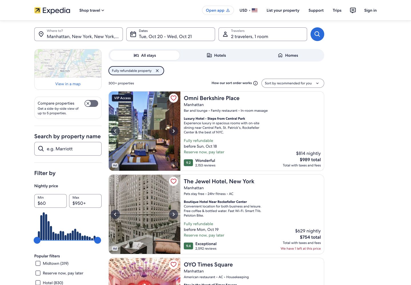
Expedia showed 480 properties after the fully refundable filter was applied. The search summary retained Manhattan, the dates, two travellers and one room, while result cards exposed nightly and total prices. Booking.com also retained the complete search context and made free cancellation a recognisable filter, but the strongest comparison appeared one step later in its property room table.
Booking.com put the decision terms in one row
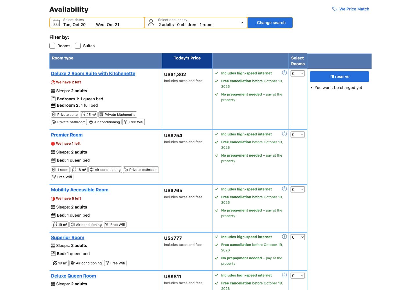
At The Jewel Hotel NY, Booking.com’s table showed a Premier Room with one queen bed, 18m², high-speed internet and a US$754 rounded display price including taxes and fees. The same row stated free cancellation before 19 October 2026 and no prepayment, with payment at the property. That layout reduced the need to move between a room description, policy panel and price summary.
Expedia’s Deluxe Room at Omni Berkshire Place stated two double beds, 271 square feet, Wi-Fi and full refund before Sunday 18 October. It then offered “Pay when you stay” and “Pay total now” as explicit choices. The information was complete, but the customer had to combine more separate panels before committing to a rate.
Round winner / Booking.com
The room, price, cancellation date and pay-at-property rule were visible as one comparable unit.
Expedia explained the cash flow; Booking.com exposed the deposit
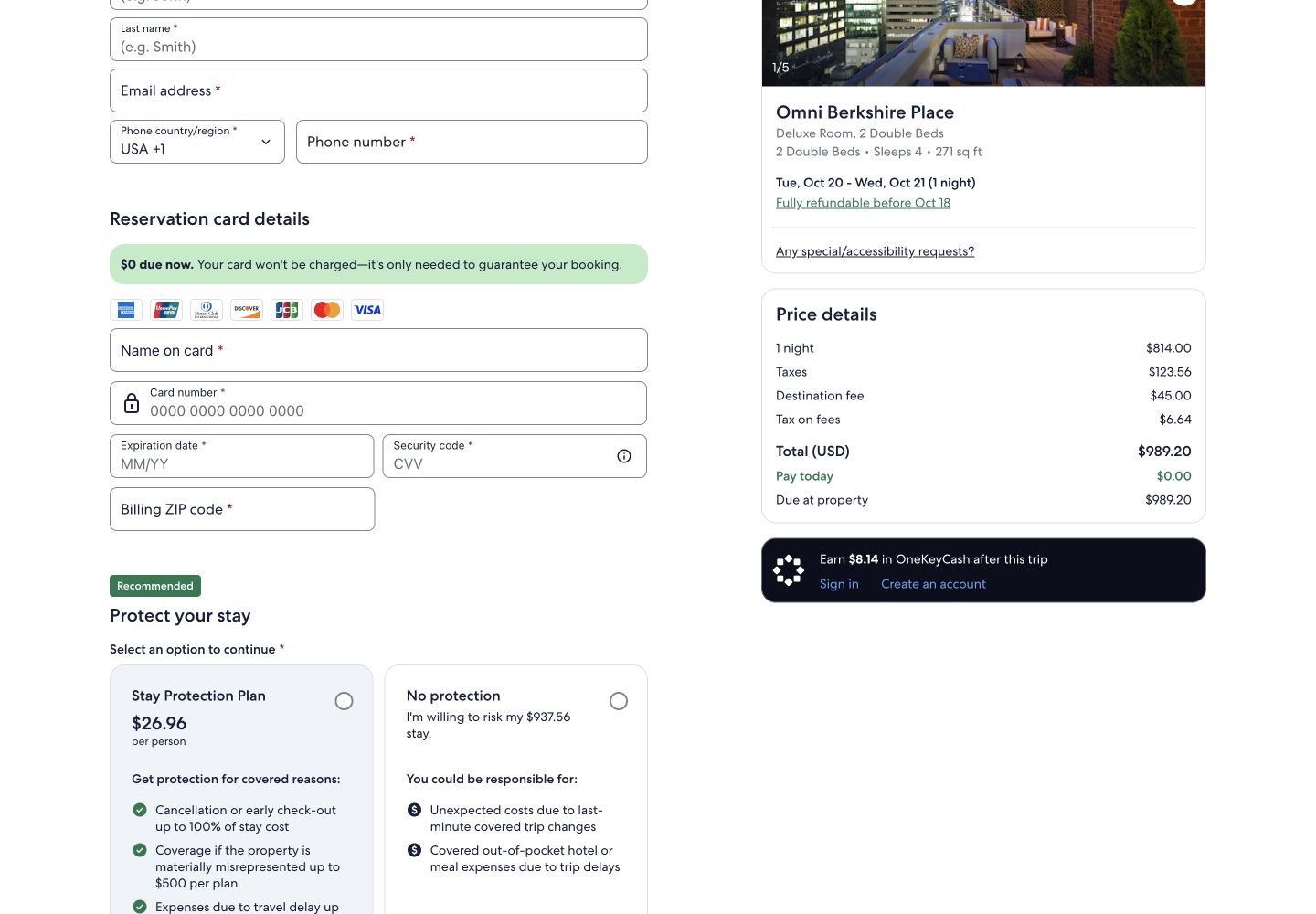
Expedia’s checkout reconciled the price precisely: US$814 room price, US$123.56 taxes, a US$45 destination fee and US$6.64 tax on that fee, for US$989.20 total. It then separated US$0 due today from US$989.20 due at the property. That is unusually effective reassurance for a pay-later rate.
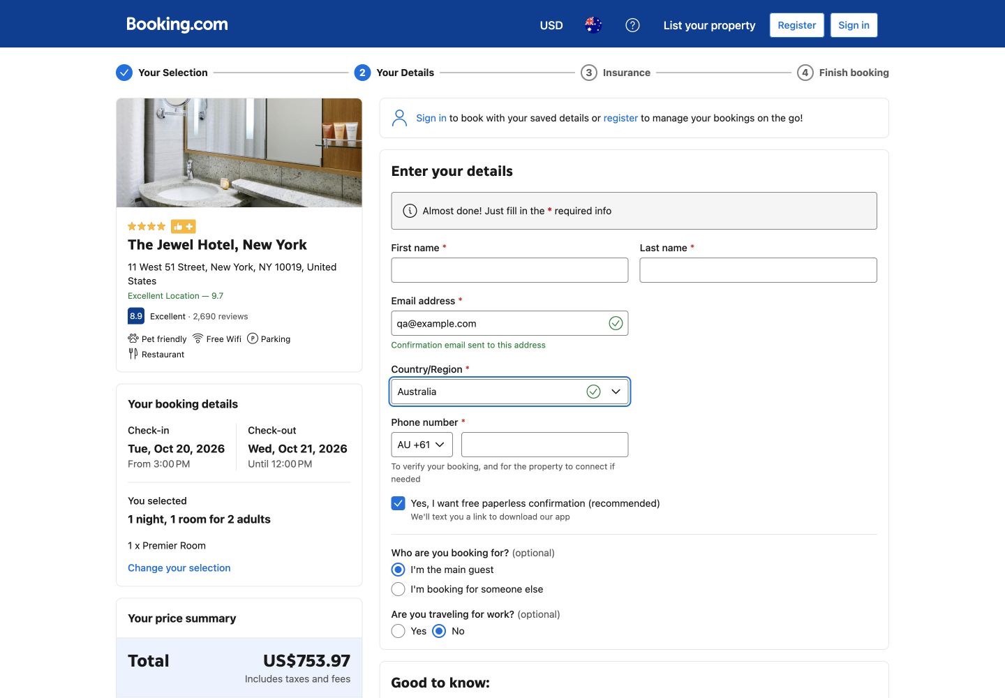
Booking.com showed an exact US$753.97 total, including 14.75% tax of US$96.47, a US$25 resort fee and US$3.50 city tax. It also disclosed a separate US$250 refundable damage deposit. The deposit was visible before personal details, but its separation from the booking total deserved stronger emphasis because it still affects the guest’s available funds.
Both email fields named the problem and recovered cleanly
We entered the harmless malformed address not-an-email. Expedia responded “Please enter a valid email address (for example: [email protected]).” Booking.com responded “Enter a valid email address.” After replacing it with the reserved address [email protected], each error cleared. Neither test sent the form or crossed the guest-details boundary.
Expedia loaded inside the good threshold; Booking.com was just outside it
These are 75th-percentile Chrome UX Report results for the exact normalised search URLs on phones, collected from 28 August to 24 September 2026. LCP is when the main content appears, INP is the delay after an interaction and CLS is unexpected movement. Expedia met the 2.5-second LCP threshold but its 313ms INP was slower. Booking.com’s 2.75-second LCP and 210ms INP both need improvement, while its layout remained very stable.
The configured mobile PageSpeed run scored both exact search pages 96 for accessibility. Expedia scored 96 for best practices and flagged small touch targets; its diagnostics also named render-blocking CSS, forced reflow, image delivery and cache lifetimes. Booking.com scored 73 for best practices and flagged heading order, small touch targets and visible-label/accessibility-name mismatches, alongside image delivery and forced reflow. These automated results guide investigation; they do not prove accessibility or WCAG conformance.
What each website gets right
- Expedia: a precise due-now/due-at-property split, an explicit payment-timing choice and a helpful email example.
- Booking.com: a compact room comparison, exact tax and fee disclosure, the damage deposit before identity, and a very stable exact search page in field data.
All ten Nielsen usability heuristics
Keep the stay summary and payment timing visible.
Both preserved the booking; Expedia’s due-now split was the strongest status signal.
Describe the money in hotel language.
“Pay at property”, cancellation deadlines and named fees matched the decision guests were making.
Make refundable choices easy to reverse.
Both exposed a cancellation deadline before personal details.
Use one total throughout.
Rounded list prices became exact checkout totals; repeating the exact amount earlier would reduce reconciliation work.
Put every compulsory fee beside the room price.
Both ultimately disclosed fees; Expedia’s destination fee and Booking.com’s deposit materially changed the commitment.
Keep room, policy and price together.
Booking.com’s table did this best.
Support pay-now and pay-later comparison.
Expedia gave those choices explicit labels.
Quiet the last step.
Essential totals should dominate loyalty and secondary promotional content.
Name the invalid field and preserve the booking.
Both inline email errors recovered without losing the stay.
Explain fees where they first appear.
A short definition for destination and damage-deposit terms would further reduce uncertainty.
What we would change first
Show the refundable damage deposit beside the selectable rate.
What
Add the deposit amount and collection timing to the same row as cancellation and prepayment.
Where
The property availability table.
Why
The US$250 deposit appeared later than the US$754 room choice.
Measure
Backtracking from guest details, deposit-help opens and completed bookings.
Keep the exact total with the room and payment choice.
What
Show the US$989.20 reconciled total and fee names before the checkout handoff.
Where
The room and “Pay when you stay” selection panel.
Why
The precise breakdown was excellent but arrived after the room decision.
Measure
Rate-selection reversals, checkout exits and fee-detail opens.
Improve interaction responsiveness without moving the layout.
What
Reduce forced reflow and main-thread work, and enlarge flagged touch targets.
Where
The exact hotel search templates and shared result-card components.
Why
Both exact pages missed the good INP threshold; Booking.com also missed good LCP.
Measure
p75 INP and LCP alongside filter use, property opens and checkout progression.
Resolve the named control defects and retest manually.
What
Fix touch-target spacing, heading order and label/name mismatches; then verify keyboard order, focus and screen-reader announcements.
Where
Search filters, result cards and guest-details controls.
Why
The automated run found concrete defects but cannot establish conformance.
Measure
Zero recurrence in component tests plus successful keyboard and assistive-technology task completion.
What this public comparison cannot see
The two observed properties are not equivalent products, and hotel inventory, ranking, tax and policies can change. We tested one public path on one date and stopped before entering guest identity or payment. Confirmation, support, modification, cancellation and refund handling are outside this test.
Public evidence cannot say which journey converts better. With consented GA4, Search Console and Microsoft Clarity data, the next comparison would connect filter use, property opens, fee-detail views, validation recovery and checkout progression to completed stays.