Independent public comparison
We asked RBC and TD to help a new Canadian customer compare an unlimited chequing account and start an online application. We are not affiliated with either bank. This records the public journeys on 25 September 2026; offers, fees and eligibility rules can change.
The chequing-account test
Compare the standard monthly fee, understand the most prominent route to reduce or waive it, then begin opening the account as a new customer.
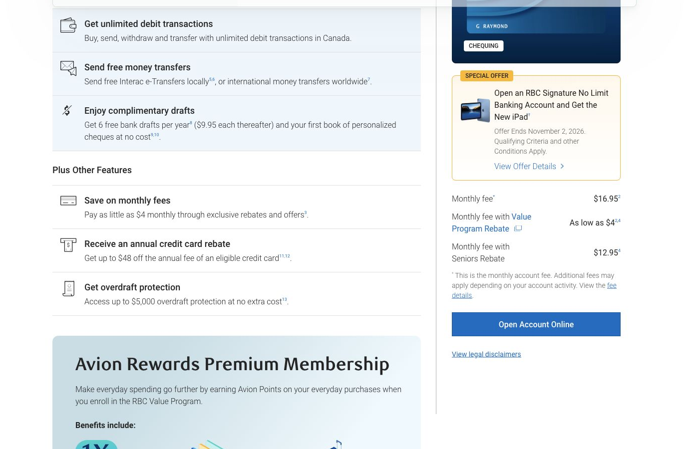
RBC Signature No Limit Banking: $16.95 a month, or “as low as $4” through the Value Program; $12.95 with the Seniors Rebate.
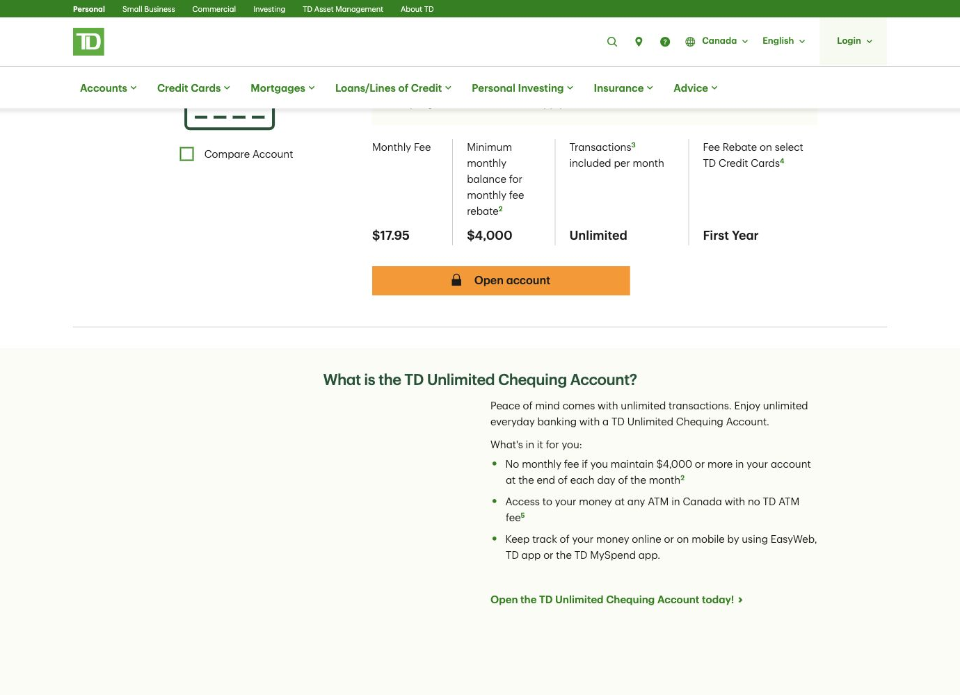
TD Unlimited Chequing: $17.95 a month, fully rebated when at least $4,000 is maintained every day of the month.
A new customer in Canada, not signed in to either bank and using the browser rather than a banking app.
Before providing real contact details, completing an identity check or accepting account terms. No account was opened.
Desktop Chrome with a 390-pixel phone-width review. Currency is Canadian dollars. Promotional gifts were noted but not treated as the core account price.
The 30-second result
TD explained the full fee waiver better. RBC made the application feel less demanding.
RBC narrowly wins the observed opening journey. Its standard fee was $1 lower and its application moved from customer status to ordinary personal and contact details with clear validation. TD made its $4,000 waiver exceptionally easy to compare, but inserted a three-product bundle page and then asked the applicant to choose an identity-verification method before collecting ordinary details. The extra decisions made TD’s path feel more consequential sooner.
TD made the fee waiver concrete; RBC made the discount conditional
RBC’s account page put the $16.95 standard monthly fee beside “as low as $4” with a Value Program Rebate. That lower number is attractive, but it is not a single qualification. The linked program depends on holding products in additional RBC categories and completing an eligible monthly activity such as a direct deposit, bill payment or pre-authorised payment. A customer has to translate a relationship program into their likely monthly fee.
TD charged $17.95, but the adjacent $4,000 minimum-balance figure and the sentence “No monthly fee if you maintain $4,000 or more in your account at the end of each day of the month” made the outcome predictable. The requirement is demanding, yet the customer can decide immediately whether it fits. Unlimited transactions and the first-year credit-card fee rebate were kept in the same comparison block.
Round winner / TD
A higher headline fee was easier to evaluate because the complete-waiver rule was specific, local and stated in plain language.
TD interrupted the application with a bundle, then led with identity
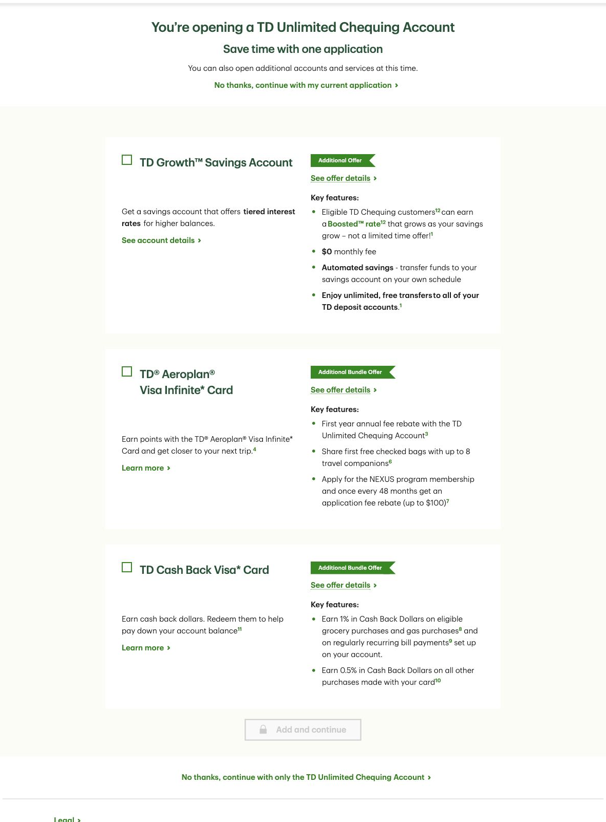
After Open account, TD presented “Save time with one application” and three optional additions: a Growth Savings Account, Aeroplan Visa Infinite Card and Cash Back Visa Card. Both the heading and the prominent product cards reframed a single-account task as a bundle decision. A text link allowed the customer to continue with only the chequing account, but it competed with much larger offers.
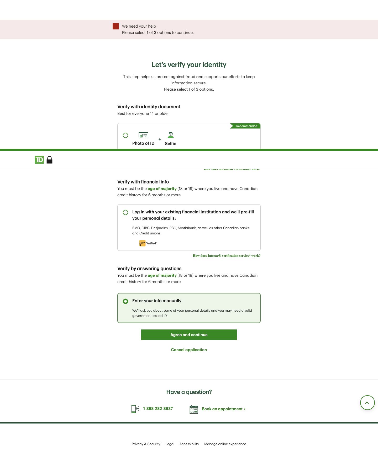
TD then confirmed eligibility and moved to identity proofing. The applicant had to choose a photo ID and selfie, login through another financial institution, or answer questions and enter information manually. The latter two routes required the age of majority and at least six months of Canadian credit history. Those are legitimate security choices, but presenting them before ordinary details raises perceived commitment.
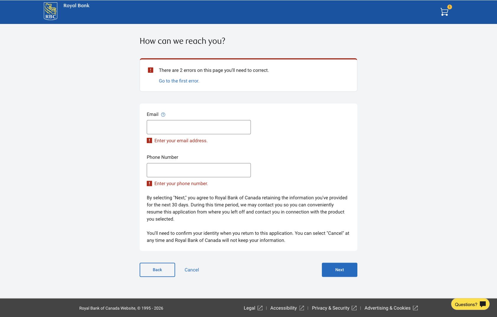
RBC asked whether the applicant already used RBC, offered mobile-app or browser continuation, confirmed the selected product and then collected familiar personal information. The next contact step disclosed that selecting Next would let RBC retain the supplied information for 30 days so the application could be resumed. That is a meaningful commitment, but it appeared beside the fields where it applied rather than as a separate product decision.
Round winner / RBC
The journey stayed centred on the chosen chequing account and deferred identity verification until after familiar application fields.
RBC’s recovery message connected the summary to the fields
Submitting an empty RBC contact step produced a summary stating that two errors needed correction, a “Go to the first error” link and specific messages under Email and Phone Number. The recovery route was visible without wiping the form or changing context. Earlier personal-detail fields used the same pattern.
TD’s empty identity step also produced a prominent alert asking the customer to select one of three options. After the manual route was selected, however, the alert remained visible in the observed state. The selected card changed clearly, but the stale warning made it less certain whether the choice had been accepted. We did not select Agree and continue.
Both exact product pages were good for real phone users
These are 75th-percentile Chrome UX Report results for the exact account URLs, collected from 27 August to 23 September 2026. They describe real Chrome visits to those product pages, not the separate application, bundle or identity pages shown above. Both pages passed all three Core Web Vitals; TD was faster and more stable in this field window.
Mobile PageSpeed checks on 25 September scored RBC 96 for accessibility and 92 for best practices, and TD 97 and 100. RBC’s run found four informative images without alt text, incorrect image aspect ratios and console errors; its lab diagnostics also identified a 1.75-second LCP resource-load delay and large unused script and style payloads. TD’s run found an unnamed cookie dialog and a visible-label/accessibility-name mismatch. Its diagnostics named unsized images and layout-shift culprits, including the product banner and cookie layer. These automated findings are investigation leads, not WCAG conformance claims.
All ten Nielsen usability heuristics
Keep the selected account and next commitment visible.
RBC retained a product summary and clear step context; TD’s bundle page temporarily shifted attention away from the chosen account.
Translate discounts into an actual monthly fee.
TD’s $4,000 requirement was concrete. RBC’s “as low as $4” required the customer to interpret products, categories and activities.
Let applicants decline extras without a detour.
TD supplied a continue-only link, but made rejection a required stop in the primary flow.
Use the expected application sequence.
RBC’s progression from eligibility to personal and contact details was easier to anticipate than TD’s early identity choice.
State identity prerequisites before the application starts.
TD explained age and credit-history restrictions at the choice, but earlier disclosure would prevent avoidable starts.
Keep fee rules beside the price.
TD did this well. RBC separated the attractive lower fee from the complete Value Program calculation.
Offer identity methods when they become necessary.
TD’s three routes support different customers, but the choice would be more useful after the applicant understands the remaining steps.
Keep a single-product task single-purpose.
The TD bundle page added substantial savings and credit-card content before the chequing application could continue.
Clear resolved alerts immediately.
RBC linked its summary to field messages. TD’s identity alert remained after an option was selected in the observed state.
Explain the trade-off behind each route.
TD described eligibility for its verification methods; RBC disclosed 30-day data retention and how to cancel.
What we would change first
Remove the bundle page from the critical path.
What
Continue directly with the chosen account and offer additional products after approval or from an optional link.
Where
Between Open account and the new-customer eligibility step.
Why
The current page requires three rejection decisions before the task can continue.
Measure
Application-start completion, continue-only clicks and exits from the bundle page.
Show a small Value Program fee calculator inline.
What
Let customers select their existing product categories and qualifying monthly activity to reveal the likely fee.
Where
Beside $16.95 and “as low as $4”.
Why
The lowest price is prominent while the route to it requires a separate rules interpretation.
Measure
Calculator completion, fee-detail opens and product-to-application progression.
Preview identity requirements before Start, then clear resolved errors.
What
Summarise the three methods and eligibility on the product page; remove the alert as soon as a valid option is selected.
Where
The account CTA and identity-verification page.
Why
Customers currently meet a high-commitment decision after starting, and the stale alert weakens confidence.
Measure
Identity-step exits, option-selection errors and progression after selection.
Fix the named accessibility and image-delivery defects.
What
Add useful alt text or mark decoration, name dialogs, align visible and accessible labels, reserve image dimensions and reduce oversized assets.
Where
RBC benefit imagery and shared scripts; TD cookie dialog, product banner and footer images.
Why
The lab checks identified specific defects even though both exact URLs passed field Core Web Vitals.
Measure
Zero recurrence in automated checks, keyboard and screen-reader verification, and stable p75 LCP and CLS.
What this public comparison cannot see
We stopped before identity verification, real contact-data submission, account terms and funding. We therefore cannot compare approval, document capture, fraud checks, downstream recovery, account activation or the accuracy of personalised offers. Public pricing and promotions may vary by applicant and change after the test date.
We also cannot say which journey opens more accounts. With consented analytics and session evidence, UX Robot could quantify product-detail engagement, bundle-page exits, identity-method selection, validation recovery, approval and account-opening completion.