Independent public comparison
We compared the unsigned-in journey for buying the entry-level membership at Costco and Sam’s Club in the United States. We are not affiliated with either company. This records the public journeys on 28 September 2026; prices and promotions can change.
The basic membership test
Compare the basic annual membership, select it and continue until personal details or payment.
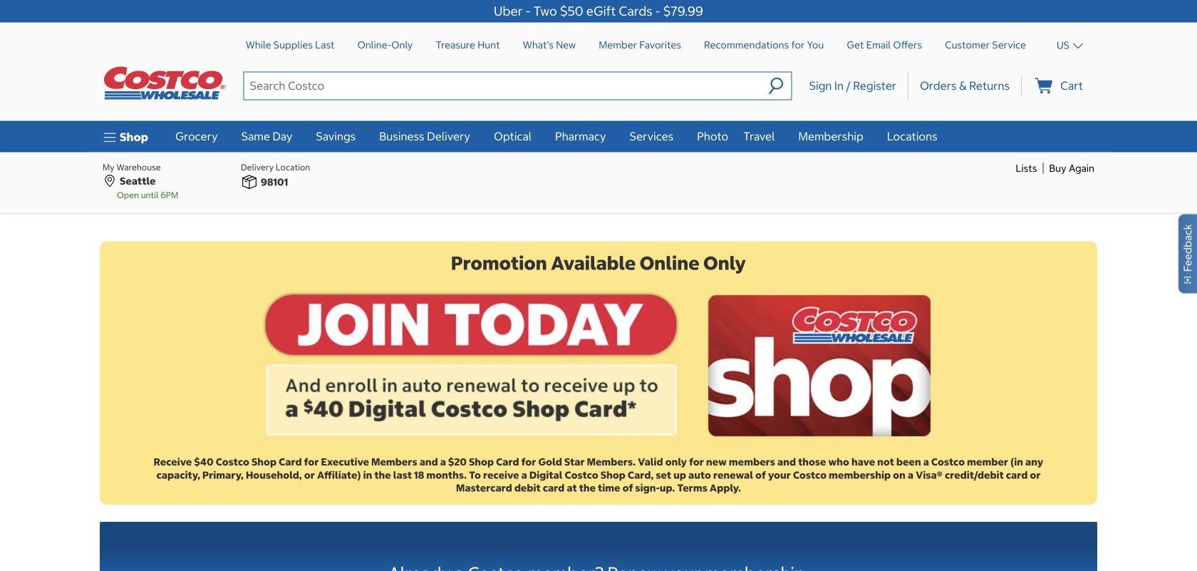
Gold Star at $65 a year, with a displayed eligible-new-member offer for a $20 Digital Costco Shop Card.
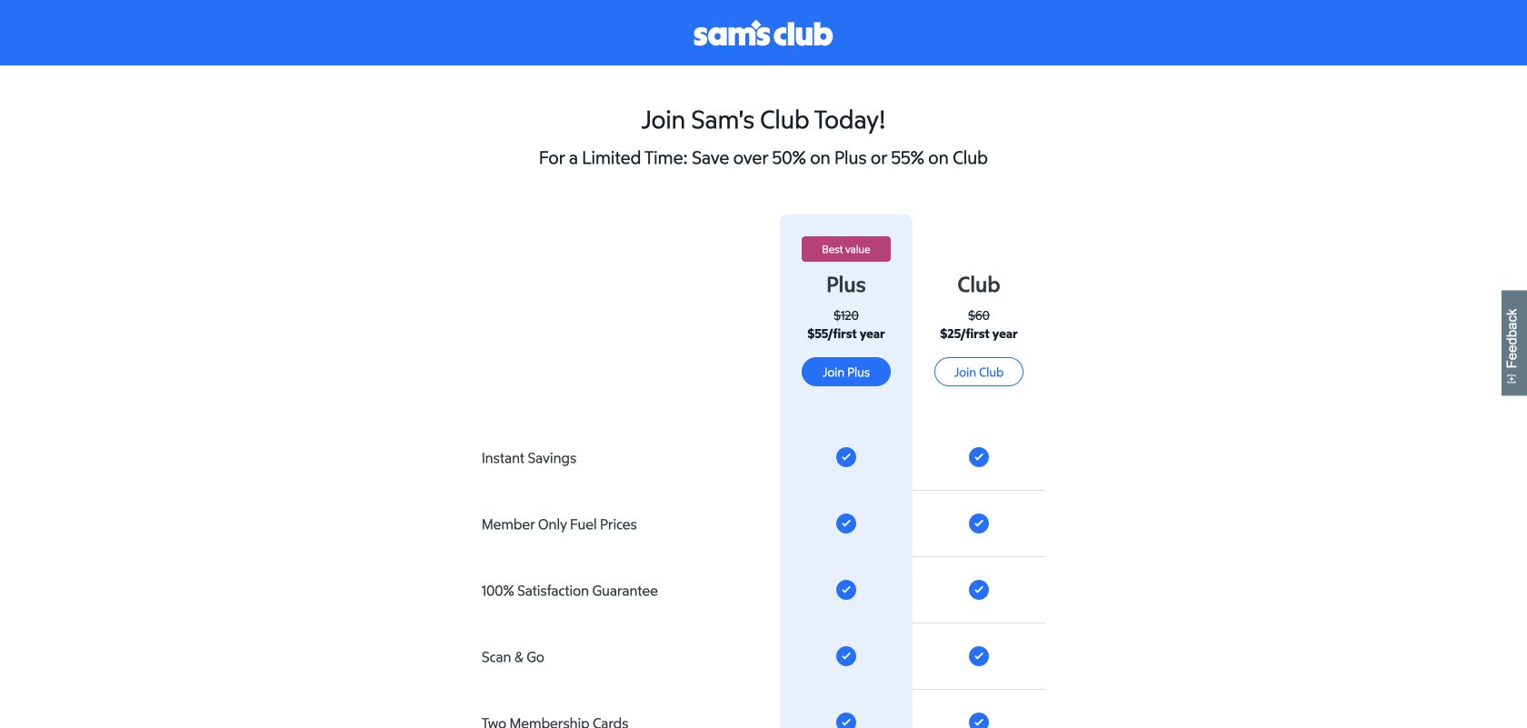
Club at a displayed $25 for the first year, reduced from $60; the application later confirmed the promotional total.
United States, unsigned-in desktop Chrome at 1440 × 1000, prices in US dollars.
Required personal details before payment. No membership, account or payment was submitted.
Continue with required fields empty, inspect messages and focus, then correct the first name.
The 30-second result
Sam’s Club makes the basic plan easier to choose and confirms the promotional total. Costco loses price continuity after selection.
Sam’s Club wins. Its plan cards were quicker to compare, the application exposed the $60 regular price and $25 promotional total, and its error summary supported recovery. Costco gave a more exhaustive benefit comparison, but the Gold Star application displayed $0.00 before payment instead of carrying the selected $65 fee forward. Both forms recovered when the first field was corrected.
Sam’s Club makes the entry plan easier to scan
Costco compared Gold Star at $65 with Executive at $130 and explained the higher tier’s 2% reward, early shopping hours and service credits. That depth is useful for a deliberate buyer, but the page makes the basic decision compete with a long benefits matrix and an auto-renew-linked promotion.
Sam’s Club put Club and Plus in two compact cards. Club was presented at $25 for the first year against a $60 regular price; Plus was $55 against $120. The difference in included services remained visible without forcing the reader through as much supporting copy.
Round winner / Sam’s Club
It gets the buyer from price to tier choice with less comparison work.
Costco’s application forgets the price the customer selected
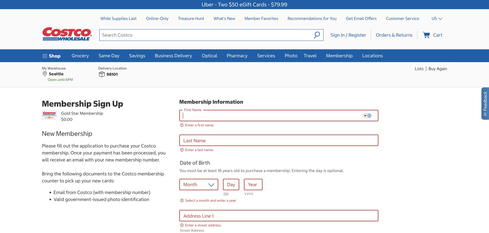
After selecting Gold Star, Costco correctly named the membership but showed $0.00 in the pre-payment summary. That creates avoidable doubt: has the choice been applied, is the fee waived, or will $65 appear later? A membership form should repeat the product, annual fee, renewal terms and any eligibility condition at every consequential step.
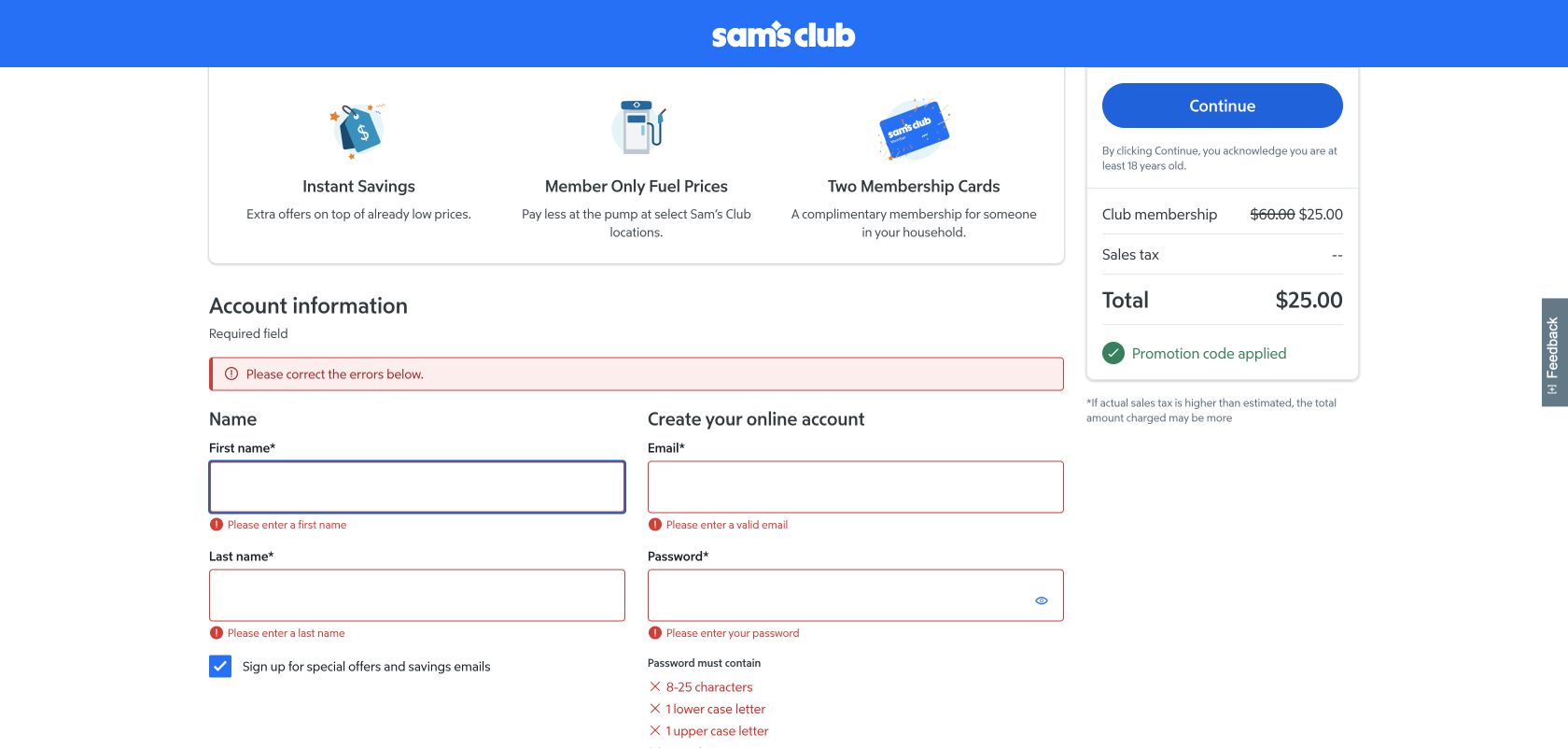
Sam’s Club also started with a $0.00 summary, but an empty Continue attempt caused the pricing panel to resolve to $60 struck through and a $25 total with the promotion applied. That is better than leaving the fee unexplained, although the correct total should appear as soon as the customer lands. We also observed different promotion end dates on the membership page and application; a single authoritative offer date would reduce uncertainty.
Both forms recover, but Sam’s Club gives the better overview
Submitting each form empty produced specific required-field messages and moved focus to First name. Entering “UX” and leaving the field cleared that error on both sites. Sam’s Club added a page-level “Please correct” summary, which is especially useful when a long form contains errors beyond the viewport. Costco relied more heavily on the inline sequence.
Consent defaults deserve attention. Sam’s Club preselected promotional email while leaving SMS unselected. Costco preselected “Add to Address Book.” Optional choices should be explained in context and should not look like prerequisites for joining.
Sam’s Club has the stronger phone field record
These are p75 phone Chrome UX Report results for the exact public membership pages from 30 August to 26 September 2026. Both loaded and responded within the good thresholds; Sam’s Club was also visually stable. Costco’s 0.11 CLS narrowly missed the good threshold, so the next investigation should isolate which page elements move during load.
The configured mobile PageSpeed runs scored Costco 85 for accessibility and 54 for best practices, compared with 98 and 77 for Sam’s Club. Costco’s findings included focusable content inside an aria-hidden region, broken ARIA parent/child relationships, low contrast and images without explicit dimensions. Sam’s Club’s main accessibility finding was the absence of a main landmark. Automated checks identify risks; they do not establish WCAG conformance.
All ten Nielsen usability heuristics
Keep the selected price visible.
Sam’s Club eventually confirmed $25; Costco’s $0.00 summary obscured the state.
Explain a year’s cost in one place.
Plan, fee, renewal and promotion should read like one purchase rather than separate disclosures.
Keep optional additions visibly optional.
Household members and communications can be deferred without blocking progress.
Use one promotion end date.
Sam’s Club displayed different dates between the comparison and application states.
Resolve totals before Continue.
A correct order summary prevents customers from advancing with the wrong expectation.
Repeat the chosen benefits.
The application should not make customers remember what the plan card promised.
Let returning members identify themselves early.
Clear sign-in and new-member routes prevent duplicate applications.
Progressively disclose the detail.
Costco can retain its thorough comparison while leading with the few differences that decide the tier.
Keep the summary and inline error in sync.
Both cleared the corrected first-name error; Sam’s Club gave the stronger overview.
Put eligibility beside the offer.
New-member and auto-renew conditions should be visible before the customer starts the form.
What we would change first
Carry the $65 Gold Star fee into the application.
What
Replace the unexplained $0.00 with the selected annual fee, discount and renewal terms.
Where
The Gold Star sign-up header and pre-payment summary.
Why
The current total contradicts the plan selected one step earlier.
Measure
Backtracking, help interactions, form abandonment and completed memberships.
Show the promotional total immediately and use one end date.
What
Resolve the price on entry and feed every offer surface from one promotion record.
Where
The Club plan card, application header and order summary.
Why
The total appeared only after validation and the observed dates differed.
Measure
Price-panel load time, pricing complaints and checkout progression.
Repair focus, ARIA and contrast contracts.
What
Remove focusable descendants from hidden regions, correct role nesting, raise contrast and reserve image space.
Where
The exact membership comparison and its navigation/components.
Why
The mobile accessibility score was 85 and the failures affect navigation and comprehension.
Measure
Zero component regressions plus successful keyboard and screen-reader completion.
Make optional choices explicit and preserve recovery quality.
What
Review preselected marketing/address choices and test summary-to-field focus after every release.
Where
Personal-details forms.
Why
Optional choices sit beside required membership data and can be mistaken for part of the transaction.
Measure
Opt-in changes, validation loops and assisted completion rate.
What this public comparison cannot see
We stopped before submitting personal details or payment. We did not verify tax, promotion eligibility, renewal charging, digital-card delivery or in-club activation. Prices and offer dates are the states displayed during the test.
Public testing cannot show which page converts better. GA4 could connect tier views, form starts, validation loops and completed memberships; Search Console could show which membership questions bring people into the journey; Microsoft Clarity could expose hesitation around totals, consent and offer terms.